Canvas 的變換功能可對繪圖進行縮放、旋轉、平移與矩陣變換。它與 CSS3 transform 概念相似,但原點、參數與影響範圍不同。
scale:縮放繪圖
scale(scaleWidth, scaleHeight) 會縮放後續繪圖。與 CSS3 不同,Canvas 的縮放會影響座標與線寬,且兩個參數不可省略。
ctx.strokeStyle = 'red';
ctx.strokeRect(5,5,50,50);
ctx.scale(2,2);
ctx.strokeRect(5,5,50,50);
ctx.scale(2,2);
ctx.strokeRect(5,5,50,50);
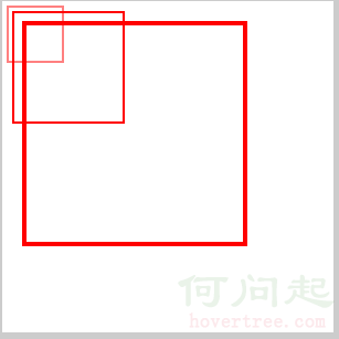
CSS3 的 scale 通常以元素中心為原點,且可只寫一個參數;Canvas 則以目前座標系統的原點進行縮放。
.box:hover { -webkit-transform: scale(2,2); }
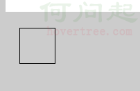
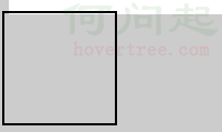
為什麼寬高要在 canvas 標籤上設定
Canvas 預設寬高為 300×150。若只用 CSS 設定寬高,瀏覽器會把 CSS 尺寸視為縮放結果,造成圖形變形。
canvas { background:#fff; width:300px; height:300px; }
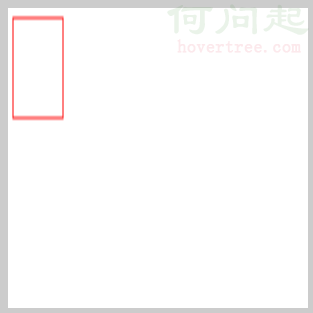
<canvas width="300" height="300" id="canvas">
  <span>您的瀏覽器不支援 canvas。</span>
</canvas>
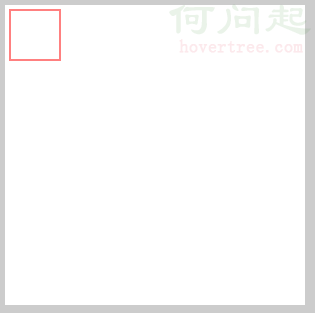
若要做連續縮放動畫,可使用 setInterval 搭配 clearRect 清除畫布,避免殘影。
var timer = null;
ctx.strokeStyle = 'red';
timer = setInterval(function(){
  ctx.beginPath();
  ctx.scale(1.5,1.5);
  ctx.strokeRect(5,5,50,50);
  ctx.closePath();
},500)
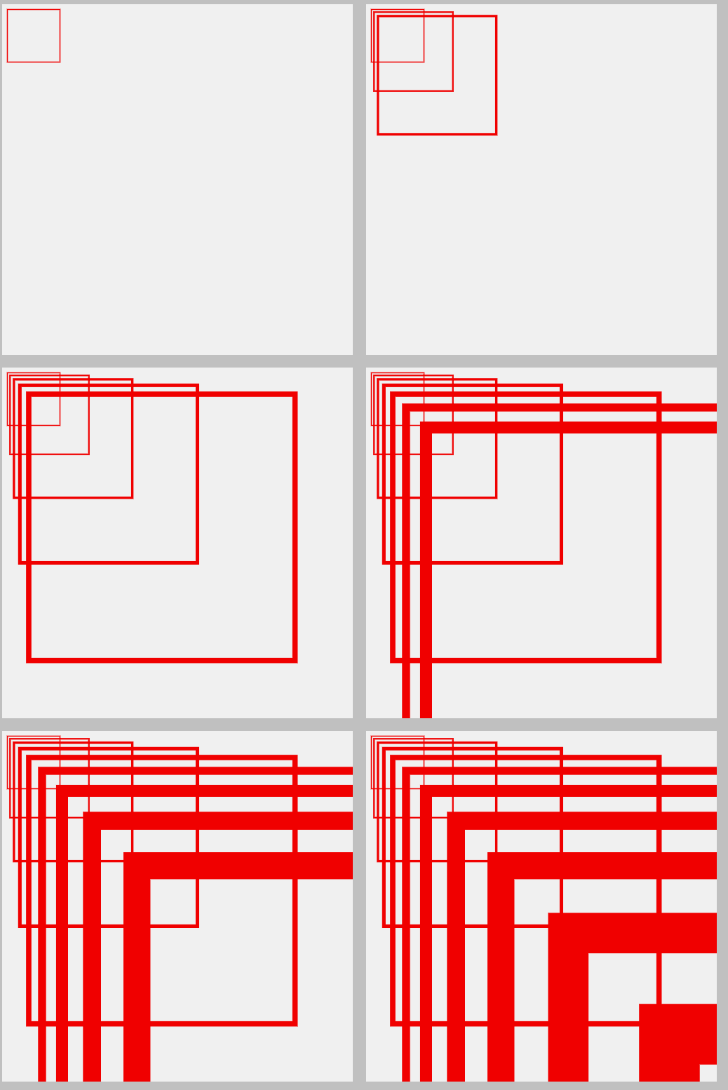
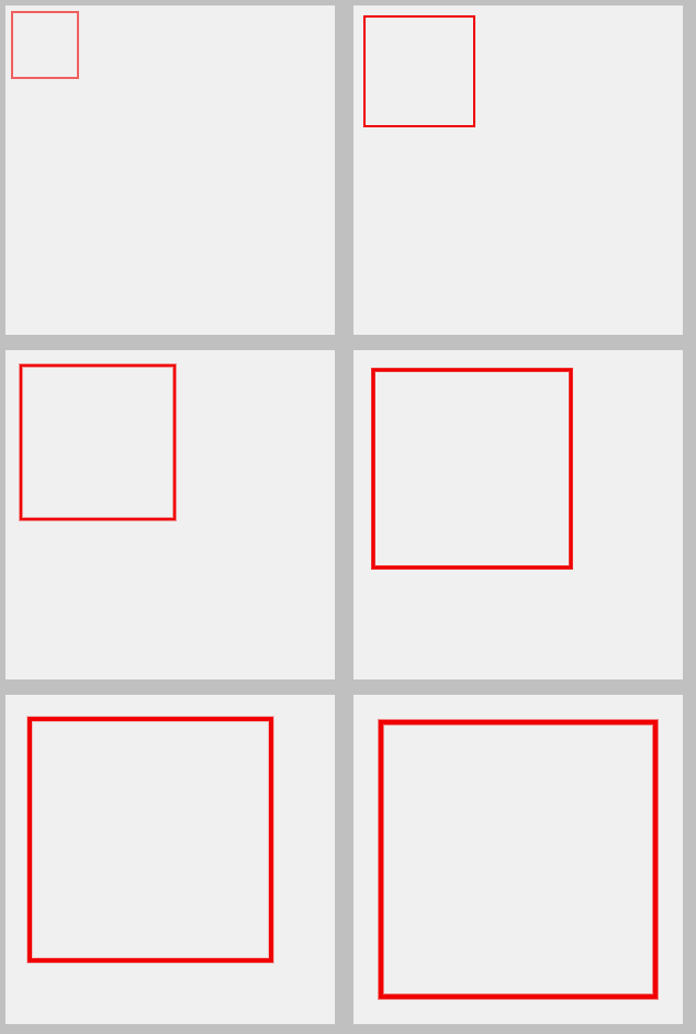
若希望每次清除後重新繪製,可使用 clearRect 與 save/restore。
var timer = null;
var num = 1;
ctx.strokeStyle = 'red';
timer = setInterval(function(){
  if(parseInt(num) >= 5){
    clearInterval(timer);
    num = 5;
  } else {
    num += 0.1;
  }
  ctx.clearRect(0,0,canvas.clientWidth,canvas.clientHeight);
  ctx.save();
  ctx.beginPath();
  ctx.scale(num,num);
  ctx.strokeRect(5,5,50,50);
  ctx.closePath();
  ctx.restore();
},500)
rotate:旋轉繪圖
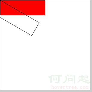
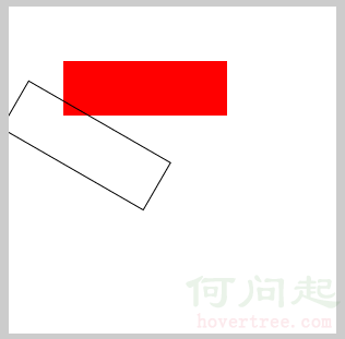
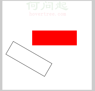
rotate(angle) 使用弧度。Canvas 的旋轉原點是畫布左上角,而圖形本身也以左上角作為旋轉參考。
ctx.fillStyle = 'red';
ctx.fillRect(0,0,150,50);
ctx.beginPath();
ctx.rotate(30*Math.PI/180);
ctx.strokeRect(0,0,150,50);
ctx.closePath();
ctx.fillStyle = 'red';
ctx.fillRect(50,50,150,50);
ctx.beginPath();
ctx.rotate(30*Math.PI/180);
ctx.strokeRect(50,50,150,50);
ctx.closePath();
ctx.fillStyle = 'red';
ctx.fillRect(100,100,150,50);
ctx.beginPath();
ctx.rotate(30*Math.PI/180);
ctx.strokeRect(100,100,150,50);
ctx.closePath();
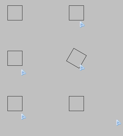
CSS3 的 rotate 以中心為原點,並接受角度;Canvas 則需轉成弧度,且原點行為不同。
.box:hover { -webkit-transform: rotate(30deg); }
translate:重新定義原點
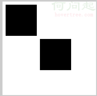
translate(x,y) 會把座標原點移動到新位置,後續繪圖都以此為基準。
ctx.fillRect(10,10,100,100);
ctx.translate(110,110);
ctx.fillRect(10,10,100,100);
CSS3 的 translate 只是位移元素,不會改變 Canvas 座標系統。
.box:hover { -webkit-transform: translate(100px,0); }
transform:矩陣變換
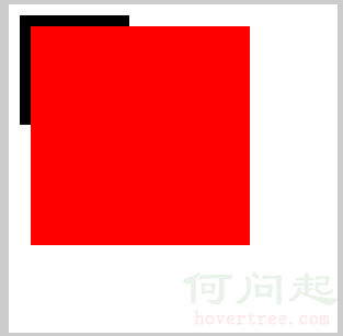
transform(a,b,c,d,e,f) 可一次套用縮放、傾斜與平移。它對應 CSS3 的 matrix。
ctx.fillRect(10,10,100,100);
ctx.transform(2,0,0,2,0,0);
ctx.fillStyle="red";
ctx.fillRect(10,10,100,100);
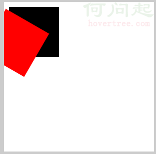
旋轉可表示為:
ctx.transform(
  Math.cos(30*Math.PI/180),
  Math.sin(30*Math.PI/180),
  -Math.sin(30*Math.PI/180),
  Math.cos(30*Math.PI/180),
  0,0
);
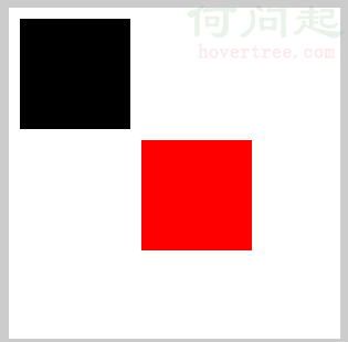
平移可表示為:
ctx.transform(1,0,0,1,110,110);
傾斜可表示為:
ctx.transform(1,Math.tan(30*Math.PI/180),Math.tan(30*Math.PI/180),1,0,0);
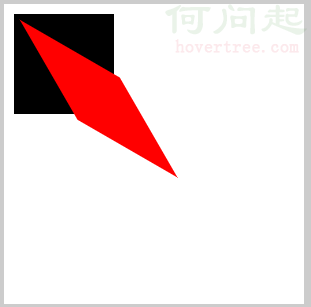
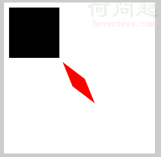
若要組合多種變換,可連續呼叫 transform。
ctx.transform(1,0,0,1,110,110);
ctx.transform(Math.cos(10*Math.PI/180),Math.sin(10*Math.PI/180),-Math.sin(10*Math.PI/180),Math.cos(30*Math.PI/180),0,0);
ctx.transform(0.5,0,0,0.5,0,0);
ctx.transform(1,Math.tan(30*Math.PI/180),Math.tan(30*Math.PI/180),1,0,0);
setTransform:重置變換矩陣
setTransform 會重置目前變換矩陣,避免前一次變換污染後續繪圖。
ctx.setTransform(2,0,0,2,0,0);
ctx.fillStyle="red";
ctx.fillRect(10,10,100,100);
ctx.setTransform(
  Math.cos(30*Math.PI/180),
  Math.sin(30*Math.PI/180),
  -Math.sin(30*Math.PI/180),
  Math.cos(30*Math.PI/180),
  0,0
);
ctx.fillStyle="green";
ctx.fillRect(10,10,100,100);
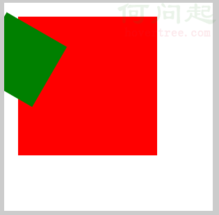
若混用 transform 與 setTransform,仍可能互相影響,因此必須注意呼叫順序與作用範圍。
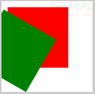
若先 transform 後 setTransform,效果又會不同。
- 上一篇文章: 從圖片裁剪到 Blob:深入瀏覽器端二進位資料處理
- 下一篇文章: placeholder 相容性處理:讓舊版瀏覽器也能顯示提示文字