前面我們把各類形狀、文字與圖片都梳理過一遍,接著該談顏色處理,也就是填充與邊框效果。你會發現這裡的概念與 Canvas 幾乎一致,最大的差別是:SVG 這些屬性既可以寫在元素標籤上,也可以交給 CSS 管理。
填充色:fill 屬性
這個屬性用指定的顏色填充圖形內部,用法很直接,把顏色值指派給它即可:
<rect x="10" y="10" width="100" height="100" stroke="blue" fill="red"
      fill-opacity="0.5" stroke-opacity="0.8" />
這段程式碼畫出一個紅底藍邊的矩形。幾個要注意的細節:
1. 若不提供 fill,預設會以黑色填充;若要取消填充,必須明確設為 none。
2. 填充透明度用 fill-opacity 控制,值域為 0 到 1。
3. 稍微複雜的是 fill-rule,它定義了「判定某點是否落在填充範圍內」的演算法。除了 inherit,還有兩個取值:
nonzero:從待判定的點向任意方向發射一條射線,計算圖形與射線交點處的走向。結果從 0 起算,每遇到一個「由左到右」的交點就加 1,每遇到一個「由右到左」的交點就減 1。所有交點算完後,若結果不為 0,該點在圖形內需填充;若等於 0,則在圖形外不需填充。
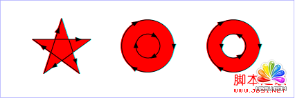
evenodd:同樣從待判定點發射射線,但只數交點個數。奇數表示該點在圖形內需填充,偶數則在圖形外不需填充。
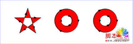
兩者在一般圖形上結果相同,差異會出現在形狀自我重疊的情況——nonzero 會把重疊區填滿,evenodd 則會讓重疊處變成空洞。實作上若要畫出「甜甜圈」這類中空效果,evenodd 往往更省事。
邊框色:stroke 屬性
上面的例子已經用到 stroke,它決定圖形邊框的顏色,同樣直接指派顏色值即可。注意:
1. 若不提供 stroke,預設不繪製邊框。
2. 邊框透明度用 stroke-opacity,值域 0 到 1。
實際上邊框比內部複雜一些,因為除了顏色,還有「形狀」需要定義——端點風格、轉角風格、虛實線型,各有專屬屬性。
線的端點:stroke-linecap
定義線段端點的風格,可取 butt、square、round 三個值:
<svg width="160" height="140">
<line x1="40" x2="120" y1="20" y2="20" stroke="black"
      stroke-width="20" stroke-linecap="butt" />
<line x1="40" x2="120" y1="60" y2="60" stroke="black"
      stroke-width="20" stroke-linecap="square" />
<line x1="40" x2="120" y1="100" y2="100" stroke="black"
      stroke-width="20" stroke-linecap="round" />
</svg>
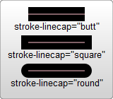
這段程式碼畫出三條使用不同端點風格的線:butt 是平齊切面,square 會向外延伸半個線寬,round 則是圓頭。從上圖可以很直觀地看出差異。
線的連接:stroke-linejoin
定義線段轉角處的風格,可取 miter、round、bevel:
<svg width="160" height="280">
<polyline points="40 60 80 20 120 60" stroke="black" stroke-width="20"
      stroke-linecap="butt" fill="transparent" stroke-linejoin="miter" />

<polyline points="40 140 80 100 120 140" stroke="black" stroke-width="20"
      stroke-linecap="round" fill="transparent" stroke-linejoin="round" />

<polyline points="40 220 80 180 120 220" stroke="black" stroke-width="20"
      stroke-linecap="square" fill="transparent" stroke-linejoin="bevel" />
</svg>
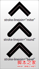
miter 形成尖銳的尖角,round 是圓潤轉角,bevel 則把尖角削平成切面。當轉角特別尖銳時,miter 可能拉出很長的尖刺,這時需要用 stroke-miterlimit 限制它的長度。
線的虛實:stroke-dasharray
用來設定虛線樣式:
<svg width="200" height="150">
<path d="M 10 75 Q 50 10 100 75 T 190 75" stroke="black"
      stroke-linecap="round" stroke-dasharray="5,10,5" fill="none" />
<path d="M 10 75 L 190 75" stroke="red"
      stroke-linecap="round" stroke-width="1" stroke-dasharray="5,5" fill="none" />
</svg>
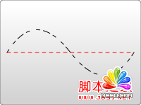
這個屬性接受一串數字,彼此必須以逗號分隔(屬性值中可以有空格,但空格不作為分隔符)。每個數字依序定義實線與虛線的長度,並按「繪製、不繪製」的順序循環下去。所以上面的例子是:畫 5 單位實線、留 5 單位空白,再畫 5 單位實線,如此往復。
其他可用的筆畫屬性
stroke-miterlimit:與 Canvas 中同名概念一致,用來決定何時放棄 miter 轉角效果。
stroke-dashoffset:設定虛線從哪個位置開始畫,做「螞蟻線」跑馬燈動畫時會用到它。
用 CSS 接管樣式
HTML5 強化了「結構與樣式分離」的思想,因此這些視覺屬性也可以完全交給 CSS。與普通 HTML 元素相比,只是把 background-color 換成 fill、border 換成 stroke,其餘大同小異:
#MyRect:hover {
  stroke: black;
  fill: blue;
}
就是這麼簡單。把 fill 與 stroke 搬到 CSS 之後,你就能用 hover、focus-within 甚至 transition 來做狀態切換與色彩過渡,這在純標籤屬性的寫法下是做不到的。
實用參考
MDN 開發中心:https://developer.mozilla.org/en/SVG
官方規範:https://www.w3.org/TR/SVG11/