HTML5+CSS3 實戰:用純 CSS3 打造圖片瀑布流版面
編輯:HTML和Xhtml
一直覺得圖片瀑布流版面很好看,以往看到的做法大多靠 JavaScript 實作。這次我嘗試用純 CSS3 實現了類似效果,分享給大家。先看參考效果:

我的程式碼:
<!DOCTYPE HTML>
<html>
<head>
<meta http-equiv="Content-Type" content="text/html; charset=utf-8">
<title>CSS3瀑布布局</title>
<style>
.container{
-webkit-column-width:160px;
-moz-column-width:160px;
-o-colum-width:160px;
-webkit-column-gap:1px;
-moz-column-gap:1px;
-o-column-gap:1px;
}
div:not(.container){
-webkit-border-radius:5px;
-moz-border-radius:5px;
border-radius:5px;
background:#D9D9D9;
border::#CCC 1px solid;
display:inline-block;
width:157px;
position:relative;
margin:2px;
}
.title{
line-height:80px;
font-size:18px;
color:#900;
text-align:center;
font-family:"Microsoft YaHei";
}
</style>
</head>
<body>
<section>
<div class="container">
<div style="height:80px" class="title">純CSS3瀑布布局</div>
<div style="height:260px"></div>
<div style="height:65px"></div>
<div style="height:120px"></div>
<div style="height:145px"></div>
<div style="height:90px"></div>
<div style="height:145px"></div>
<div style="height:160px"></div>
<div style="height:65px"></div>
<div style="height:230px"></div>
<div style="height:140px"></div>
<div style="height:85px"></div>
<div style="height:20px"></div>
<div style="height:145px"></div>
<div style="height:50px"></div>
<div style="height:65px"></div>
<div style="height:230px"></div>
<div style="height:140px"></div>
<div style="height:85px"></div>
<div style="height:20px"></div>
<div style="height:145px"></div>
<div style="height:50px"></div>
<div style="height:145px"></div>
<div style="height:160px"></div>
<div style="height:240px"></div>
</div>
</section>
</body>
</html>
運行效果如下(已在 Firefox 與 Google Chrome 測試通過,其他瀏覽器未測試):
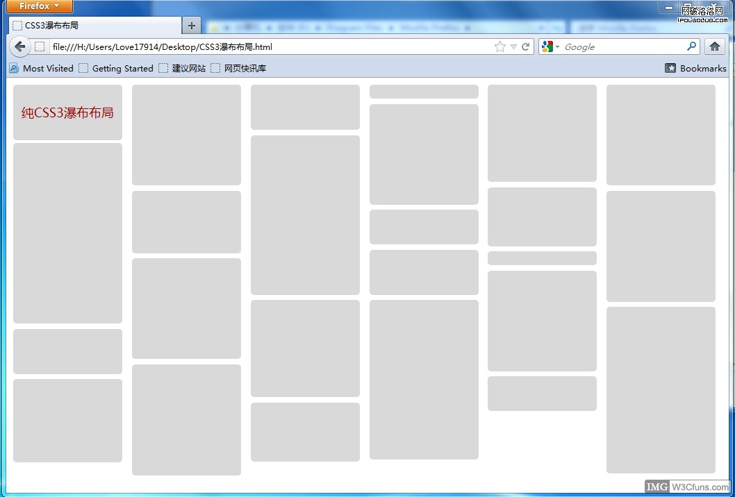
核心在於 column-width 與 column-gap 屬性,讓瀏覽器自動把內容分成多欄並保持間距,搭配 inline-block 與圓角,就能做出不依賴 JS 的瀑布流效果。
- 上一篇文章: HTML5+CSS3 實戰:用三角形變換繪製播放器按鈕
- 下一篇文章: HTML5+CSS3 實戰:三欄式版面寬度自適應