用 CSS border 模擬 Windows 風格:凸起、凹陷與多頁籤切換
編輯:JavaScript綜合知識
本文示範如何用純 CSS 的 border 樣式做出 Windows 9x/2000 時代的視覺風格,再用 JavaScript 完成多頁籤切換。這個範例的價值在於它完整展示了 outset 與 inset 這兩種 border style 如何撐起整個「立體感」的視覺語言。
樣式:用 border 製造立體感
body {
  font-family: 'MS Shell Dlg', 宋體, Tahoma;
  font-size: 12px;
  background-color: #336699;
  color: #000000;
}
td, div, input, textarea {
  font-family: 'MS Shell Dlg', 宋體, Tahoma;
  font-size: 12px;
  cursor: default;
}

/* 標題列:深藍底、米黃字 */
.title { background-color: #000080; color: #fdf7d3; padding: 1; }

/* 凸起:未按下的按鈕 */
.up   { background-color: #cccccc; color: #000000; border: 2px outset #ffffff; }
/* 凹陷:被按下的按鈕 */
.down { background-color: #cccccc; border: 2px inset #ffffff; }

/* 單像素版本,用於細邊框場合 */
.up1   { background-color: #cccccc; color: #000000; border: 1px outset #ffffff; }
.down1 { background-color: #cccccc; border: 1px inset #ffffff; }

/* 頁籤:上緣凸起、其餘方向無框線 */
.l  { background-color: #cccccc; height: 18px; color: #000000;
      border-left: 2px outset #ffffff; border-right: 2px outset #ffffff;
      border-top: 2px outset #ffffff; padding-top: 2; }
.lc { /* 同 .l,但用於選中狀態,高度略高以蓋住下方接縫 */ height: 20px; }

/* 頁籤下方那條細長的裝飾列,分成左中右三格 */
.l-h  { background-color: #cccccc; color: #000000;
        border-left: 2px outset #ffffff; border-top: 2px outset #ffffff; }
.l-c  { background-color: #cccccc; border-top: 2px outset #ffffff; }
.l-r  { background-color: #cccccc; color: #000000;
        border-right: 2px outset #ffffff; border-top: 2px outset #ffffff; }
.l-hc { background-color: #cccccc; color: #000000; border-left: 2px outset #ffffff; }
.l-cc { background-color: #cccccc; color: #000000; }
.l-rc { background-color: #cccccc; color: #000000; border-right: 2px outset #ffffff; }
關鍵概念是 outset 與 inset:前者讓上緣與左緣呈亮色、下緣與右緣呈暗色,視覺上像是「凸起」;後者剛好相反,看起來像「凹陷」。整個 Windows 經典介面的立體感,就是靠這兩個值搭配灰色底色撐起來的。
JavaScript:restore 加上各頁的顯示函式
function restore() {
  // 先把所有頁籤還原成未選中樣式
  td1.className = "l";  td2.className = "l";  td3.className = "l";
  td4.className = "l";  td5.className = "l";  td6.className = "l";

  td_1.className = "l-h";
  td_2.className = "l-c";  td_3.className = "l-c";
  td_4.className = "l-c";  td_5.className = "l-c";
  td_6.className = "l-c";

  // 再把所有內容頁隱藏
  w1.style.display = "none";
  w2.style.display = "none";
  w3.style.display = "none";
  w4.style.display = "none";
  w5.style.display = "none";
  w6.style.display = "none";
}

function c1() { td1.className = "lc"; td_1.className = "l-hc"; w1.style.display = "block"; }
function c2() { td2.className = "lc"; td_2.className = "l-cc"; w2.style.display = "block"; }
function c3() { td3.className = "lc"; td_3.className = "l-cc"; w3.style.display = "block"; }
function c4() { td4.className = "lc"; td_4.className = "l-cc"; w4.style.display = "block"; }
function c5() { td5.className = "lc"; td_5.className = "l-cc"; w5.style.display = "block"; }
function c6() { td6.className = "lc"; td_6.className = "l-cc"; w6.style.display = "block"; }
切換邏輯是「先全部還原,再啟動一頁」。每個頁籤的 onclick 都寫成 restore(); c1(); 這種組合,因此不需要判斷目前狀態。
那個 lc 樣式比 l 高了 2px(20px 對 18px),用意是讓選中的頁籤往下多出來一點,蓋住下方那條 l-c 裝飾列的接縫,看起來就像內容區與頁籤連成一體。這是沒有 border-radius 的年代用來「做圓角替代品」的土法煉鋼。
HTML:頁籤列加上內容區
<table border="0" cellpadding="0" cellspacing="0" width="400" height="61">
<tr>
  <td width="50" height="20" align="center" valign="bottom" onclick="restore();c1();">
    <div id="td1" class="lc">背景</div></td>
  <td width="50" height="20" align="center" valign="bottom" onclick="restore();c2();">
    <div id="td2" class="l">屏保</div></td>
  <td width="50" height="20" align="center" valign="bottom" onclick="restore();c3();">
    <div id="td3" class="l">外觀</div></td>
  <td width="50" height="20" align="center" valign="bottom" onclick="restore();c4();">
    <div id="td4" class="l">Web</div></td>
  <td width="50" height="20" align="center" valign="bottom" onclick="restore();c5();">
    <div id="td5" class="l">效果</div></td>
  <td width="50" height="20" align="center" valign="bottom" onclick="restore();c6();">
    <div id="td6" class="l">設置</div></td>
</tr>
<tr>
  <td class="l-hc" id="td_1"></td>
  <td class="l-c"  id="td_2"></td>
  <td class="l-c"  id="td_3"></td>
  <td class="l-c"  id="td_4"></td>
  <td class="l-c"  id="td_5"></td>
  <td class="l-c"  id="td_6"></td>
</tr>
<tr>
  <td colspan="8" class="up" style="padding:5">
    <div id="w1"><h1>1</h1></div>
    <div id="w2" style="display:none"><h1>2</h1></div>
    <div id="w3" style="display:none"><h1>3</h1></div>
    <div id="w4" style="display:none"><h1>4</h1></div>
    <div id="w5" style="display:none"><h1>5</h1></div>
    <div id="w6" style="display:none"><h1>6</h1></div>
  </td>
</tr>
</table>
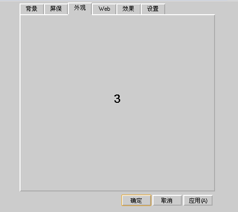
運行效果
用現代方式重做同一個頁籤
這個範例的視覺創意很有意思,但實作方式幾乎每一處都可以改進。同樣的效果今天只需要這樣:
<style>
.tabs { display: flex; gap: 2px; border-bottom: 2px solid #808080; }
.tabs button {
  font: 12px 'MS Shell Dlg', Tahoma, sans-serif;
  padding: 4px 14px;
  background: #cccccc;
  border: 2px outset #ffffff;
  cursor: default;
}
.tabs button[aria-selected="true"] {
  border-bottom-color: #cccccc;   /* 蓋住接縫,做出「連成一體」的效果 */
  position: relative;
  top: 2px;
}
.panel { padding: 8px; border: 2px inset #ffffff; background: #cccccc; }
.panel[hidden] { display: none; }
</style>

<div class="tabs" role="tablist">
  <button role="tab" aria-selected="true"  aria-controls="p1">背景</button>
  <button role="tab" aria-selected="false" aria-controls="p2">屏保</button>
  <button role="tab" aria-selected="false" aria-controls="p3">外觀</button>
</div>

<div class="panel" id="p1" role="tabpanel">背景設定</div>
<div class="panel" id="p2" role="tabpanel" hidden>屏保設定</div>
<div class="panel" id="p3" role="tabpanel" hidden>外觀設定</div>

<script>
const tabs = document.querySelectorAll('[role="tab"]');
tabs.forEach(function (tab) {
  tab.addEventListener('click', function () {
    tabs.forEach(function (t) {
      t.setAttribute('aria-selected', 'false');
      document.getElementById(t.getAttribute('aria-controls')).hidden = true;
    });
    this.setAttribute('aria-selected', 'true');
    document.getElementById(this.getAttribute('aria-controls')).hidden = false;
  });
});
</script>
改進的重點:
- 用 flex 取代 table 排版,不必再手動對齊
l-h/l-c/l-r三格。 - 用迴圈統一處理所有頁籤,不必為每一頁寫一個
c1~c6。 - 加上
role="tablist"、role="tab"、aria-selected、aria-controls,螢幕閱讀器才能正確朗讀狀態。 - 用
hidden屬性取代style.display,語意更明確。 - 用
addEventListener取代 HTML 內的 onclick。
若真要重現那種像素級的復古質感,其實不必手寫 border,直接用 image-rendering: pixelated 搭配 90 年代風格的 icon 與配色,效果會更完整也更好維護。