取得瀏覽器視窗尺寸與位置的 JavaScript 做法
編輯:關於JavaScript
視窗尺寸
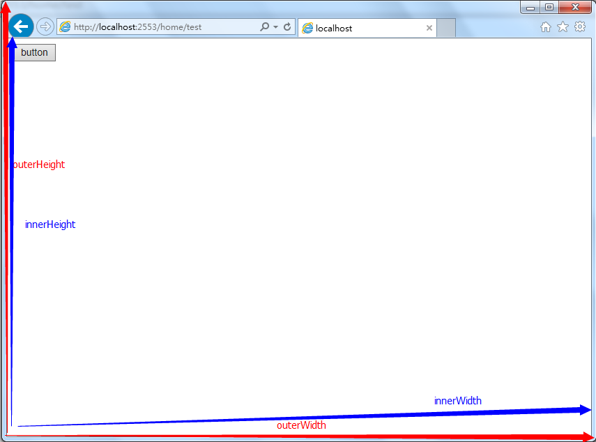
在 JavaScript 中,outerWidth 與 outerHeight 取得的是整個瀏覽器視窗(含工具列與邊框)的尺寸;innerWidth 與 innerHeight 則是真正可用於顯示內容的區域大小,也就是扣掉瀏覽器外框之後的部分。
較舊版本的 IE 需要再進一步判斷文件模式:標準模式(CSS1Compat)下應取 document.documentElement.clientWidth / clientHeight,而怪異模式(quirks mode)下則要用 document.body.clientWidth / clientHeight。
   (function () {
      var pageWidth = window.innerWidth;
      var pageHeight = window.innerHeight;
      var broswerWidth = window.outerWidth;
      var broswerHeight = window.outerHeight;
      alert(pageWidth + " " + pageHeight);
      alert(broswerWidth + " " + broswerHeight);
      if (typeof pageWidth != "number") {
          if (document.compatMode == "CSS1Compat") {  //The standard mode
            pageWidth = document.documentElement.clientWidth;
            pageHeight = document.documentElement.clientHeight;
          } else {
            pageWidth = document.body.clientWidth;
            pageHeight = document.body.clientHeight;
          }
      }
  })();
這裡的 typeof pageWidth != "number" 就是偵測「不支援 innerWidth」的舊環境,再退回 documentElement / body 的兼容分支。今日的專案已不必背負這段歷史包袱,直接取 window.innerWidth 即可;若需要扣除捲軸寬度,可再減去 window.innerWidth - document.documentElement.clientWidth。
視窗位置
取得視窗相對於螢幕左上角的座標時,IE、Chrome、Safari 使用 screenLeft 與 screenTop;Firefox 則不支援這組屬性,需改用 screenX 與 screenY。
   (function btnFun() {
     var leftPos = (typeof window.screenLeft == "number") ? window.screenLeft :
            window.screenX;
     var topPos = (typeof window.screenTop == "number") ? window.screenTop :
                          window.screenY;
     alert(leftPos + " " + topPos);
     //alert(window.screenLeft+" "+window.screenTop);
  })();
寫法上要點是「先偵測再取值」:用 typeof 判斷首選屬性是否存在,不存在時才退回另一組,這樣就能同時兼容兩大陣營的瀏覽器。這也是處理瀏覽器差異最通用的一套思路——能力偵測永遠優於版本判斷。
- 上一篇文章: JavaScript 解析 URL:結構拆解與參數提取全攻略
- 下一篇文章: JavaScript 建立自訂物件的六種模式與取捨