用輕量 JS 類庫統一取得瀏覽器視口、視窗與頁面尺寸
編輯:關於JavaScript
想像一個常見場景:在使用者滑了很久的長頁面中,點擊某個按鈕要彈出一層 DIV,結果畫面毫無反應——因為它其實被畫在了頁面最頂端,早已滾出視線之外。要解決這個問題,我們必須準確掌握使用者目前所處的捲動位置,以及可視區域的實際尺寸。
而在 JavaScript 中,能拿到這類資訊的工具多到令人眼花撩亂:
- 網頁可見區域寬:
document.body.clientWidth - 網頁可見區域高:
document.body.clientHeight - 網頁可見區域寬(含邊線與捲軸):
document.body.offsetWidth - 網頁可見區域高(含邊線):
document.body.offsetHeight - 網頁正文整體寬:
document.body.scrollWidth - 網頁正文整體高:
document.body.scrollHeight - 網頁被捲起的高度(Firefox):
document.body.scrollTop - 網頁被捲起的高度(IE):
document.documentElement.scrollTop - 網頁被捲起的左側距離:
document.body.scrollLeft - 正文部分距螢幕上方:
window.screenTop - 正文部分距螢幕左方:
window.screenLeft - 螢幕解析度高:
window.screen.height - 螢幕解析度寬:
window.screen.width - 可用工作區高:
window.screen.availHeight - 可用工作區寬:
window.screen.availWidth - 色彩深度:
window.screen.colorDepth - 裝置 DPI:
window.screen.deviceXDPI
第一次看到這麼多名稱高度相似、意義卻微妙不同的屬性,確實容易崩潰。但如果每次想取一個尺寸都得重新思考一遍,那才是真正的折磨。於是我把這些屬性重新整理、抽象成三個概念:頁面、視窗與視口。
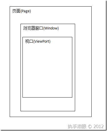
三個核心概念
頁面:我們做出來的網頁本身。它的高度通常遠大於瀏覽器高度,寬度則約等於或略小於瀏覽器寬度。
瀏覽器視窗:使用者實際操作的瀏覽器視窗,包含工具列、書籤列、狀態列與頁面顯示區。因此它的高度與寬度必定大於或等於視口。
視口:瀏覽器中真正用來顯示網頁內容的那塊區域。
實作一個小類庫
有了這三個概念打底,就能把雜亂的屬性收攏成結構清晰的介面:
var Browser = {};

// 頁面
Browser.Page = (function () {
  return {
    scrollTop: function () {
      return Math.max(document.body.scrollTop, document.documentElement.scrollTop);
    },
    scrollLeft: function () {
      return Math.max(document.body.scrollLeft, document.documentElement.scrollLeft);
    },
    height: function () {
      var _height;
      if (document.compatMode == "CSS1Compat") {
        _height = document.documentElement.scrollHeight;
      } else {
        _height = document.body.scrollHeight;
      }
      return _height;
    },
    width: function () {
      var _width;
      if (document.compatMode == "CSS1Compat") {
        _width = document.documentElement.scrollWidth;
      } else {
        _width = document.body.scrollWidth;
      }
      return _width;
    }
  };
})();

// 視窗
Browser.Window = (function () {
  return {
    outerHeight: function () {
      var _hei = window.outerHeight;
      if (typeof _hei != "number") {
        _hei = Browser.ViewPort.outerHeight();
      }
      return _hei;
    },
    outerWidth: function () {
      var _wid = window.outerWidth;
      if (typeof _wid != "number") {
        _wid = Browser.ViewPort.outerWidth();
      }
      return _wid;
    },
    innerHeight: function () {
      var _hei = window.innerHeight;
      if (typeof _hei != "number") {
        _hei = Browser.ViewPort.innerHeight();
      }
      return _hei;
    },
    innerWidth: function () {
      var _wid = window.innerWidth;
      if (typeof _wid != "number") {
        _wid = Browser.ViewPort.innerWidth();
      }
      return _wid;
    },
    height: function () {
      return Browser.Window.innerHeight();
    },
    width: function () {
      return Browser.Window.innerWidth();
    }
  };
})();

// 視口
Browser.ViewPort = (function () {
  return {
    innerHeight: function () {
      var _height;
      if (document.compatMode == "CSS1Compat") {
        _height = document.documentElement.clientHeight;
      } else {
        _height = document.body.clientHeight;
      }
      return _height;
    },
    innerWidth: function () {
      var _width;
      if (document.compatMode == "CSS1Compat") {
        _width = document.documentElement.clientWidth;
      } else {
        _width = document.body.clientWidth;
      }
      return _width;
    },
    outerHeight: function () {
      var _height;
      if (document.compatMode == "CSS1Compat") {
        _height = document.documentElement.offsetHeight;
      } else {
        _height = document.body.offsetHeight;
      }
      return _height;
    },
    outerWidth: function () {
      var _width;
      if (document.compatMode == "CSS1Compat") {
        _width = document.documentElement.offsetWidth;
      } else {
        _width = document.body.offsetWidth;
      }
      return _width;
    },
    width: function () {
      return Browser.ViewPort.innerWidth();
    },
    height: function () {
      return Browser.ViewPort.innerHeight();
    }
  };
})();
幾點補充說明
- 這套寫法已經能跨瀏覽器取得視口的寬高資訊。
- IE9 之後與 Opera、Chrome、Firefox、Safari 一致,支援
window.innerHeight / innerWidth / outerHeight / outerWidth;IE9 以前沒有這些屬性,因此在那種情況下,我把視窗與視口的概念視為等同來降級處理。 - 即使 window 提供了寬高,也不必然是瀏覽器視窗的真實尺寸——有些瀏覽器回傳的值不含工具列、選單列的高度。
實際應用:讓 DIV 固定在視口中央
在內容很長的頁面中,讓某個元素隨捲動保持在視口中央(近似即可):
window.onload = window.onresize = function () {
  var top = Math.round(Browser.Page.scrollTop()
    + (Browser.ViewPort.height() / 2)
    - (parseInt(document.getElementById("divCenter").style.height) / 2));
  var left = Math.round(Browser.Page.scrollLeft()
    + (Browser.ViewPort.width() / 2)
    - (parseInt(document.getElementById("divCenter").style.width) / 2));
  document.getElementById("divCenter").style.top = top + "px";
  document.getElementById("divCenter").style.left = left + "px";
};
測試時直接拖拉改變視窗大小,就能看到效果。