成品預覽
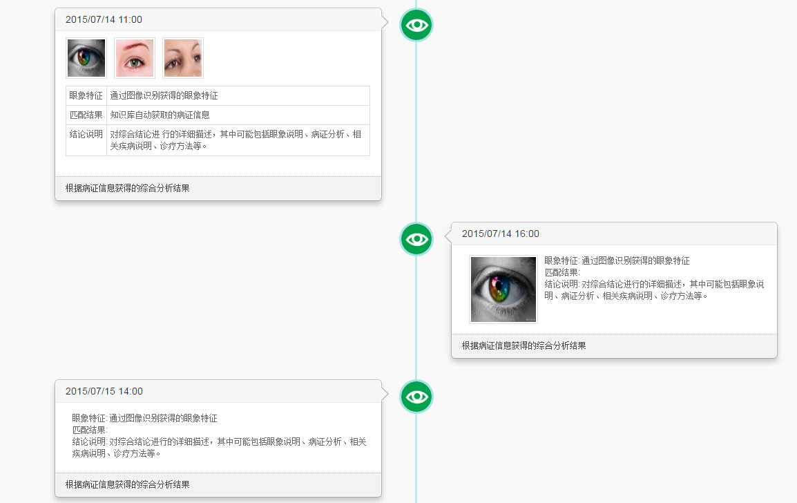
(圖一)視窗寬度大於 560px
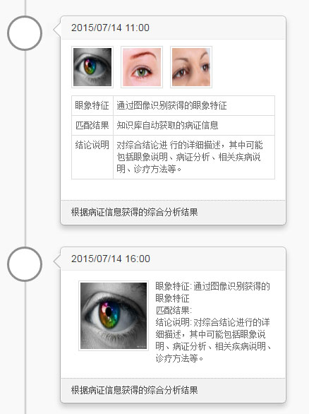
(圖二)視窗寬度小於 560px
響應式是怎麼做到的
兩張圖的差別在於:寬螢幕時節點左右交錯分佈,窄螢幕時全部改為靠左單列排列。這一切都靠 CSS3 的 Media Query 完成,只寫了一份 HTML,樣式自己隨寬度變換。
另外,時間軸上的圓點、圓角框、對話框的小三角,全部使用 CSS3 的 border-radius 與 border 技巧繪製,不需要任何圖片。這些基礎樣式本文不展開,有興趣可以自行查閱。
每個節點的內容提供三種排版:多圖、單圖、純文字,可依資料型態自由套用。
版面配置思路
核心邏輯只有一句話:外層容器相對定位,內部元素絕對定位。如下圖所示:
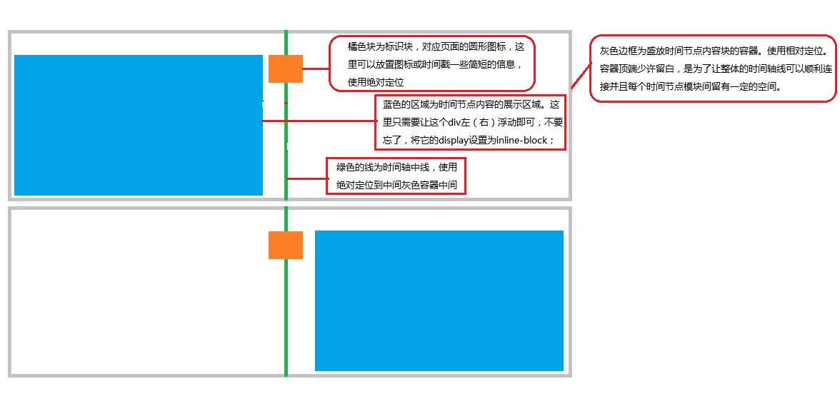
依照這個思路,左右交錯的時間軸就成形了。版面搞定後,再用 jQuery 的 animate 加上進場動畫——左側節點從左邊滑入,右側節點從右邊滑入,整頁就不會那麼死板。
為什麼要動態載入
真實場景裡,時間軸的資料量往往可觀:公司發展歷程、產品重大更新、個人年表……一次全部渲染出來,不只是首屏變慢,使用者滑到一半也早就失去耐心了。
比較合理的做法是參考分頁的概念,每次只載入固定筆數,觸發條件則換成「滾動」。這裡有兩個必須處理好的細節:
1. 首屏沒出現捲軸時要繼續載入。如果每次載入 5 筆,而 5 筆的內容不足以撐出捲軸,那麼後續的滾動事件永遠不會被觸發,使用者就再也看不到更多資料了。因此載入完畢後要檢查一次,不足則再呼叫一次。
2. 不能一滾動就觸發。否則請求會像連珠炮一樣發出,伺服器與瀏覽器都吃不消。正確做法是判斷「捲軸已到底部」才觸發。
CSS 程式碼
.timeline-container { width: 100%; }
.timeline {
 width: 100%; margin: auto; position: relative;
 height: auto; padding: 30px 0px 0px 0px;
}
.timeline > .timeline-block { width: 50%; }
.timeline-block > .popover { max-width: 70%; }
.timeline > .timeline-block-odd { float: left; }
.timeline > .timeline-block-even { float: right; }

.timeline-block-odd > .timeline-content {
 display: block; position: relative; float: right; margin-right: 50px;
}
.timeline-block-even > .timeline-content {
 display: block; float: left; position: relative; margin-left: 50px;
}
.timeline-content > .arrow { top: 20px !important; background: #f7f7f7; }
.timeline-content > .popover-content {
 max-height: 240px; overflow-y: auto;
 color: #696969; font-size: 11px;
}
.timeline-content > .popover-footer {
 padding: 8px 14px; margin: 0px; font-size: 11px;
 border-top: 1px dotted #b9b9b9; color: #4b4b4b; background: #F2F2F2;
}
.timeline img { border: 1px solid #dddddd; padding: 2px; }

.timeline-img {
 width: 50px; height: 50px;
 -webkit-border-radius: 25px; -moz-border-radius: 25px;
 -o-border-radius: 25px; border-radius: 25px;
 border: 3px solid #A3E3E8; margin: auto;
 background: #ffffff; position: absolute; z-index: 9;
 left: 50%; margin-left: -25px;
 background: url(../../indexImg/greeneye.jpg);
 background-size: cover;
}
.timeline-line {
 width: 4px; height: 100%; background: #aef0f5;
 position: absolute; z-index: 8; left: 50%;
 border-left: 1px solid #aef0f5; border-right: 1px solid #ffffff;
 margin-left: -2px; margin-top: -30px;
}
.timeline-block-odd > .popover.left > .arrow:after {
 right: 2px; border-left-color: #F7F7F7;
}
.timeline-block-even > .popover.right > .arrow:after {
 left: 2px; border-right-color: #F7F7F7;
}

/** 窄螢幕:全部改為單列靠左 **/
@media screen and (max-width: 560px) {
 .timeline { width: 100%; position: relative; height: auto; padding: 30px 0px 0px 0px; }
 .timeline > .timeline-block { width: 100%; }
 .timeline > .timeline-block-odd { float: right; }
 .timeline-block-odd > .timeline-content {
 display: block; position: relative; float: left; margin-left: 75px;
 }
 .timeline-block-even > .timeline-content {
 display: block; position: relative; float: left; margin-left: 75px;
 }
 .timeline-block-odd > .popover > .arrow,
 .timeline-block-odd > .popover > .arrow:after {
 position: absolute; display: block; width: 0; height: 0;
 border-color: transparent; border-style: solid;
 }
 .timeline-block-odd > .popover.left > .arrow {
 left: -21px; bottom: -10px; content: " ";
 border-left-width: 0; border-right-color: #999; border-width: 10px;
 }
 .timeline-block-odd > .popover.left > .arrow:after {
 left: 1px; right: 1px; bottom: -10px; content: " ";
 border-left-width: 0; border-right-color: #fff;
 }
 .timeline-block-odd > .popover > .arrow:after { content: ""; border-width: 10px; }
 .timeline-img {
 width: 50px; height: 50px; margin: auto; background: #ffffff;
 -webkit-border-radius: 25px; -moz-border-radius: 25px;
 -o-border-radius: 25px; border-radius: 25px;
 border: 3px solid #8e8e8e; position: absolute; z-index: 9;
 left: 0; margin-left: 0px;
 }
 .timeline-line {
 width: 4px; height: 100%; background: #d0d0d0;
 border-left: 1px solid #ececec; border-right: 1px solid #ececec;
 position: absolute; z-index: 8; left: 0;
 margin-left: 24px; margin-top: -30px;
 }
}
jQuery 程式碼
$(function () {
 var _timeline_row_ = $("<div></div>").addClass("row");
 $(".timeline-container").append(_timeline_row_);

 var loadData = function () {
 $.getJSON("timeline.json", function (data) {
 $.each(data, function (i, tl) {
 var _timeline_ = $("<div></div>").addClass("timeline");
 _timeline_row_.append(_timeline_);

 var _time_block_ = $("<div></div>").addClass("timeline-block");
 var _time_content_ = $("<div></div>").addClass("popover timeline-content");
 _time_block_.append(_time_content_);

 var _popover_title_ = $("<h3></h3>").addClass("popover-title").text(tl["diagTime"]);
 var _popover_footer_ = $("<div></div>").addClass("popover-footer").text(tl["result"]);
 var _popover_content_ = $("<div></div>").addClass("popover-content");
 _time_content_.append($("<div></div>").addClass("arrow"))
 .append(_popover_title_)
 .append(_popover_content_)
 .append(_popover_footer_);

 // 情況一:多張圖片
 if (tl["images"].length > 1 && tl["images"] != "" && tl["images"] != null && tl["images"] != "undefined") {
 var _img_container_ = $("<div></div>").css("margin-bottom", "10px");
 var _table_container_ = $("<table></table>").addClass("table table-bordered table-condensed");
 for (var m = 0; m < tl["images"].length; m++) {
 _img_container_.append($("<img/>").attr("src", tl["images"][m])
 .css({ "width": "60px", "height": "60px", "margin-right": "10px" }));
 }
 _popover_content_.append(_img_container_);
 _table_container_.append($("<tr></tr>")
 .append($("<td nowrap></td>").text("眼象特征"))
 .append($("<td></td>").text(tl["feature"])));
 _table_container_.append($("<tr></tr>")
 .append($("<td nowrap></td>").text("匹配結果"))
 .append($("<td></td>").text(tl["matchList"])));
 _table_container_.append($("<tr></tr>")
 .append($("<td nowrap></td>").text("結論說明"))
 .append($("<td></td>").text(tl["desc"])));
 _popover_content_.append(_img_container_).append(_table_container_);
 }
 // 情況二:單張圖片
 else if (tl["images"].length == 1 && tl["images"] != "" && tl["images"] != null && tl["images"] != "undefined") {
 var _img_container_ = $("<div></div>").addClass("pull-left")
 .append($("<img/>").attr("src", tl["images"][0])
 .css({ "margin": "5px 10px", "width": "100px", "height": "100px" }));
 var _text_container_ = $("<p></p>").css({ "margin-left": "10px", "margin-top": "5px", "font-size": "12px" })
 .append("眼象特征: " + tl["feature"]).append("<br/>")
 .append("匹配結果: " + tl["matchList"]).append("<br/>")
 .append("結論說明: " + tl["desc"]).append("<br/>");
 _popover_content_.append(_img_container_).append(_text_container_);
 }
 // 情況三:無圖片
 else {
 var _text_container_ = $("<p></p>").css({ "margin-left": "10px", "margin-top": "5px", "font-size": "12px" })
 .append("眼象特征: " + tl["feature"]).append("<br/>")
 .append("匹配結果: " + tl["matchList"]).append("<br/>")
 .append("結論說明: " + tl["desc"]).append("<br/>");
 _popover_content_.append(_text_container_);
 }

 $(_timeline_).append(_time_block_)
 .append($("<div></div>").addClass("timeline-img"))
 .append($("<div></div>").addClass("timeline-line"))
 .append($("<div></div>").addClass("clearfix"));

 // 左右交錯
 if ($(_timeline_).prev().find(".timeline-block").hasClass("timeline-block-odd")) {
 $(_timeline_).find(".timeline-block").addClass("timeline-block-even");
 $(_timeline_).find(".timeline-block-even>.timeline-content").addClass("right").css({ "left": "150px" });
 } else {
 $(_timeline_).find(".timeline-block").addClass("timeline-block-odd");
 $(_timeline_).find(".timeline-block-odd>.timeline-content").addClass("left").css({ "left": "-150px" });
 }

 // 進場動畫
 $(_timeline_).find(".timeline-block>.timeline-content").animate({ left: "0px" }, 1000);
 });

 // 首屏沒撐出捲軸就繼續抓
 if ($(window).height() >= document.documentElement.scrollHeight) {
 loadData();
 }
 });
 }

 var tcScroll = function () {
 $(window).on('scroll', function () {
 var scrollTop = $(this).scrollTop();
 var scrollHeight = $(document).height();
 var windowHeight = $(this).height();
 if (scrollTop + windowHeight == scrollHeight) {
 loadData(); // 捲到底才觸發
 }
 });
 }

 loadData();
 tcScroll();
});
寫完之後的回顧
這個 Demo 的重心其實在版面:外層相對定位、內層絕對定位,加上 media query 做窄螢幕變形。滾動載入的部分邏輯不難,但細節——首屏補抓、到底判定——決定它能不能穩定跑起來。
最後要誠實說一句:這份程式碼把邏輯和樣式混在一起,也沒有把插件抽成獨立模組,當作教學分享可以,正式專案請不要照抄這個組織方式。認真開發時,把資料渲染、滾動觸發、動畫效果拆成獨立元件,後續維護會輕memberName很多。