起因
工作上有個需求是做出自訂樣式的單選按鈕,而瀏覽器原生的 radio 樣式幾乎無法更動。搜尋之後找到一個相當漂亮的解法,能完美解決這個問題。
原理
寫表單時,radio 或 checkbox 通常會搭配 label 一起使用。當 label 的 for 屬性值與 input 的 id 相同時,點擊 label 就等於點擊 input。
於是整個技巧就是:用 label 蓋住原生的 input。把 input 的 z-index 設為 -1 讓它隱形但仍可互動,再幫 label 加上一張美化過的 sprite 背景圖;點擊時切換背景位置,視覺上就變成了「選中/未選中」的狀態。
頁面結構
<form class="form" method="post"> <fieldset> <legend>Which genres do you like?</legend> <input type="checkbox" value="action" id="check-1" name="genre"><label for="check-1" class="">Action / Adventure</label> <input type="checkbox" value="comedy" id="check-2" name="genre"><label for="check-2" class="">Comedy</label> <input type="checkbox" value="epic" id="check-3" name="genre"><label for="check-3" class="">Epic / Historical</label> <input type="checkbox" value="science" id="check-4" name="genre"><label for="check-4" class="">Science Fiction</label> <input type="checkbox" value="romance" id="check-5" name="genre"><label for="check-5" class="">Romance</label> <input type="checkbox" value="western" id="check-6" name="genre"><label for="check-6" class="">Western</label> </fieldset> <fieldset> <legend>Caddyshack is the greatest movie of all time, right?</legend> <input type="radio" value="1" id="radio-1" name="opinions"><label for="radio-1" class="">Totally</label> <input type="radio" value="1" id="radio-2" name="opinions"><label for="radio-2" class="">You must be kidding</label> <input type="radio" value="1" id="radio-3" name="opinions"><label for="radio-3" class="">What's Caddyshack?</label> </fieldset> </form>
jQuery 程式碼
jQuery.fn.customInput = function(){ $(this).each(function(i){ if($(this).is('[type=checkbox],[type=radio]')){ var input = $(this); //get the associated label using the input's id var label = $('label[for='+input.attr('id')+']'); //get type,for classname suffix var inputType = (input.is('[type=checkbox]')) ? 'checkbox' : 'radio'; //wrap the input + label in a div $('<div class="custom-'+ inputType +'"></div>').insertBefore(input).append(input,label); //find all inputs in this set using the shared name attribute var allInputs = $('input[name='+input.attr('name')+']'); //necessary for browsers that don't support the :hover pseudo class on labels label.hover(function(){ $(this).addClass('hover'); if(inputType == 'checkbox' && input.is(':checked')) { $(this).addClass('checkedHover'); } },function(){ $(this).removeClass('hover checkedHover'); }); //bind custom event, trigger it, bind click,focus,blur events input.bind('updateState',function(){ if(input.is(':checked')){ if(input.is(':radio')){ allInputs.each(function(){ $('label[for='+$(this).attr('id')+']').removeClass('checked'); }); }; label.addClass('checked'); } else { label.removeClass('checked checkedHover checkedFocus'); } }) .trigger('updateState') .click(function(){ $(this).trigger('updateState'); }) .focus(function(){ label.addClass('focus'); if(inputType == 'checkbox' && input.is(':checked')) { $(this).addClass('checkedFocus'); } }) .blur(function(){ label.removeClass('focus checkedFocus'); }); } }); }
引入 jQuery 與這段程式後,只要呼叫 $('input').customInput(); 就能套用。
自動生成的外層 div
如果原本 label 與 input 是成對寫的,執行後它們外層會被包上一個 div,方便統一控制樣式:

準備精靈圖
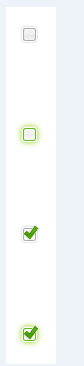
要注意的是,圖片頂端刻意留了一段空白。因為 input 選項多是置中顯示的,而我們是用 label 的背景圖來模擬,所以要預留距離讓圖示能對齊。總之:小圖示務必垂直排列,並留出足夠間距以達到置中效果。
基礎樣式
/* wrapper divs */ .custom-checkbox, .custom-radio { position: relative; display: inline-block; } /* input, label positioning */ .custom-checkbox input, .custom-radio input { position: absolute; left: 2px; top: 3px; margin: 0; z-index: -1; } .custom-checkbox label, .custom-radio label { display: block; position: relative; z-index: 1; font-size: 1.3em; padding-right: 1em; line-height: 1; padding: .5em 0 .5em 30px; margin: 0 0 .3em; cursor: pointer; }
這裡 label 的左內距留了 30px,正好讓出圖示的位置;input 則用 z-index: -1 藏起來但保持可互動。
狀態樣式
/* ==默認狀態效果== */ .custom-checkbox label { background: url(images/checkbox.gif) no-repeat; } .custom-radio label { background: url(images/button-radio.png) no-repeat; } .custom-checkbox label, .custom-radio label { background-position: 0px 0px; }
/*==鼠標懸停和得到焦點狀態==*/ .custom-checkbox label.hover, .custom-checkbox label.focus, .custom-radio label.hover, .custom-radio label.focus { /*background-position: -10px -114px;*/ } /*==選中狀態==*/ .custom-checkbox label.checked, .custom-radio label.checked { background-position: 0px -47px; } .custom-checkbox label.checkedHover, .custom-checkbox label.checkedFocus { /*background-position: -10px -314px;*/ } .custom-checkbox label.focus, .custom-radio label.focus { outline: 1px dotted #ccc; }
這裡的關鍵是 background-position:把精靈圖的「未選中」定在 0px 0px、「選中」定在 0px -47px,切換 class 時背景就換了圖。
最後的成果如下:

一點補充
這個方案的優點是完全不犧牲無障礙性——input 依然真實存在、依然可以 Tab 聚焦、依然會隨表單送出。當今若重寫,用純 CSS 的 appearance: none 搭配 input:checked + label::before 就能做到大部分效果,不必再靠 JavaScript 切換 class;上面的 hover 處理也只是為了照顧不支援 label:hover 的舊瀏覽器。
- 上一篇文章: 用 jQuery 實作圖片上傳前的預覽
- 下一篇文章: jQuery 原型屬性與原型方法詳解