jQuery 之父 John Resig 寫過一篇《Sub-Pixel Problems in CSS》,指出一個看似不該出問題的情況:一個寬 50px 的 div 裡放四個 float 的 div,每個寬 25%——理論上剛好填滿。但各家瀏覽器對「50 × 25%」的理解卻各不相同。
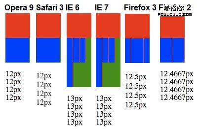
隨後 Steven Wittens 的《CSS Sub-pixel Background Misalignments》進一步測試了固定寬度元素水平居中時,父元素背景圖居中的差異,結果更令人眼花。
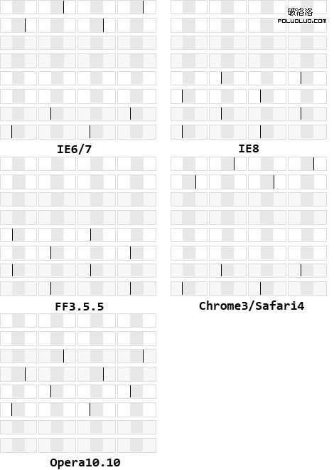
麻煩的是,這不只是 IE 的問題,各瀏覽器的不同版本之間也有細微差異。
典型的出問題場景
還好實務上很少碰到這種極端案例,最常見的莫過於這類需求:某個活動頁想鋪一張寬 1280px 的大背景圖居中,中間 980px 的內容區也居中。在 1024 解析度下,980px 之外能顯示多少算多少,不出現橫向捲軸;解析度大於 1024 時,大圖完整呈現。
為了方便觀察與歸納問題,下面把尺寸按比例縮小:外圍大圖寬 400px(對應 1280px),中間 200px 掏空(對應 980px),中間圖寬 200px。
<!DOCTYPE html PUBLIC "-//W3C//DTD XHTML 1.0 Transitional//EN"
  "https://www.w3.org/TR/xhtml1/DTD/xhtml1-transitional.dtd">
<html xmlns="https://www.w3.org/1999/xhtml">
<head>
<meta content="text/html; charset=utf-8" http-equiv="Content-Type" />
<title>Sub-Pixel</title>
<style type="text/css">
body, div, p { margin:0; padding:0; }
body { text-align:center; }
button { margin:1em; padding:0 1em; }
#pg, body { background-position:center 0; background-repeat:no-repeat; }
body { background-image:url('big.jpg'); }
#pg {
  margin:0 auto;
  width:200px;
  height:200px;
  background-image:url('small.jpg');
}
</style>
</head>
<body>
  <div id="pg"></div>
</body>
</html>
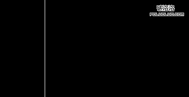
拖動瀏覽器邊緣改變視窗寬度,你會發現在某些時刻 body 與 #pg 的交界處會出現 1px 的空隙。這個問題存在於 IE6 / Chrome 3 / Safari 4 中。
同事給的兩個土辦法
- 切圖時不要分開。把 body 與 #pg 的圖合成一張大圖,只對 body 寫背景居中。若圖片太大,就切成多張寬度相同的小圖,用嵌套多層 div 拼起來:
<div class="bg1"> <div class="bg2"> <div class="bg3"> <div id="pg"></div> </div> </div> </div> - 掏空區域多留幾像素。現在中間是 200px,切圖時做成 198px,兩側各多留 1px 作為緩衝。
方法一在多數情況下很完美,但仍有不適用的個案;方法二對交界處色彩漸變柔和的圖很合適,可一旦交界線對比強烈,那 1px 的錯位就會非常刺眼——對追求細節的重構工程師來說無法接受。
用可調寬度的實驗頁找出規律
我們改一下結構,把大圖掛在外層 #pg,小圖掛在內層 #hd,再用 JS 加上一對 +1 / -1 按鈕即時改變 #pg 的寬度,觀察縫隙何時出現:
<style type="text/css">
body, div, p { margin:0; padding:0; }
body { text-align:center; }
button { margin:1em; padding:0 1em; }
#pg, #hd { background-position:center 0; background-repeat:no-repeat; }
#pg { background-image:url('big.jpg'); }
#hd {
  margin:0 auto;
  width:200px;
  height:200px;
  background-image:url('small.jpg');
}
</style>

<div id="pg">
  <div id="hd"></div>
</div>
<button id="sum">+1</button><button id="substruction">-1</button>
<p>#pg 寬度為 <strong id="current"></strong>px</p>

<script>
$(document).ready(function(){
  var pg = $('#pg');
  var current = $('#current');

  function getWidth(){
    current.text(pg.width());
  }

  getWidth();
  $(window).resize(getWidth);

  $('#sum').click(function(){
    pg.width(pg.width() + 1);
    getWidth();
  });

  $('#substruction').click(function(){
    pg.width(pg.width() - 1);
    getWidth();
  });
});
</script>
連續點擊 +1 / -1 可以歸納出結論:當 #pg 的寬度大於背景大圖寬度(400px)且為奇數時,右側才會出現這 1px 的空隙。
奇技淫巧:margin-left: 1px
正當我們跟奇偶數糾纏時,這個屬性出現了:
body { margin-left: 1px }
設了之後,不論奇偶都不會出現右側那道縫。但天下沒有白吃的午餐——當 body 寬度小於背景大圖寬度(400px)且為偶數時,左側交界處反而出現了 1px 的空隙。
最後只能靠 JS 收尾
結論很明確:當 body 寬度 ≥ 大圖寬度時加上 margin-left: 1px,反之移除。用一個 class 切換來做最乾淨:
<style type="text/css">
.fix-bg { margin-left: 1px; }
</style>

<script>
$(document).ready(function(){
  var body = $('body');

  function fixBg() {
    (body.width() >= 400) ? body.addClass('fix-bg') : body.removeClass('fix-bg');
  }

  fixBg();
  $(window).resize(fixBg);
});
</script>
後記
眼看就要圓滿了,忽然想到一個問題:「如果大圖寬度是奇數,還會出現這個問題嗎?如果會,那又該怎麼辦?」
呃……這個,那個……
寫這篇文章的十幾年後回頭看,這類問題的處理方式已經完全不同:現代瀏覽器對子像素渲染的實作趋于一致,多背景、background-size 與 CSS 變數讓布局手段豐富得多,而 1px 的縫隙通常也能用 outline 或 box-shadow 填補。這些 hack 的價值,如今更多是理解瀏覽器如何把 CSS 的浮點計算結果映射到實體像素上。