某次工作中有個需求,要讓選單依螢幕高度做位移。實作時發現各瀏覽器計算出來的數值並不一致,於是乾脆把常見的螢幕相關屬性都測了一遍,記錄如下,希望對同樣遇到問題的人有幫助。
測試環境為 1280 × 1024 的螢幕,瀏覽器視窗新開頁面。
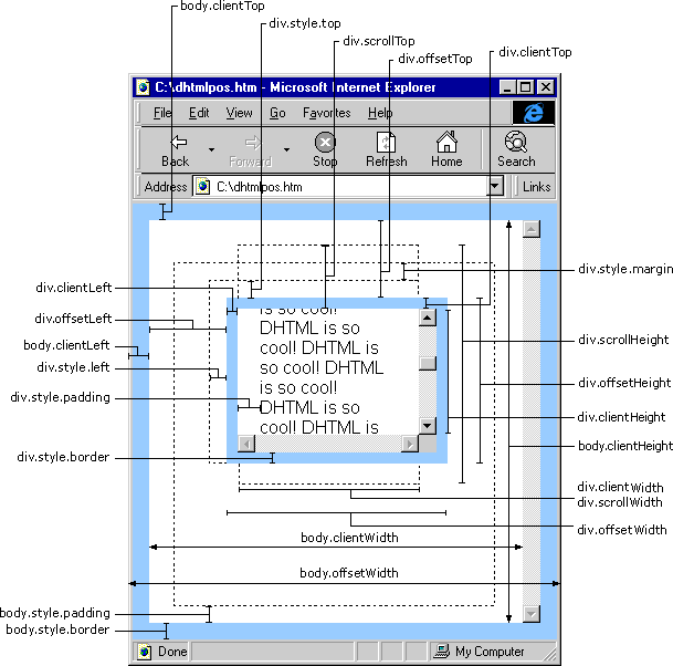
IE 下的實測結果
網頁可見區域寬度 document.body.clientWidth:1239
網頁可見區域高度 document.body.clientHeight:0
網頁可見區域寬度 document.body.offsetWidth:1239
網頁可見區域高度 document.body.offsetHeight:0
網頁正文全文寬度 document.body.scrollWidth:1239
網頁正文全文高度 document.body.scrollHeight:0
網頁被捲去的高度 document.body.scrollTop:0
網頁被捲去的寬度 document.body.scrollLeft:0
網頁正文部分距上 window.screenTop:144
網頁正文部分距左 window.screenLeft:0
螢幕解析度高度 window.screen.height:1024
螢幕解析度寬度 window.screen.width:1280
可用工作區高度 window.screen.availHeight:990
可用工作區寬度 window.screen.availWidth:1280
網頁內容可視區域高度 document.documentElement.clientHeight:820
垂直捲動值 document.documentElement.scrollTop:0
只支援 IE 的部分:window.innerHeight 為 undefined。
Firefox 下的實測結果
網頁可見區域寬度 document.body.clientWidth:1264
網頁可見區域高度 document.body.clientHeight:0
網頁可見區域寬度 document.body.offsetWidth:1264
網頁可見區域高度 document.body.offsetHeight:0
網頁正文全文寬度 document.body.scrollWidth:1264
網頁正文全文高度 document.body.scrollHeight:0
網頁被捲去的高度與寬度:皆為 0
螢幕解析度高度 window.screen.height:1024
螢幕解析度寬度 window.screen.width:1280
可用工作區高度 window.screen.availHeight:990
可用工作區寬度 window.screen.availWidth:1280
整個視窗寬高(不含工具列)window.innerHeight:829
網頁內容可視區域高度 document.documentElement.clientHeight:858
只支援 Firefox 的部分:window.screenTop 與 window.screenLeft 皆為 undefined。
差異在哪裡
對照兩邊數據,可以歸納出幾個重點。
寬度差了 25 像素。同樣是 1280 的螢幕,IE 下 document.body.clientWidth 是 1239,Firefox 則是 1264。這 25 像素的差額來自瀏覽器邊框與捲軸的計算方式不同,在做居中或滿版配置時容易造成版面偏移。
screenTop 與 screenLeft 只有 IE 有。Firefox 需要用 window.mozInnerScreenX 這類專屬屬性,或改用 screenX、screenY 取得類似資訊。
innerHeight 只有 Firefox 系支援。IE 得改用 document.documentElement.clientHeight 來取得等效數值。
body 的高度相關屬性在新頁面下都是 0。這是因為空頁面的 body 尚未撐開,並不代表瀏覽器有問題。實務上若要取得可靠的視窗高度,應該優先使用 documentElement 而非 body。
實務上的建議
處理這類跨瀏覽器差異,最省事的辦法是寫一個兼容函式,把判斷邏輯收攏在同一處:
function getViewport() {
    var w = window.innerWidth || document.documentElement.clientWidth || document.body.clientWidth;
    var h = window.innerHeight || document.documentElement.clientHeight || document.body.clientHeight;
    return { width: w, height: h };
}
用 || 串起各種可能的屬性,誰有值就用誰。這種「物件檢測」的思維,永遠比直接判斷瀏覽器型別更可靠,也更經得起時間考驗。
- 上一篇文章: JavaScript 題解:如何準確判斷陣列與類陣列集合
- 下一篇文章: 相容 Firefox 的「設為首頁」與「加入收藏」寫法