用 slideout.js 做出手機側邊欄滑動選單
編輯:關於JavaScript
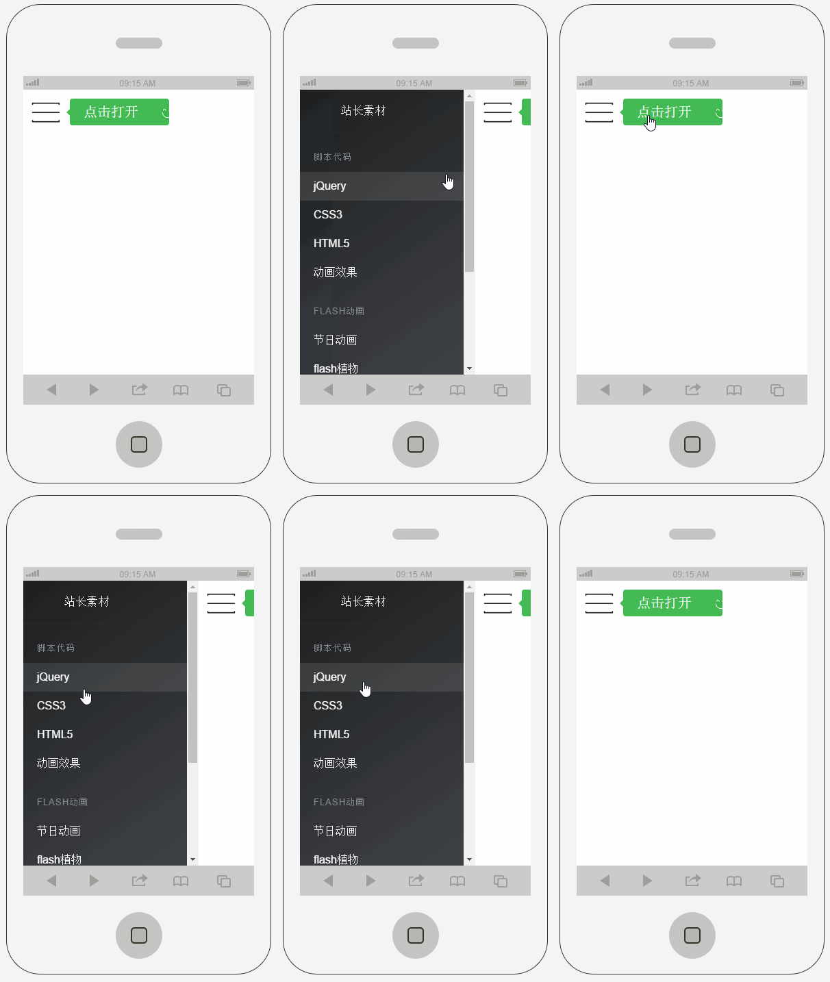
HTML5 的能力現在已經不只滿足於 PC 端,行動裝置上的各種特效同樣靠它實現。這次要介紹的 slideout.js,用起來非常輕巧,專門處理「側邊抽屜」這一類互動。
一、準備
只需要 slideout.js 一個檔案:https://github.com/Mango/slideout/blob/master/dist/slideout.js
以及一張漢堡選單的小圖:
二、HTML
 <!doctype html>
<html lang="zh">
<head>
<meta charset="UTF-8">
<meta http-equiv="X-UA-Compatible" content="IE=edge,chrome=1">
<meta name="viewport" content="width=device-width, initial-scale=1.0">
<title>適合手機的側邊欄滑動選單</title>
<link rel="stylesheet" href="css/styles.css">
</head>
<body>
<nav id="menu" class="menu">
  <a href="#" target="_blank">
    <header class="menu-header">
      <span class="menu-header-title">主題</span>
    </header>
  </a>
  <section class="menu-section">
    <h3 class="menu-section-title">腳本代碼</h3>
    <ul class="menu-section-list">
      <li><a href="#" target="_blank">jQuery</a></li>
      <li><a href="#" target="_blank">CSS3</a></li>
      <li><a href="#" target="_blank">HTML5</a></li>
      <li><a href="#" target="_blank">動畫效果</a></li>
    </ul>
  </section>
  <section class="menu-section">
    <h3 class="menu-section-title">flash 動畫</h3>
    <ul class="menu-section-list">
      <li><a href="#" target="_blank">節日動畫</a></li>
      <li><a href="#" target="_blank">flash 植物</a></li>
      <li><a href="#">flash 動物</a></li>
    </ul>
  </section>
  <section class="menu-section">
    <h3 class="menu-section-title">音效下載</h3>
    <ul class="menu-section-list">
      <li><a href="#" target="_blank">鳥叫聲</a></li>
      <li><a href="#" target="_blank">狗叫聲</a></li>
    </ul>
  </section>
</nav>>

<main id="main" class="panel">
  <button class="btn-hamburger js-slideout-toggle">
    <span class="tooltip">點擊打開</span>
  </button>
</main>

<script type="text/javascript" src="js/slideout.min.js"></script>
<script type="text/javascript">
var slideout = new Slideout({
  'panel':    document.getElementById('main'),  // 主要內容區
  'menu':     document.getElementById('menu'),  // 被藏起來的側邊選單
  'padding':  256,   // 點開後主面板右移的距離
  'tolerance': 70    // 拖曳超過這個距離才判定為有效滑動
});

document.querySelector('.js-slideout-toggle').addEventListener('click', function () {
  slideout.toggle();
});

// 點到選單裡的連結就自動收起
document.querySelector('.menu').addEventListener('click', function (eve) {
  if (eve.target.nodeName === 'A') {
    slideout.close();
  }
});
</script>
</body>
</html>
結構本身沒什麼學問,重點在 Slideout 建構子的四個參數:panel 是主要面板,也就是整個內容展示區;menu 是被隱藏的那側選單;padding 決定點擊後主面板往右滑多遠;tolerance 是手勢判定的門檻,使用者拖曳距離不足時不會觸發開啟,可以避免誤觸。
三、CSS
 html, body {
  width: 100%; height: 100%;
  font: 100%/1.4em 'Calibre Light', 'Helvetica Neue', Helvetica, Arial, sans-serif;
  margin: 0 auto; color: #222;
  -webkit-text-size-adjust: none;
  -webkit-font-smoothing: antialiased;
}
body, .panel { background-color: #fff; }

.menu {
  background-color: #1D1F20;
  background-image: linear-gradient(145deg, #1D1F20, #404348);
}
a { color: #4B5; text-decoration: none; }
.menu a { color: #fff; }
.menu a:hover { text-decoration: underline; }

.menu-header {
  border-bottom: 1px solid #2a2d2f;
  padding: 20px 0 20px 60px;
  background: url('../images/github.png') no-repeat 15px 15px;
  background-size: 32px;
}
.menu-header-title { font-weight: 400; letter-spacing: 0.5px; margin: 0; }

.menu-section { margin: 25px 0; }
.menu-section-title {
  text-transform: uppercase; color: #85888d;
  font-weight: 200; font-size: 13px; letter-spacing: 1px;
  padding: 0 20px; margin: 0;
}
.menu-section-list { padding: 0; margin: 10px 0; list-style: none; }
.menu-section-list a { display: block; padding: 10px 20px; }
.menu-section-list a:hover { background-color: rgba(255,255,255,0.1); text-decoration: none; }

.panel { text-align: center; padding-top: 5px; min-height: 100%; }

/* 漢堡按鈕 */
.btn-hamburger {
  border: none; position: absolute; top: 12px; left: 12px;
  outline: none;
  background: url('../images/menu.png') no-repeat left center;
}
.tooltip {
  font-size: 20px; line-height: 19px; display: inline-block;
  background: #4B5 url('../images/happy.png') no-repeat 135px 15px;
  color: #fff; padding: 10px 45px 10px 20px;
  border-radius: 4px; position: relative; left: 50px;
}

/* 中等尺寸畫面 */
@media all and (min-width: 40em) {
  .btn-hamburger { top: 20px; left: 30px; }
  .panel-header { margin-top: 40px; width: 455px; }
  .title { font-size: 4.2em; }
  .subtitle { font-size: 1.8em; }
  .btn-download { margin-right: 20px; }
  .btn-fork { margin-left: 20px; }
}

/* slideout 的必要樣式 */
.menu, .slideout-menu {
  position: fixed; left: 0; top: 0; bottom: 0; right: 0;
  z-index: 0; width: 256px; overflow-y: scroll;
  -webkit-overflow-scrolling: touch;
  display: none;
}
.panel, .slideout-panel { position: relative; z-index: 1; }
.slideout-open, .slideout-open body { overflow: hidden; }
.slideout-open .slideout-menu { display: block; }
這份 CSS 有些規則確實用不太到,但不必太計較細節,能跑出效果就好。真正不能省的是最後那段:menu 必須 position: fixed 且 z-index 低於 panel,panel 必須 position: relative 且 z-index 較高——這個層級關係決定了滑動時誰蓋在誰上面。另外 -webkit-overflow-scrolling: touch 是 iOS 上的慣性捲動,選單項目多的時候差別很明顯。
以上就是本文的全部內容,希望對你的學習有所幫助。
- 上一篇文章: 用正則表達式清掉 HTML 標籤的實作討論
- 下一篇文章: JavaScript 右鍵選單實作(含阻止預設行為)