用 JavaScript 解決圖片被拉伸變形的問題
編輯:關於JavaScript
當圖片來自多個第三方來源、尺寸無法預期時,若在樣式中寫死寬高,畫面就會出現嚴重變形。本文示範如何在圖片載入後取得真實尺寸,再動態調整,做到不變形又能填滿版面。
問題描述
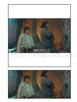
產品上的圖片來自多個供應商,尺寸各異。直接寫死 width:100%;height:100% 的結果就是長寬比被破壞,非常影響觀感。先寫個 demo 把問題重現出來:
<html>
<head>
<meta http-equiv="Content-Type" content="text/html; charset=UTF-8">
<script src="./js/jquery-1.11.1.min.js"></script>
<style>
.img1{width:200px;height:200px;border: 1px solid #000;overflow: hidden;margin: 10px;}
.img2{width:200px;height:90px;border: 1px solid #000;overflow: hidden;margin: 10px;}
</style>
</head>
<body>
<div class="img1"><img id="img1" src="./img/1.jpg" height="100%" width="100%"></div>
<div class="img2"><img id="img2" src="./img/1.jpg" height="100%" width="100%"></div>
</body>
</html>

解決思路
既然寫死會變形,那就換個方向:等圖片載入完成後,取得圖片真實尺寸與容器尺寸,再動態設定 img 的寬高。
取得圖片的真實尺寸
HTML5 已提供 img.naturalWidth 與 img.naturalHeight;針對舊版 IE,則可以用另建一個 Image 物件的方式取得:
var image = new Image();
image.src = img.src;
image.onload = function() {
  var w = image.width;
  var h = image.height;
}
整合成一個方法:
setImgSize : function(img, callback) {
  if (img.naturalWidth) {
    // HTML5
    callback(img, img.naturalWidth, img.naturalHeight, img.width, img.height);
  } else {
    // IE 6 / 7 / 8
    var image = new Image();
    image.src = img.src;
    image.onload = function() {
      callback(img, image.width, image.height, img.width, img.height);
    }
  }
}
重新計算尺寸
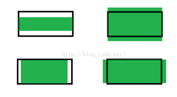
目標很明確:圖片比例與容器不一致時,錨定其中一個維度填滿,另一維度超出部分居中裁切;容器比圖片大時則居中顯示。以黑色實線表示顯示區域、綠色表示圖片實際大小:
策略一:以寬度為基準
// 參數依序為 原始寬、原始高、容器寬、容器高
resetImgSizeW : function(img, nw, nh, w, h) {
  var nwh = nw / nh, wh = w / h;
  if (nwh > wh) {
    img.width = w;
    var height = parseInt(1 / nwh * w);
    img.height = height;
    img.style.marginTop = parseInt((h - height) / 2) + "px";
  } else if (nwh < wh) {
    img.width = w;
    var height = parseInt(1 / nwh * w);
    img.height = height;
    img.style.marginTop = parseInt((height - h) / 2) * -1 + "px";
  } else {
    img.height = h;
    img.width = w;
  }
}
先比較圖片長寬比與容器長寬比:高度有餘就把圖片往下推,高度不足就往上推,讓中間部分露出來。
策略二:以高度為基準
resetImgSizeH : function(img, nw, nh, w, h) {
  var nwh = nw / nh, wh = w / h;
  if (nwh > wh) {
    img.height = h;
    var width = parseInt(nwh * h);
    img.width = width;
    img.style.marginLeft = parseInt((width - w) / 2) * -1 + "px";
  } else if (nwh < wh) {
    img.height = h;
    var width = parseInt(nwh * h);
    img.width = width;
    img.style.marginLeft = parseInt((w - width) / 2) + "px";
  } else {
    img.height = h;
    img.width = w;
  }
}

策略三:鋪滿整個顯示區
resetImgSizeWH : function(img, nw, nh, w, h) {
  var nwh = nw / nh, wh = w / h;
  if (nwh > wh) {
    img.height = h;
    var width = parseInt(nwh * h);
    img.width = width;
    img.style.marginLeft = parseInt((width - w) / 2) * -1 + "px";
  } else if (nwh < wh) {
    img.width = w;
    var height = parseInt(1 / nwh * w);
    img.height = height;
    img.style.marginTop = parseInt((height - h) / 2) * -1 + "px";
  } else {
    img.height = h;
    img.width = w;
  }
}

如何呼叫
<!-- 引用腳本 -->
<script src="./js/imageLoad.js"></script>
<script>
var imageLoad = new ImageLoad();
// 批次處理全站圖片,以下三種擇一使用
// imageLoad.initImg("w");   // 寬度一致
// imageLoad.initImg("h");   // 高度一致
// imageLoad.initImg("wh");  // 鋪滿顯示區

// 處理單張圖片
imageLoad.setImgSize(document.getElementById("img1"), imageLoad.resetImgSizeW);
imageLoad.setImgSize(document.getElementById("img2"), imageLoad.resetImgSizeW);
imageLoad.setImgSize(document.getElementById("img3"), imageLoad.resetImgSizeH);
imageLoad.setImgSize(document.getElementById("img4"), imageLoad.resetImgSizeH);
imageLoad.setImgSize(document.getElementById("img5"), imageLoad.resetImgSizeWH);
imageLoad.setImgSize(document.getElementById("img6"), imageLoad.resetImgSizeWH);
</script>
ImageLoad 完整原始碼
$(document).ready(function() { new ImageLoad(); });
ImageLoad = function(){ this.init(); };
ImageLoad.prototype = {
  init : function () {
    // this.initImg("w");
  },
  initImg : function(type) {
    var _this = this;
    var imgs = document.getElementsByTagName('img');
    for (var i = 0; i < imgs.length; i++) {
      try {
        var img = imgs[i];
        if ("w" == type) { $(img).onload = _this.setImgSize(img, _this.resetImgSizeW); }
        else if ("h" == type) { $(img).onload = _this.setImgSize(img, _this.resetImgSizeH); }
        else if ("wh" == type) { $(img).onload = _this.setImgSize(img, _this.resetImgSizeWH); }
      } catch(e) { }
    }
  },
  resetImgSizeH : function(img, nw, nh, w, h) {
    var nwh = nw / nh, wh = w / h;
    if (nwh > wh) {
      img.height = h;
      var width = parseInt(nwh * h);
      img.width = width;
      img.style.marginLeft = parseInt((width - w) / 2) * -1 + "px";
    } else if (nwh < wh) {
      img.height = h;
      var width = parseInt(nwh * h);
      img.width = width;
      img.style.marginLeft = parseInt((w - width) / 2) + "px";
    } else { img.height = h; img.width = w; }
  },
  resetImgSizeW : function(img, nw, nh, w, h) {
    var nwh = nw / nh, wh = w / h;
    if (nwh > wh) {
      img.width = w;
      var height = parseInt(1 / nwh * w);
      img.height = height;
      img.style.marginTop = parseInt((h - height) / 2) + "px";
    } else if (nwh < wh) {
      img.width = w;
      var height = parseInt(1 / nwh * w);
      img.height = height;
      img.style.marginTop = parseInt((height - h) / 2) * -1 + "px";
    } else { img.height = h; img.width = w; }
  },
  resetImgSizeWH : function(img, nw, nh, w, h) {
    var nwh = nw / nh, wh = w / h;
    if (nwh > wh) {
      img.height = h;
      var width = parseInt(nwh * h);
      img.width = width;
      img.style.marginLeft = parseInt((width - w) / 2) * -1 + "px";
    } else if (nwh < wh) {
      img.width = w;
      var height = parseInt(1 / nwh * w);
      img.height = height;
      img.style.marginTop = parseInt((height - h) / 2) * -1 + "px";
    } else { img.height = h; img.width = w; }
  },
  setImgSize : function(img, callback) {
    if (img.naturalWidth) {
      callback(img, img.naturalWidth, img.naturalHeight, img.width, img.height);
    } else {
      var image = new Image();
      image.src = img.src;
      image.onload = function() {
        callback(img, image.width, image.height, img.width, img.height);
      }
    }
  },
}
現代替代方案
今天若不需要相容舊版 IE,純 CSS 就能解決大部分變形問題:object-fit: cover 等同於本文的「鋪滿顯示區」,contain 則是完整顯示不裁切,再搭配 object-position 控制裁切重心即可。仍要留意的是,CSS 方案無法取得圖片的實際像素資訊;若業務上需要讀取真實尺寸(例如做畫質判斷),則仍需回到 naturalWidth 這條路。
- 上一篇文章: JS 數值大小比較為什麼會出錯?字串與數字的陷阱
- 下一篇文章: JS 將輸入框游標移到文字最後位置的寫法