善用陣列方法實現圖片輪播切換
編輯:關於JavaScript
圖片輪播的切換本質上是「位置狀態的輪轉」。與其為每張圖單獨寫切換邏輯,不如把位置資訊存進陣列,用 push / shift / unshift / pop 完成輪轉,再重新賦值給元素。這個思路能大幅減少代碼量。
一、陣列元素位置輪轉
把第一個元素搬到最後並刪除原位置,就是最基礎的輪轉:
<div id="box">1,2,3,4</div>
<input type="button" value="切換" id="input">

<script>
window.onload = function () {
  var oDiv   = document.getElementById('box');
  var oInput = document.getElementById('input');

  oInput.onclick = function () {
    var arr = oDiv.innerHTML.split(',');
    arr.push(arr[0]);   // 第一個放到最後
    arr.shift();        // 刪掉原來的第一個
    oDiv.innerHTML = arr;
  };
};
</script>
二、模擬圖片切換
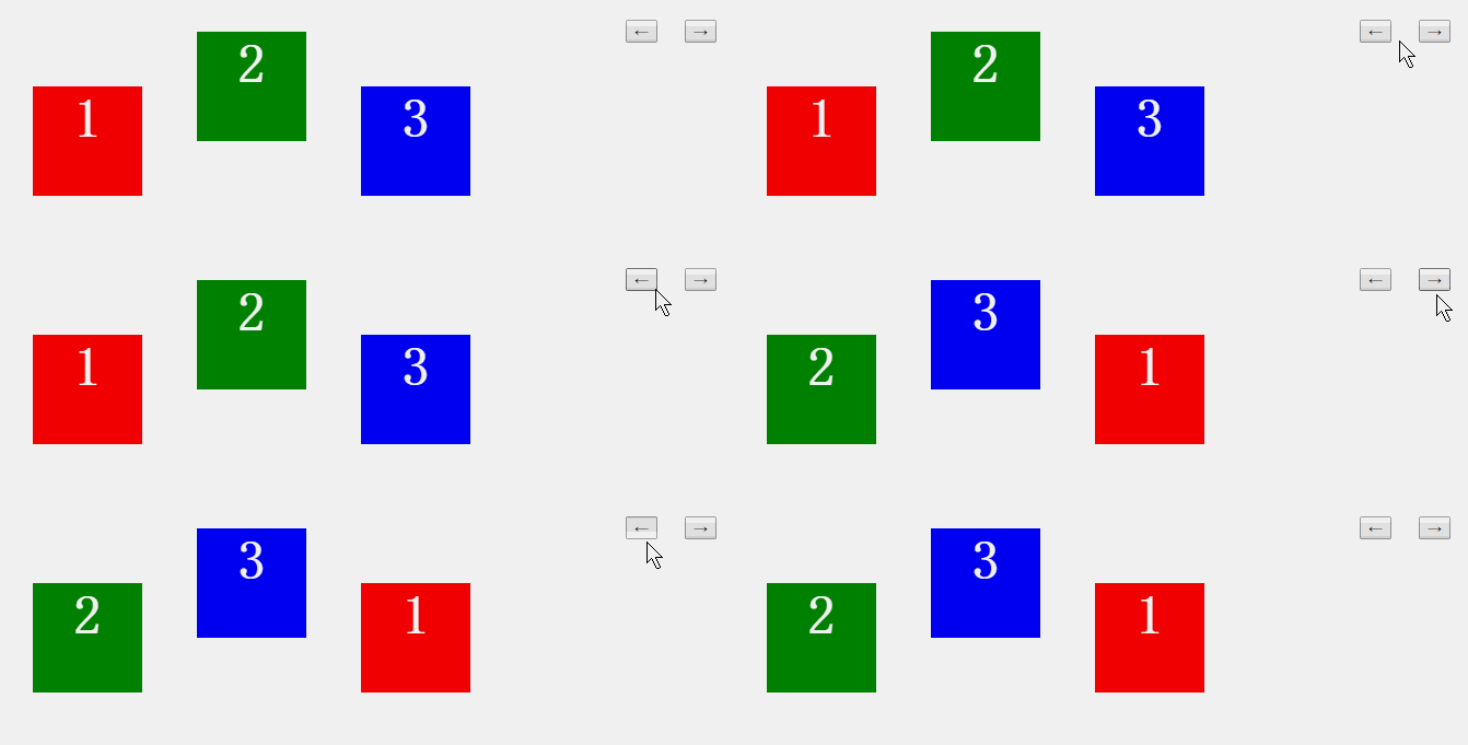
把每個元素的定位屬性收集成二維陣列,輪轉陣列後再寫回樣式即可:
window.onload = function () {
  var aDiv   = document.getElementsByTagName('div');
  var aInput = document.getElementsByTagName('input');
  var arr = [];   // 存放各元素的屬性組合

  for (var i = 0; i < aDiv.length; i++) {
    arr.push([getStyle(aDiv[i], 'left'), getStyle(aDiv[i], 'top')]);
  }

  // 左切換:第一個移到最後
  aInput[0].onclick = function () {
    arr.push(arr[0]);
    arr.shift();
    for (var i = 0; i < aDiv.length; i++) {
      aDiv[i].style.left = arr[i][0];
      aDiv[i].style.top  = arr[i][1];
    }
  };

  // 右切換:最後一個移到最前
  aInput[1].onclick = function () {
    arr.unshift(arr[arr.length - 1]);
    arr.pop();
    for (var i = 0; i < aDiv.length; i++) {
      aDiv[i].style.left = arr[i][0];
      aDiv[i].style.top  = arr[i][1];
    }
  };

  // 取得最終樣式,兼容 IE
  function getStyle(obj, attr) {
    return obj.currentStyle ? obj.currentStyle[attr] : getComputedStyle(obj, false)[attr];
  }
};
三、完整輪播實例
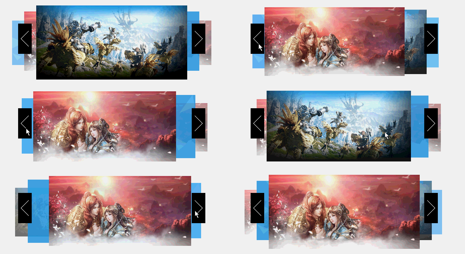
思路:五張圖片的 left 分別為 20px、60px、100px、240px、380px。點擊左切換後變為 60px、100px、240px、380px、20px——相當於把這組數值的頭部元素搬到尾端再刪除重複項,以此類推。
結構:
<div id="box">
  <ul>
    <li class="pos_0"><img src="images/1.png" width="300"></li>
    <li class="pos_1"><img src="images/1.jpg" width="400"></li>
    <li class="pos_2"><img src="images/2.jpg" width="500"></li>
    <li class="pos_3"><img src="images/3.jpg" width="400"></li>
    <li class="pos_4"><img src="images/1.jpg" width="300"></li>
  </ul>
  <span class="dir dirl"></span>
  <span class="dir dirr"></span>
</div>
樣式:用 absolute 定位搭配 z-index 與 opacity 營造層次感。
#box { width: 700px; height: 300px; position: relative; margin: 20px auto; text-align: center; }
#box ul { list-style: none; }
#box ul li { position: absolute; }
#box ul li.pos_0 { top: 50px; left: 20px;  z-index: 1; opacity: 0.5; }
#box ul li.pos_1 { top: 20px; left: 60px;  z-index: 2; opacity: 0.8; }
#box ul li.pos_2 { top: 0px;  left: 100px; z-index: 3; opacity: 1;   }
#box ul li.pos_3 { top: 20px; left: 240px; z-index: 2; opacity: 0.8; }
#box ul li.pos_4 { top: 50px; left: 380px; z-index: 1; opacity: 0.5; }
.dir {
  display: inline-block; width: 45px; height: 100px;
  background: url('images/button.png') no-repeat;
  position: absolute; top: 60px; z-index: 4;
}
.dirl { background-position: 0px 0;    left: 40px; }
.dirr { background-position: -55px 0;  right: 40px; }
腳本:把 top、opacity、z-index、圖片寬度四個屬性一起存進陣列,切換時整組輪轉。
window.onload = function () {
  var oPre  = document.getElementsByClassName('dir')[0];
  var oNext = document.getElementsByClassName('dir')[1];
  var aLi   = document.getElementsByTagName('li');
  var arr   = [];

  for (var i = 0; i < aLi.length; i++) {
    var oImg = aLi[i].getElementsByTagName('img')[0];
    arr.push([
      parseInt(getStyle(aLi[i], 'top')),
      parseInt(getStyle(aLi[i], 'opacity') * 100),
      parseInt(getStyle(aLi[i], 'z-index')),
      oImg.width
    ]);
  }

  oPre.onclick = function () {          // 左切換
    arr.push(arr[0]);
    arr.shift();
    render();
  };

  oNext.onclick = function () {         // 右切換
    arr.unshift(arr[arr.length - 1]);
    arr.pop();
    render();
  };

  function render() {
    for (var i = 0; i < aLi.length; i++) {
      var oImg = aLi[i].getElementsByTagName('img')[0];
      startMove(aLi[i], { left: arr[i][0], top: arr[i][1], opacity: arr[i][2] });
      aLi[i].style.zIndex = arr[i][3];
      startMove(oImg, { width: arr[i][4] });
    }
  }

  function getStyle(obj, attr) {
    return obj.currentStyle ? obj.currentStyle[attr] : getComputedStyle(obj, false)[attr];
  }
};
這個方案的價值
切換的核心從來不是「操作元素」,而是「操作狀態」。把狀態收攏到一個陣列裡,新增一張圖片或調整位置時,只需維護 CSS 類與陣列初始值,切換邏輯一行都不用改。其中 startMove 為通用的樣式動畫函式,可搭配任意 tween 實作使用。
- 上一篇文章: 用 JavaScript 實現數字遞增動畫(千分位格式化 + requestAnimationFrame)
- 下一篇文章: 專案實戰:圖片上傳方案選型——iframe 表單 vs Base64 前端壓縮