淺析 JS 非同步載入進度條的實作
編輯:關於JavaScript
長時間的非同步請求需要一個「正在處理中」的回饋,否則使用者會以為畫面當機。本文示範一個純 CSS 動畫的載入指示器,並用一層遮罩鎖住介面。
效果說明
點擊 Load 鈕後模擬非同步載入:瀏覽器被灰色遮罩蓋住,中央出現三顆跳動的圓點,五秒後自動消失。
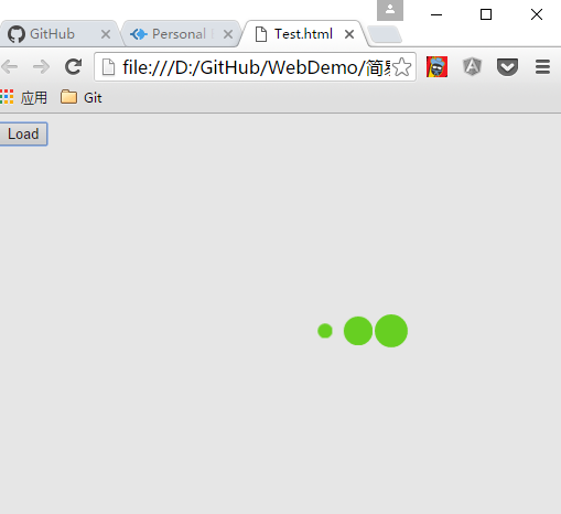
實作思路
使用者點擊按鈕 → 觸發非同步請求 → 呼叫顯示方法。
進度指示器由兩層動態建立的 div 組成:一層是覆蓋整個視窗的半透明遮罩(z-index 999),讓使用者無法在載入中誤改表單;另一層是實際的動畫容器。
Main.html
<!DOCTYPE html>
<html>
<head>
<meta charset="utf-8">
<title></title>
<script src="Loading.js" charset="utf-8"></script>
<link rel="stylesheet" href="Loading.css" media="screen" title="no title" charset="utf-8">
</head>
<body>
<button onclick="showLoading()">Load</button>
</body>
</html>
Loading.js
function showLoading() {
    var overDiv    = document.createElement("div");
    var loadingDiv = document.createElement("div");
    var childDiv1  = document.createElement("div");
    var childDiv2  = document.createElement("div");
    var childDiv3  = document.createElement("div");

    overDiv.classList.add('over');
    loadingDiv.classList.add('spinner');
    childDiv1.classList.add('bounce1');
    childDiv2.classList.add('bounce2');
    childDiv3.classList.add('bounce3');

    loadingDiv.appendChild(childDiv1);
    loadingDiv.appendChild(childDiv2);
    loadingDiv.appendChild(childDiv3);

    document.body.appendChild(overDiv);
    document.body.appendChild(loadingDiv);

    setTimeout(function () {
        document.body.removeChild(overDiv);
        document.body.removeChild(loadingDiv);
    }, 5000);
}
Loading.css
.spinner {
    width: 150px;
    text-align: center;
    left: 50%;
    top: 50%;
    position: absolute;
    z-index: 1000;
}
.over {
    width: 100%;
    height: 100%;
    z-index: 998;
    background-color: gray;
    position: absolute;
    top: 0px;
    left: 0px;
    opacity: 0.2;
}
.spinner > div {
    width: 30px;
    height: 30px;
    background-color: #67CF22;
    border-radius: 100%;
    display: inline-block;
    -webkit-animation: bouncedelay 1.4s infinite ease-in-out;
    animation: bouncedelay 1.4s infinite ease-in-out;
    /* 避免動畫起始時第一幀閃爍 */
    -webkit-animation-fill-mode: both;
    animation-fill-mode: both;
}
.spinner .bounce1 { -webkit-animation-delay: -0.32s; animation-delay: -0.32s; }
.spinner .bounce2 { -webkit-animation-delay: -0.16s; animation-delay: -0.16s; }

@-webkit-keyframes bouncedelay {
    0%, 80%, 100% { -webkit-transform: scale(0.0); }
    40%           { -webkit-transform: scale(1.0); }
}
@keyframes bouncedelay {
    0%, 80%, 100% { transform: scale(0.0); -webkit-transform: scale(0.0); }
    40%           { transform: scale(1.0); -webkit-transform: scale(1.0); }
}
動畫原理
三顆圓點共用同一組 keyframes,透過 animation-delay 的負值錯開相位:bounce1 提前 0.32 秒、bounce2 提前 0.16 秒、bounce3 從頭開始。負延遲的技巧讓動畫在頁面載入的第一刻就處於「進行中」的狀態,而不是靜止在起始格,這也順帶解決了首幀閃爍。
animation-fill-mode: both 則確保動畫在開始前與結束後都套用第一/最後一幀的樣式。
兩個可以更好的地方
一、把邏輯收進 Ajax 封裝。目前 show/hide 得自己在每個請求裡呼叫。可以改寫成一個包住 $.ajax 的函式,在 beforeSend 顯示、在 complete 隱藏,呼叫方就完全不必理會。
二、用框架的攔截器。若使用 Angular,可用 HTTP Interceptor 監聽所有請求,在進行中顯示指示器,無需在每處手動呼叫。React 可用 axios 的 interceptor,Vue 也有對應機制。jQuery 則可用全域的 $(document).ajaxStart/ajaxStop。
另外記得替遮罩加上 aria-busy="true" 與適當的 role="status",讓輔助技術也能感知載入狀態。
- 上一篇文章: ECMAScript 5 新特性:get/set 訪問器深入剖析
- 下一篇文章: 一分鐘搞懂 JavaScript 閉包