JavaScript 實戰:手寫菜單特效合集
編輯:關於JavaScript
這個系列會持續收錄我用原生 JS 寫的各種菜單特效。網路上現成的方案一搜一大堆,但我還是喜歡自己動手做一遍。
以下是經過優化後的完整程式碼,相較於前一版優化了 CSS 樣式、簡化事件函式、精簡 HTML 層級,刪掉了至少二十行冗餘程式。
特效一:伸縮動畫多層菜單
 <!DOCTYPE html>
<html lang="en">
<head>
<meta charset="UTF-8">
<title></title>
<script>
window.onload = function() {
  // ======== 伸縮動畫菜單 ========
  var ul = document.getElementById('ul');

  if (ul.addEventListener) {
    ul.addEventListener('mouseover', listener1, true);
    ul.addEventListener('mouseout',  listener2, true);
    ul.addEventListener('click',     listener3, false);
  } else if (ul.attachEvent) {
    // 相容 IE8 及更早版本
    ul.attachEvent('onmouseover', listener1, false);
    ul.attachEvent('onmouseout',  listener2, false);
    ul.attachEvent('onclick',     listener3, false);
  }

  function listener1(event){
    var target = event.target || event.srcElement;   // 相容 IE8
    if (target.tagName.toLowerCase() === 'li') {
      var div1 = target.getElementsByTagName('div')[0];
      div1.style.display = 'block';
      div1.style.opacity = 1;
    }
  }

  function listener2(event){
    var target = event.target || event.srcElement;
    if (target.tagName.toLowerCase() === 'li') {
      var div1 = target.getElementsByTagName('div')[0];
      div1.style.display = 'none';
      div1.style.opacity = 0;
      div1.onmouseover = function(){
        div1.style.display = 'block';
        div1.style.opacity = 1;
      };
      div1.onmouseout = function(){
        div1.style.display = 'none';
        div1.style.opacity = 0;
      };
    }
  }

  var bool = true;

  function listener3(event) {
    var event = event || window.event;
    var target = event.target || event.srcElement;

    if (target.className === 'show-hide') {
      var adiv = target.nextElementSibling;

      if (window.getComputedStyle(adiv, null).opacity > 0.5) {
        bool = false;
      } else {
        bool = true;
      }

      var height = 90, changeH, opacity, id;

      if (bool) {
        changeH = 0;
        opacity = 0;
        var text = target.innerHTML.slice(0, -1);
        target.innerHTML = text + ' -';

        (function show() {
          if (changeH > height) { clearTimeout(id); return }
          changeH += 5;
          opacity += 0.06;
          adiv.style.height = changeH + 'px';
          adiv.style.opacity = opacity;
          adiv.style.display = 'block';
          id = setTimeout(function () { clearTimeout(id); show(); }, 16.7);
        })();

        bool = false;
      } else {
        changeH = height;
        opacity = 1;
        var text = target.innerHTML.slice(0, -1);
        target.innerHTML = text + ' +';

        (function hidden() {
          if (changeH < 0) {
            clearTimeout(id);
            adiv.style.display = 'none';
            return;
          }
          changeH -= 10;
          opacity -= 0.11;
          adiv.style.height = changeH + 'px';
          adiv.style.opacity = opacity;
          id = setTimeout(function () { clearTimeout(id); hidden(); }, 16.7);
        })();

        bool = true;
      }
    }
  }
};
</script>

<style>
*{ margin: 0; padding: 0; }
a, img { border: 0; }

ul {
  position: absolute;
  top: 20px;
  left: 30px;
  z-index: 100;
}

#ul li {
  display: inline-block;
  position: relative;
  height: 30px;
  text-align: center;
  line-height: 30px;
  padding: 3px;
  border: 1px solid gray;
  border-radius: 10px 10px 0 0;
  background-color: aliceblue;
  cursor: pointer;
  -webkit-transition: all ease-in-out 0.3s;
  -moz-transition:    all ease-in-out 0.3s;
  -ms-transition:     all ease-in-out 0.3s;
  -o-transition:      all ease-in-out 0.3s;
  transition:         all ease-in-out 0.3s;
}

#ul li:hover { background-color: aquamarine; }

.nav-div {
  position: absolute;
  width: 100%;
  left: -1px;
  top: 37px;
  display: none;
  border: 1px solid gray;
  border-top: 0;
  border-radius: 0 0 10px 10px;
  background-color: aliceblue;
}

.show-hide {
  position: relative;
  display: block;
  border-radius: 0 0 10px 10px;
  background-color: lightblue;
  -webkit-transition: all ease-in-out 0.3s;
  -moz-transition:    all ease-in-out 0.3s;
  -ms-transition:     all ease-in-out 0.3s;
  -o-transition:      all ease-in-out 0.3s;
  transition:         all ease-in-out 0.3s;
  border-bottom: 1px solid gray;
}

.show-hide:hover { background-color: lavender; }

.a-div {
  background-color: aliceblue;
  display: none;
  border-radius: 0 0 10px 10px;
  opacity: 0;
}

.a {
  z-index: -1;
  display: block;
  text-decoration: none;
  border-radius: 10px;
  -webkit-transition: all ease-in-out 0.3s;
  -moz-transition:    all ease-in-out 0.3s;
  -ms-transition:     all ease-in-out 0.3s;
  -o-transition:      all ease-in-out 0.3s;
  transition:         all ease-in-out 0.3s;
}

.a:hover { background-color: lavender; }
</style>
</head>
<body>
<ul id="ul">
  <li>JavaScript 實戰
    <div class="nav-div">
      <span class="show-hide">導航特效 +</span>
      <div class="a-div">
        <a class="a" href="">可收放子菜單</a>
        <a class="a" href="">切換頁面</a>
        <a class="a" href="">持續添加中...</a>
      </div>
      <span class="show-hide">其它特效 +</span>
      <div class="a-div">
        <a class="a" href="">持續添加中...</a>
        <a class="a" href="">持續添加中...</a>
        <a class="a" href="">持續添加中...</a>
      </div>
    </div>
  </li>
  <li>JavaScript 性能優化
    <div class="nav-div">
      <span class="show-hide">財經 +</span>
      <div class="a-div">
        <a class="a" href="">今日頭條</a>
        <a class="a" href="">所有新聞</a>
        <a class="a" href="">往日回看</a>
      </div>
      <span class="show-hide">科技 +</span>
      <div class="a-div">
        <a class="a" href="">今日頭條</a>
        <a class="a" href="">所有新聞</a>
        <a class="a" href="">往日回看</a>
      </div>
    </div>
  </li>
  <li>今日新聞
    <div class="nav-div">
      <span class="show-hide">財經 +</span>
      <div class="a-div">
        <a class="a" href="">今日頭條</a>
        <a class="a" href="">所有新聞</a>
        <a class="a" href="">往日回看</a>
      </div>
      <span class="show-hide">科技 +</span>
      <div class="a-div">
        <a class="a" href="">今日頭條</a>
        <a class="a" href="">所有新聞</a>
        <a class="a" href="">往日回看</a>
      </div>
    </div>
  </li>
</ul>
</body>
</html>
效果圖:
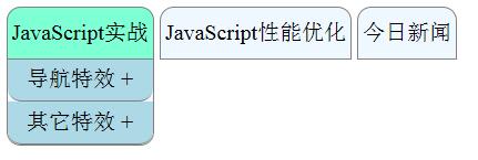
這版有兩個關鍵設計值得說明。一是事件委派:mouseover/mouseout/click 全部掛在最外層的 ul 上,靠事件冒泡統一手動處理,不必替每個 li 與每個 a 個別綁定,程式碼量大幅縮減。二是 window.getComputedStyle(adiv, null).opacity 這一行——直接用 adiv.style.opacity 在首次點擊時會取到空字串(因為初始值來自 CSS 類別而非行內樣式),導致 bool 判斷失效、第一次點擊沒反應;改用 getComputedStyle 取得「計算後」的最終樣式就沒這個問題。
特效二:橫向選單切換內容
第二個特效實作上簡單許多,重點在 CSS 排版。
 <!DOCTYPE html>
<html lang="en">
<head>
<meta charset="UTF-8">
<title></title>
<style>
*{ margin: 0; padding: 0; }
a, img { border: 0; }

#menu {
  position: absolute;
  top: 30px;
  left: 0;
  right: 0;
  margin: auto;
  width: 400px;
  border-left: 1px solid gray;
  border-top: 1px solid gray;
  background-color: lemonchiffon;
  text-align: center;
}

#menu li {
  list-style: none;
  float: left;
  width: 99px;
  height: 30px;
  line-height: 30px;
  border-right: 1px solid gray;
  background-color: burlywood;
  color: white;
  -webkit-transition: all ease-in-out 0.5s;
  -moz-transition:    all ease-in-out 0.5s;
  -ms-transition:     all ease-in-out 0.5s;
  -o-transition:      all ease-in-out 0.5s;
  transition:         all ease-in-out 0.5s;
}

#menu li:hover {
  background-color: lemonchiffon;
  color: #336699;
}

.contain {
  position: absolute;
  left: -1px;
  display: none;
  width: 399px;
  height: 300px;
  color: #336699;
  border-left: 1px solid gray;
  border-right: 1px solid gray;
  border-bottom: 1px solid gray;
  background-color: lemonchiffon;
}
</style>

<script>
window.onload = function(){
  var menu = document.getElementById('menu');

  if (menu.addEventListener) {
    menu.addEventListener('mouseover', show, false);
    menu.addEventListener('mouseout',  hide, false);
  } else if (menu.attachEvent) {
    menu.attachEvent('onmouseover', show, false);
    menu.attachEvent('onmouseout',  hide, false);
  }

  function show(event){
    var target = event.target || event.srcElement;
    if (target.tagName.toLowerCase() === 'li') {
      target.firstElementChild.style.display = 'block';
    } else if (target.parentNode.tagName.toLowerCase() === 'li') {
      target.style.display = 'block';
    }
  }

  function hide(event){
    var target = event.target || event.srcElement;
    if (target.tagName.toLowerCase() === 'li') {
      target.firstElementChild.style.display = 'none';
    } else if (target.parentNode.tagName.toLowerCase() === 'li') {
      target.style.display = 'none';
    }
  }
}
</script>
</head>
<body>
<div id="menu">
  <ul>
    <li id="menu1">蘇福的特效1<div class="contain">111111111111</div></li>
    <li id="menu2">蘇福的特效2<div class="contain">222222222222</div></li>
    <li id="menu3">蘇福的特效3<div class="contain">333333333333</div></li>
    <li id="menu4">蘇福的特效4<div class="contain">444444444444</div></li>
  </ul>
</div>
</body>
</html>
效果圖:
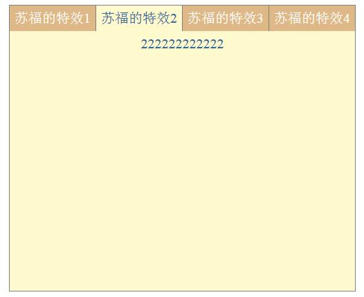
這裡的 show/hide 之所以要分成「target 是 li」與「target 的父節點是 li」兩個分支,是因為滑鼠其實是在 li 與其內部的 .contain 之間移動。若只判斷 target 是 li,當游標從 li 移進 .contain 時會觸發 li 的 mouseout,導致內容層閃一下消失。多這一層判斷,才能讓移動過程平順。
要補充的是,這兩個範例的收放動畫都以 setTimeout 手刻,好處是每一幀的步長與透明度都能自由微調;但若追求效能與開發效率,直接用 CSS transition 搭配 class 切換會更簡潔,也交給瀏覽器的合成器處理,避免主執行緒被反覆的計時器佔用。