JavaScript + CSS 實現仿 Mootools 豎排彈性動畫菜單
編輯:關於JavaScript
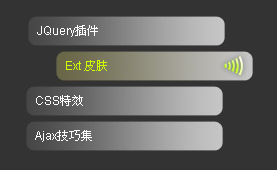
本文示範一個豎排的黑色動畫菜單。它並沒有真的引入 Mootools 庫,但借助手寫的緩動函數,最終效果與使用 Mootools 幾乎一致:動畫平滑、操作順手,給菜單增色不少。
運行效果截圖如下:
在線演示地址:
https://demo.jb51.net/js/2015/js-css-mootools-style-demo/
完整代碼
<!DOCTYPE html PUBLIC "-//W3C//DTD XHTML 1.0 Transitional//EN" "https://www.w3.org/TR/xhtml1/DTD/xhtml1-transitional.dtd">
<html xmlns="https://www.w3.org/1999/xhtml">
<head>
<title>豎排黑色動畫菜單</title>
<style type="text/css">
#menu { height: auto; width: 350px; float: left; }
body {
    overflow: auto; background: #333; color: #FFF;
    font: 12px Arial, Helvetica, sans-serif;
}
#menu li { display: block; list-style-type: none; }
#menu a {
    font-size: 11px; color: #FFF; padding-right: 10px; padding-left: 10px;
    line-height: 30px; text-decoration: none;
    background: #000 url(images/bg.jpg) no-repeat left;
    height: 30px; width: 180px; display: block; outline: 0; margin-bottom: 5px;
}
#menu a:hover { color: #CCFF00; background: #000 url(images/bg1.jpg) no-repeat left; }
</style>
</head>
<body>
<div id="menu">
<ul>
<li><a href="#" title="" class="toggler">JQuery插件</a></li>
<li><a href="#" class="toggler">Ext 皮膚</a></li>
<li><a href="#" class="toggler">CSS特效</a></li>
<li><a href="#">Ajax技巧集</a></li>
</ul>
</div>
<script type="text/javascript">
var $ = function (_sId) {
    return typeof _sId == 'string' ? document.getElementById(_sId) : _sId;
};
var Each = function (a, fn) { for (var i = 0; i < a.length; i++) fn.call(a[i], i, a) };

// 緩動函數集合
var Tweener = {
    easeNone: function (t, b, c, d) {
        return c * t / d + b;
    },
    // 回彈效果:接近終點時會有幾次衰減的「彈跳」
    easeOutBounce: function (t, b, c, d) {
        if ((t /= d) < (1 / 2.75)) {
            return c * (7.5625 * t * t) + b;
        } else if (t < (2 / 2.75)) {
            return c * (7.5625 * (t -= (1.5 / 2.75)) * t + .75) + b;
        } else if (t < (2.5 / 2.75)) {
            return c * (7.5625 * (t -= (2.25 / 2.75)) * t + .9375) + b;
        } else {
            return c * (7.5625 * (t -= (2.625 / 2.75)) * t + .984375) + b;
        }
    }
};

Each($('menu').getElementsByTagName('a'), function () {
    // 鼠標移入:用線性緩動快速右移 30px
    this.onmouseover = function () {
        var b = parseInt(this.style.marginLeft);
        b = isNaN(b) ? 0 : b;
        var t = 0, c = 30 - b, d = 10, ttl = 10;
        var me = this;
        clearInterval(me.only);
        me.only = setInterval(function () {
            me.style.marginLeft = Tweener.easeNone(t, b, c, d) + 'px';
            if (t < d) { t++; } else { clearInterval(me.only); }
        }, ttl)
    }
    // 鼠標移出:用回彈緩動緩慢歸位,產生彈性手感
    this.onmouseout = function () {
        var b = parseInt(this.style.marginLeft);
        b = isNaN(b) ? 0 : b;
        var t = 0, c = 0 - b, d = 50, ttl = 10;
        var me = this;
        clearInterval(me.only);
        me.only = setInterval(function () {
            me.style.marginLeft = Tweener.easeOutBounce(t, b, c, d) + 'px';
            if (t < d) { t++; } else { clearInterval(me.only); }
        }, ttl)
    }
});
</script>
</body>
</html>
彈性從哪裡來
關鍵在於兩個方向用了不同的緩動函數:移入時用 easeNone(線性),10 個時間單位內迅速推開,動作乾脆;移出時換成 easeOutBounce,用 50 個時間單位慢慢回位,並在接近終點時製造幾次幅度遞減的「彈跳」。
easeOutBounce 的實現是分段函數:把 0 到 1 的區間切成四段,每段的拋物線係數依次調整(0.75 → 0.9375 → 0.984375),於是曲線在落地時出現越來越小的反彈。這正是 Mootools、jQuery Easing 等庫中 bounce 效果的經典算法。
另一個值得注意的細節是 clearInterval(me.only):把定時器掛在元素自身屬性上,每次觸發先清掉上一個,避免快速滑過時多個動畫互相打架。這是手寫定時器動畫必做的防護。
今天用 CSS transition 配合 cubic-bezier 也能做出類似手感,但分段回彈這種效果,仍然需要 JS 或 spring 類動畫庫來實現。
希望本文所述對大家的 JavaScript 程序設計有所幫助。
熱門推薦
深入剖析 JavaScript 原始型別 null 與 undefined
for...in 迴圈為什麼「太犀利」:一個車庫的例子
用 mouseover/mouseout 做最簡易的滑鼠移入高亮
JavaScript 取得元素的三種核心方法完全解析
兼容各大主流瀏覽器的 JS 操作 iframe 示例
別再寫 onclick 內聯:Dom Level 0 事件的效能代價
基於NodeJS的前後端分離實踐(三):輕量級接口建模框架ModelProxy
Node.js 的 console.dir 詳解:以物件檢視格式印出內容
解決 IE 瀏覽器不支持 getElementsByClassName 的方案