SVG 除了能畫向量圖形,還能透過 CSS 動畫做出令人驚豔的效果。本文記錄了用 SVG 製作富有動態的 tooltip(聊天對話框)的完整過程,並歸納了幾個平日容易糾結的細節該如何處理。
首先是關於 display:inline-block 的經典問題。當 article 標籤寬 600px、內部兩個 section 各 300px 並設為 inline-block 時,理論上應該水平並排,實際卻因為標籤之間的空白被渲染成空格而換行:

解法很簡單,只要給父元素 article 設 font-size:0 清除空白即可:
article{ width:600px; margin:200px; font-size:0; } article section{ display:inline-block; width:300px; font-size:14px; position:relative; } 接著是 SVG 圖像的引入問題。SVG 的原始碼大致如下:
<?xml version="1.0" encoding="utf-8"?> <!-- Generator: Adobe Illustrator 17.0.0, SVG Export Plug-In . SVG Version: 6.00 Build 0) --> <!DOCTYPE svg PUBLIC "-//W3C//DTD SVG 1.1//EN" "https://www.w3.org/Graphics/SVG/1.1/DTD/svg11.dtd"> <svg version="1.1" id="Layer_1" xmlns="https://www.w3.org/2000/svg" xmlns:xlink="https://www.w3.org/1999/xlink" x="0px" y="0px" width="600px" height="300px" viewBox="0 0 600 300" enable-background="new 0 0 600 300" xml:space="preserve"> <polygon points="89.571,6.648 513.333,6.648 590.25,75.342 553.002,215.306 313.065,273.358 300,293.352 288.876,272.71 48.936,215.306 9.75,75.342 "/> </svg>
如果圖檔很多,逐一修改会很麻煩。因此改用 ajax 動態載入,在 DOM 中只寫 <svg data-src="bubble1.svg" width="280" height="140"></svg>,再用 JS 讀取並插入:
$('svg[data-src]').each(function(index, svg) { var src = $(svg).data('src'); //data用於獲取data-*屬性的路徑 $.ajax({ url: src, dataType: 'xml', success: function(content) { var doc = content.documentElement; $(doc).attr({ width: $(svg).attr('width'), height: $(svg).attr('height') }); $(svg).after(doc).remove(); } }) }); 至於描邊動畫效果,SVG 提供了兩個絕佳屬性:stroke-dasharray(虛線描邊,可調至適應大小以完成整個描邊)與 stroke-dashoffset(虛線間隔,調至整個 SVG 沒有描邊),再搭配 transition 就能實現描邊生長的動畫。最終完整程式碼如下(沒有附在線演示,動畫需實際運行才看得到;下載兩個 svg 圖檔與頭像後即可使用):

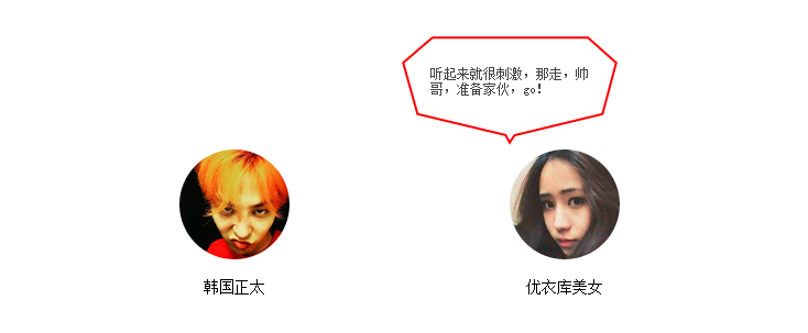
<!DOCTYPE html> <html lang="zh-cn"> <head> <title>toolTip聊天對話框制作</title> <meta charset="utf-8"/> <meta name="keywords" content="" /> <meta name="description" content="" /> <script type="text/javascript" src="jquery.js"></script> <style type="text/css"> h1{ color:red; font-size:18px; } article{ width:600px; margin:200px; font-size:0; } article section{ /*問題一:對於display:inline-block;會出現兩個section無法並排排列,由於使用此屬性會將article與section之間的空白處渲染成空格,於是無法並排*/ /*技巧一: 父元素設置 font-size:0;清除空白*/ display:inline-block; width:300px; font-size:14px; position:relative; } .text-center{ text-align:center; } #sound1,#sound2{ cursor:pointer; } #sound1 img,#sound2 img{ width:100px; height:100px; border-radius:100%; } .sound_1,.sound_2{ position:absolute; top:-104px; width:200px; height:100px; box-sizing: border-box; opacity:1; } .sound_2{ padding:28px; } .sound_1{ padding: 25px 68px 25px 30px; left: -150px; top: -134px; width: 280px; height: 140px; } .sound_1 svg ,.sound_2 svg{ position:absolute; top:0; left:0; } .sound_1 p,.sound_2 p{ position:relative; margin:0; color:#444; font-size:12px; } .sound_1 svg path, .sound_2 svg polygon{ fill:#fff;/*填充的顏色*/ stroke:red;/*描邊的顏色*/ stroke-width: 6px;/*邊的寬度*/ } .sound_1 svg #path1 { transform: scale(0, 0); transform-origin: center; opacity: 0; transition-duration: .3s; transition-delay: 0; } .sound_1 svg #path2 { transform: scale(0, 0); transform-origin: center; opacity: 0; transition-duration: .3s; transition-delay: .1s; } .sound_1 svg #path3 { transform: scale(0, 0); transform-origin: center; opacity: 0; transition-duration: .3s; transition-delay: .2s; } .sound_1 svg #path4 { transform: scale(0, 0); transform-origin: center; opacity: 0; transition-duration: .3s; transition-delay: .25s; } .sound_1 p { transition: .2s .35s; opacity: 0; transform: translate(0, -10px); } #sound1:hover .sound_1 svg #path1,#sound1:hover .sound_1 svg #path2,#sound1:hover .sound_1 svg #path3,#sound1:hover .sound_1 svg #path4{ transform: scale(1, 1); opacity: 1; transition-delay: 0; } #sound1:hover .sound_1 p{ opacity: 1; transform: translate(0, 0); } /*問題三:對於圖片的描邊動畫效果,這裡又怎麼個好的方法,只針對svg圖像*/ /*技巧三:使用stroke-dasharray(虛線描邊,可以不斷嘗試,使其調至適應大小,實現描邊的效果)stroke-dashoffset(虛線間隔,調至整個svg沒有描邊的效果),然後使用transition實現這個動畫 */ .sound_2 svg polygon{ stroke-dasharray: 1500; stroke-dashoffset: 1500; fill-opacity: 0; transition: .6s; } .sound_2 p { transition: .4s; transform: scale(-0.5); opacity: 0; transform: translate(0, -10px); } #sound2:hover .sound_2 svg polygon{ stroke-dashoffset: 0; fill-opacity: 1; } #sound2:hover .sound_2 p { transform: scale(0); opacity: 1; transform: translate(0, 0); } </style> </head> <body> <h1>toolTip聊天對話框制作</h1> <article> <section id="sound1"> <div class="text-center"><img src="nan.jpg" /></div> <p class="text-center">韓國正太</p> <div class="sound_1"> <svg data-src="bubble1.svg" width="280" height="140"></svg> <p>聽說優衣庫的試衣間已全面升級,空間大小擴充一倍,精裝修,同時四面都安有鏡子,方便無死角錄像呢,要去試一下不,美女!</p> </div> </section> <section id="sound2"> <div class="text-center"><img src="nv.jpg" /> </div> <p class="text-center">優衣庫美女</p> <div class="sound_2"> <svg data-src="bubble2.svg" width="200" height="100"></svg> <p>聽起來就很刺激,那走,帥哥,准備家伙,go!</p> </div> </section> </article> <script type="text/javascript"> $(document).ready(function() { // 問題二:對於svg圖像我們要如何引入,不可能將整個svg都引入吧,不便於修改編輯 // 技巧二:使用js進行加載 $('svg[data-src]').each(function(index, svg) { var src = $(svg).data('src'); //data用於獲取data-*屬性的路徑 $.ajax({ url: src, dataType: 'xml', success: function(content) { var doc = content.documentElement; $(doc).attr({ width: $(svg).attr('width'), height: $(svg).attr('height') }); $(svg).after(doc).remove(); } }) }); }) </script> </body> </html> 整份作品把三個問題串成一氣:用 font-size:0 解決 inline-block 的空白難題、用 ajax 動態載入 SVG 以便維護、再用 stroke-dasharray 與 stroke-dashoffset 搭配 transition 做出描邊生長的動態效果。滑過頭像時,對話框會以描邊或縮放的方式華麗登場,充分展現了 SVG 結合 CSS 動畫的表現力,是很值得深入學習 SVG 的絕佳起點。
- 上一篇文章: JavaScript 生成不重複隨機數的多種思路總結
- 下一篇文章: JavaScript 調用瀏覽器列印功能的實作解析