淘寶類型的首頁橫幅有個鮮明特徵:下方一排數字標籤,當前項目會高亮,點數字可直接跳,滑鼠移入則暫停自動播放。以下示範如何用原生 JavaScript 做出這個效果。
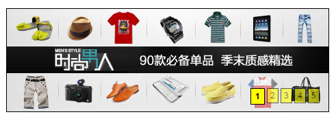
效果預覽
JavaScript
function getClass(oParent,name){ var arr=[]; var oBj=oParent.getElementsByTagName("*"); for(var i=0;i<oBj.length;i++){ if(oBj[i].className==name){ arr.push(oBj[i]); } } return arr; } function startmove(obj,json,fnEnd){ var cur=0; clearInterval(obj.timer); obj.timer=setInterval(function(){ var oStop=true; for(var attr in json){ if(attr=='opacity'){ cur=Math.round(parseFloat(getStyle(obj,attr)*100)); }else{ cur=parseInt(getStyle(obj,attr)); } var speed=(json[attr]-cur)/10; speed=speed>0?Math.ceil(speed):Math.floor(speed); if(cur!=json[attr]){ oStop=false; } if(attr=='opacity'){ obj.style[attr]=(cur+speed)/100; obj.style.filter="alpha(opacity:"+cur+speed+")"; }else{ obj.style[attr]=cur+speed+"px"; } } if(oStop){ clearInterval(obj.timer); if(fnEnd)fnEnd(); } },30); }; function getStyle(obj,name){ if(obj.currentStyle){ return obj.currentStyle[name]; }else{ return getComputedStyle(obj,false)[name]; } };
CSS
*{ margin: 0px; padding: 0px; } img{ border: none; width: 470px; height: 150px; float: left; } .pic_body li{ width: 470px; height: 150px; float: left; z-index: 3001; } ul{ list-style: none; position: absolute; top: 0px; left: 0px; width: 470px; height: 150px; background: yellow; z-index: 3000; } #div1{ border: 1px solid black; width: 470px; height: 150px; position: relative; margin: 100px auto; padding: 0px; overflow: hidden; } #div1 ol{ bottom: 10px; right: 10px; position: absolute; z-index: 9999; } ol li{ background: yellow; float: left; display: inline; margin-right: 3px; padding: 3px 4px; position: relative; top: 0px; left: 0px; font-family: arial; font-size: 12px; cursor: pointer; filter: alpha(opacity:60); opacity: 0.6; border: 1px solid black; } .active{ background: yellow; font-weight: bolder; padding: 4px 6px; filter: alpha(opacity:100); opacity: 1; }
HTML
<!DOCTYPE html> <html> <head lang="en"> <meta charset="UTF-8"> <title></title> <link href="css.css" rel="stylesheet" type="text/css"> <script src="myscript.js"></script> <script> window.onload=function() { var now = 0; var oDiv = document.getElementById('div1'); var oOl = oDiv.getElementsByTagName('ol')[0]; var oLi = oOl.getElementsByTagName('li'); var oUl = getClass(oDiv, 'pic_body')[0]; for(var i=0;i<oLi.length;i++){ oLi[i].index=i; oLi[i].onclick=function(){ now=this.index; tab(); }; } function tab(){ for(var i=0;i<oLi.length;i++){ oLi[i].className=''; } oLi[now].className='active'; startmove(oUl,{top:-150*now}); }; function next(){ now++; if(now==oLi.length){ now=0; } tab(); }; var timer=setInterval(next,3000); oUl.onmouseover=function(){ clearInterval(timer); }; oUl.onmouseout=function(){ timer=setInterval(next,3000); }; } </script> </head> <body> <div id="div1"> <ol> <li class="active">1</li> <li>2</li> <li>3</li> <li>4</li> <li>5</li> </ol> <ul class="pic_body"> <li><img src="image/1.jpg"></li> <li><img src="image/2.jpg"></li> <li><img src="image/3.jpg"></li> <li><img src="image/4.jpg"></li> <li><img src="image/5.jpg"></li> </ul> </div> </body> </html>
原理拆解
這個版本採用的是「整條捲動」而非淡入淡出:所有圖片以 float 縱向堆疊在 ul 內,外層 #div1 以 overflow: hidden 裁切,切換時只要改變 ul 的 top 值(如 -150 × index),目標圖自然就滑進可視區。
startmove() 是個相當通用的多屬性動畫函式。它接受一個 JSON 物件描述終點值,同一輪就把所有屬性一起推進;以 oStop 旗標判斷是否全部到位,全部達成才清除計時器,並呼叫可選的 fnEnd 回呼。透明度在內部一律換算成 0 到 100 的整數計算,最後再除回 100,這樣才能與 Math.ceil/floor 的整數取捨相容。
速度設計為 (目標 − 當前) / 10,距離越遠位移越大,形成自然的先快後慢;配合 Math.ceil/Math.floor 保證每輪至少推進 1,避免無限逼近卻永遠到不了終點。這兩個細節是手寫動畫能否收得住尾的關鍵。
tab() 負責兩件事:更新數字標籤的 active 樣式,以及呼叫 startmove 移動圖片。next() 則把索引前進一格、到底就回到 0,並由 setInterval 每 3 秒觸發;滑鼠移入暫停、移出恢復,是為了不讓自動播放打斷使用者閱讀。
現代寫法對照
同样的效果,用 CSS 就只需在 ul 上定義 transition: top .3s,JS 只負責改 class 或 top 值:
const ul = document.querySelector('.pic_body'); let now = 0; const total = ul.children.length; function go(i) { now = (i + total) % total; ul.style.top = `${-150 * now}px`; document.querySelectorAll('ol li').forEach((li, idx) => li.classList.toggle('active', idx === now)); }
另外兩點值得補上:自動輪播應該在頁面不可見時暫停(visibilitychange),並提供上一頁/下一頁與鍵盤方向鍵操作;數字標籤若是純裝飾,記得加上 aria-hidden 或改用 button 標籤並標示 aria-current,讓輔具能正確朗讀。