Bootstrap 最大的價值在於用預先定義好的 class 就能拿到像樣的畫面。以下用三組範例說明表格、表單與登入頁最常見的寫法,適合當作語速查的參考。
一、表格的三種典型樣式
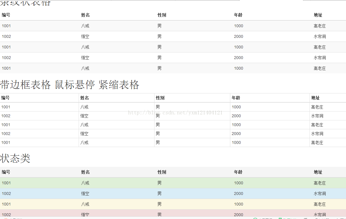
範例涵蓋條紋狀表格(table-striped)、帶邊框搭配滑鼠懸停與緊縮(table-bordered table-hover table-condensed),以及狀態色類別(active、success、info、warning、danger)。
<!doctype html> <html> <head> <meta charset="utf-8"> <title>表格</title> <meta name="viewport" content="width=device-width, initial-scale=1"> <link href="css/bootstrap.css" rel="external nofollow" rel="external nofollow" rel="external nofollow" rel="external nofollow" rel="external nofollow" rel="external nofollow" rel="stylesheet"> <script src="js/jquery-1.9.0.min.js"></script> <script src="js/bootstrap.min.js"></script> </head> <body> <h1>條紋狀表格</h1> <table class="table table-striped"> <thead> <tr> <th>編號</th> <th>姓名</th> <th>性別</th> <th>年齡</th> <th>地址</th> </tr> </thead> <tbody> <tr> <td>1001</td> <td>八戒</td> <td>男</td> <td>1000</td> <td>高老莊</td> </tr> <tr> <td>1002</td> <td>悟空</td> <td>男</td> <td>2000</td> <td>水簾洞</td> </tr> <tr> <td>1001</td> <td>八戒</td> <td>男</td> <td>1000</td> <td>高老莊</td> </tr> <tr> <td>1002</td> <td>悟空</td> <td>男</td> <td>2000</td> <td>水簾洞</td> </tr> <tr> <td>1001</td> <td>八戒</td> <td>男</td> <td>1000</td> <td>高老莊</td> </tr> </tbody> </table> <h1>帶邊框表格 鼠標懸停 緊縮表格</h1> <table class="table table-bordered table-hover table-condensed"> <thead> <tr> <th>編號</th> <th>姓名</th> <th>性別</th> <th>年齡</th> <th>地址</th> </tr> </thead> <tbody> <tr> <td>1001</td> <td>八戒</td> <td>男</td> <td>1000</td> <td>高老莊</td> </tr> <tr> <td>1002</td> <td>悟空</td> <td>男</td> <td>2000</td> <td>水簾洞</td> </tr> <tr> <td>1001</td> <td>八戒</td> <td>男</td> <td>1000</td> <td>高老莊</td> </tr> <tr> <td>1002</td> <td>悟空</td> <td>男</td> <td>2000</td> <td>水簾洞</td> </tr> <tr> <td>1001</td> <td>八戒</td> <td>男</td> <td>1000</td> <td>高老莊</td> </tr> </tbody> </table> <h1>狀態類</h1> <table class="table "> <thead> <tr class="active"> <th>編號</th> <th>姓名</th> <th>性別</th> <th>年齡</th> <th>地址</th> </tr> </thead> <tbody> <tr class="success"> <td>1001</td> <td>八戒</td> <td>男</td> <td>1000</td> <td>高老莊</td> </tr> <tr class="info"> <td>1002</td> <td>悟空</td> <td>男</td> <td>2000</td> <td>水簾洞</td> </tr> <tr class="warning"> <td>1001</td> <td>八戒</td> <td>男</td> <td>1000</td> <td>高老莊</td> </tr> <tr class="danger"> <td>1002</td> <td>悟空</td> <td>男</td> <td>2000</td> <td>水簾洞</td> </tr> <tr> <td>1001</td> <td>八戒</td> <td>男</td> <td>1000</td> <td>高老莊</td> </tr> </tbody> </table> </body> </html>
二、表單元件
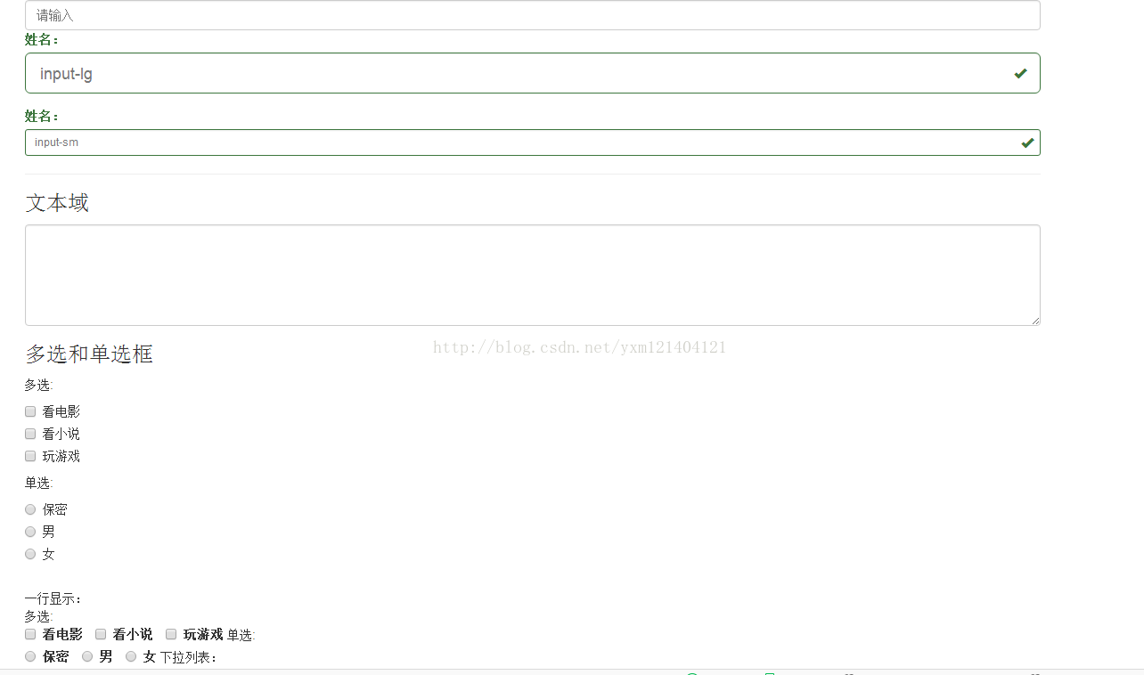
重點 class 包含 form-control(統一輸入框外觀)、input-lg 與 input-sm(尺寸變化)、has-success has-feedback(驗證狀態與提示圖示)、checkbox 與 checkbox-inline(多選的直排與橫排)、radio 與 radio-inline(單選同理)。
<!doctype html> <html> <head> <meta charset="utf-8"> <title>表單</title> <meta name="viewport" content="width=device-width, initial-scale=1"> <link href="css/bootstrap.css" rel="external nofollow" rel="external nofollow" rel="external nofollow" rel="external nofollow" rel="external nofollow" rel="external nofollow" rel="stylesheet"> <script src="js/jquery-1.9.0.min.js"></script> <script src="js/bootstrap.min.js"></script> </head> <body> <div class="container"> <input type="text" name="" class=" form-control" placeholder="請輸入"> <div class="form-group has-success has-feedback "> <label class="control-label">姓名:</label> <input type="text" name="" class=" form-control input-lg " placeholder="input-lg"> <span class="glyphicon glyphicon-ok form-control-feedback"></span> </div> <div class="form-group has-success has-feedback "> <label class="control-label">姓名:</label> <input type="text" name="" class=" form-control input-sm " placeholder="input-sm"> <span class="glyphicon glyphicon-ok form-control-feedback"></span> </div> <hr/> <h3>文本域</h3> <textarea class="form-control" rows="5" ></textarea> <h3>多選和單選框</h3> 多選:<br/> <div class="checkbox"> <label> <input type="checkbox" value=""/> 看電影 </label> </div> <div class="checkbox"> <label> <input type="checkbox" value=""/> 看小說 </label> </div> <div class="checkbox"> <label> <input type="checkbox" value=""/> 玩游戲 </label> </div> 單選:<br/> <div class="radio"> <label> <input type="radio" name="sex" value="保密"/>保密 </label> </div> <div class="radio"> <label> <input type="radio" name="sex" value="男"/>男 </label> </div> <div class="radio"> <label> <input type="radio" name="sex" value="女"/>女 </label> </div> <br/> 一行顯示:<br/> 多選:<br/> <div class=" checkbox-inline"> <label> <input type="checkbox" value=""/> 看電影 </label> </div> <div class="checkbox-inline"> <label> <input type="checkbox" value=""/> 看小說 </label> </div> <div class="checkbox-inline"> <label> <input type="checkbox" value=""/> 玩游戲 </label> </div> 單選:<br/> <div class="radio-inline"> <label> <input type="radio" name="sex" value="保密"/>保密 </label> </div> <div class="radio-inline"> <label> <input type="radio" name="sex" value="男"/>男 </label> </div> <div class="radio-inline"> <label> <input type="radio" name="sex" value="女"/>女 </label> </div> 下拉列表: <select class="form-control"> <option>請選擇</option> <option>技術部</option> <option>研發部</option> <option>後勤部</option> </select> </div> </body> </html>
三、登入頁的四種排版
登入頁示範了從簡單到進階的四種寫法,分別對應不同的版面需求。
寫法一:柵格系統置中
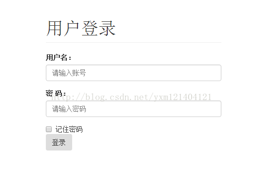
用 col-md-4 col-md-offset-4 讓表單在中等螢幕以上置中,是最常見的經典做法。
<!doctype html> <html> <head> <meta charset="utf-8"> <title>登錄</title> <meta name="viewport" content="width=device-width, initial-scale=1"> <link href="css/bootstrap.css" rel="external nofollow" rel="external nofollow" rel="external nofollow" rel="external nofollow" rel="external nofollow" rel="external nofollow" rel="stylesheet"> <script src="js/jQuery-1.9.0.min.js"></script> <script src="js/bootstrap.min.js"></script> </head> <body> <div class="Container"> <div class="row"> <div class="col-md-4 col-md-offset-4"> <h1 class="page-header">用戶登錄</h1> <form role="form"> <div class="form-group"> <label for="userId">用戶名:</label> <input type="text" class="form-control" placeholder="請輸入賬號" id="userId" name="userId"> </div> <div class="form-group"> <label for="password">密 碼:</label> <input type="password" class="form-control" placeholder="請輸入密碼" id="password" name="password"> </div> <div class="checkbox"> <label> <input type="checkbox"/>記住密碼 </label> <br/> <input type="submit" value="登錄" class="btn"/> </div> </form> </div> </div> </div> </body> </html>
寫法二:行內表單(form-inline)

用 input-group 搭配 input-group-addon 加上前置符號,並以 sr-only 把 label 視覺隱藏但仍保留給螢幕閱讀器,是兼顧無障礙的常見技巧。
<!doctype html> <html> <head> <meta charset="utf-8"> <title>登錄</title> <meta name="viewport" content="width=device-width, initial-scale=1"> <link href="css/bootstrap.css" rel="external nofollow" rel="external nofollow" rel="external nofollow" rel="external nofollow" rel="external nofollow" rel="external nofollow" rel="stylesheet"> <script src="js/jquery-1.9.0.min.js"></script> <script src="js/bootstrap.min.js"></script> </head> <body> <div class="container"> <h1 class="page-header">用戶登錄</h1> <form class="form-inline" role="form"> <div class="form-group"> <div class="input-group" > <div class="input-group-addon">@</div> <input type="text" class="form-control" placeholder="請輸入賬號" id="userId" name="userId"> </div> </div> <div class="form-group"> <label for="password" class="sr-only">密 碼:</label> <input type="password" class="form-control" placeholder="請輸入密碼" id="password" name="password"> </div> <div class="checkbox"> <label> <input type="checkbox"/>記住密碼 </label> <input type="submit" value="登錄" class="btn"/> </div> </form> </div> </body> </html>
寫法三:水平表單(form-horizontal)
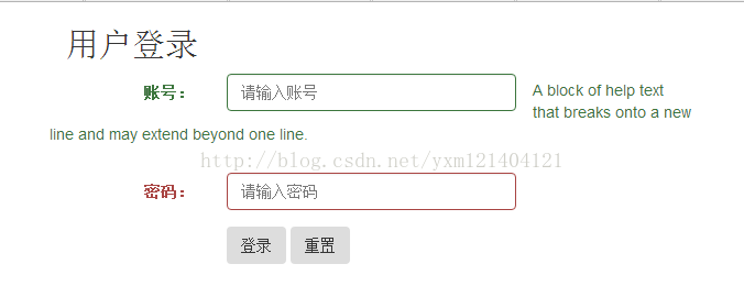
label 佔固定欄寬、輸入框佔其餘空間,並用 has-success/has-error 標示驗證結果,help-block 則用來放提示文字。
<!doctype html> <html> <head> <meta charset="utf-8"> <title>登錄</title> <meta name="viewport" content="width=device-width, initial-scale=1"> <link href="css/bootstrap.css" rel="external nofollow" rel="external nofollow" rel="external nofollow" rel="external nofollow" rel="external nofollow" rel="external nofollow" rel="stylesheet"> <script src="js/jquery-1.9.0.min.js"></script> <script src="js/bootstrap.min.js"></script> </head> <body> <div class=" container"> <div class="row"> <div class="col-md-6"> <h2>用戶登錄</h2> <form class="form-horizontal" role="form"> <div class="form-group has-success "> <label class="col-md-3 control-label" for="userId">賬號:</label> <div class="col-md-6"> <input type="text" class="form-control" placeholder="請輸入賬號" id="userId" name="userId"> </div> <span class="help-block">A block of help text that breaks onto a new line and may extend beyond one line.</span> </div> <div class="form-group has-error"> <label class="col-md-3 control-label" for="password">密碼:</label> <div class="col-md-6"> <input type="password" class="form-control" placeholder="請輸入密碼" id="password" name="password"> </div> </div> <div class="form-group"> <div class="col-md-4 col-md-offset-3"> <input type="submit" value="登錄" class="btn"/> <input type="reset" value="重置" class="btn"/> </div> </div> </form> </div> </div> </div> </body> </html>
寫法四:靜態文字顯示
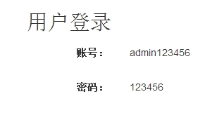
當欄位只是要「呈現」而非「輸入」時,用 form-control-static 搭配 <p> 標籤,就能讓文字與輸入框對齊而不出現邊框。
<!doctype html> <html> <head> <meta charset="utf-8"> <title>登錄</title> <meta name="viewport" content="width=device-width, initial-scale=1"> <link href="css/bootstrap.css" rel="external nofollow" rel="external nofollow" rel="external nofollow" rel="external nofollow" rel="external nofollow" rel="external nofollow" rel="stylesheet"> <script src="js/jquery-1.9.0.min.js"></script> <script src="js/bootstrap.min.js"></script> </head> <body> <div class=" container"> <div class="row"> <div class="col-md-6"> <h2>用戶登錄</h2> <form class="form-horizontal" role="form"> <div class="form-group"> <label class="col-md-3 control-label" for="userId">賬號:</label> <div class="col-md-6"> <p class=" form-control-static">admin123456</p> </div> </div> <div class="form-group"> <label class="col-md-3 control-label" for="password">密碼:</label> <div class="col-md-6"> <p class="form-control-static">123456</p> </div> </div> </form> </div> </div> </div> </body> </html>
總結
這三組範例的共同邏輯是:結構用 HTML 語意標籤搭好,樣式全部交給 class。上手時建議先把常用 class 記熟,再回頭看官方文件的元件頁,會發現絕大多數需求都能直接組裝出來,不必自己寫太多 CSS。
- 上一篇文章: 原生 JS + Ajax 打造百度風格智慧搜尋下拉建議
- 下一篇文章: JavaScript 跨域請求與後端攔截設定完整解析