滑鼠移入浮出氣泡提示框:hover 搭配 animate 的經典效果
編輯:JQuery入門技巧
這是一個很有名的選單效果:滑鼠移到某個項目上,上方會浮出一個帶箭頭的氣泡框顯示說明文字,移開就淡出。做法結合了 CSS 定位與 jQuery 的 hover 加 animate。
一、HTML 與樣式
<!DOCTYPE html PUBLIC "-//W3C//DTD XHTML 1.0 Transitional//EN"
  "https://www.w3.org/TR/xhtml1/DTD/xhtml1-transitional.dtd">
<html xmlns="https://www.w3.org/1999/xhtml">
<head>
<meta http-equiv="Content-Type" content="text/html; charset=UTF-8" />
<title>Animated Menu Hover</title>
<script type="text/javascript" src="jquery.js"></script>
<script type="text/javascript">
$(document).ready(function () {
    $(".menu li").hover(function () {
        $(this).find("em").animate({ opacity: "show", top: "-75" }, "slow");
    }, function () {
        $(this).find("em").animate({ opacity: "hide", top: "-85" }, "fast");
    });
});
</script>
<style type="text/css">
body { margin: 10px auto; width: 570px; font: 75%/120% Arial, Helvetica, sans-serif; }

.menu { margin: 100px 0 0; padding: 0; list-style: none; }

.menu li {
    padding: 0; margin: 0 2px;
    float: left; position: relative; text-align: center;
}

.menu a {
    padding: 14px 10px; display: block; color: #000;
    width: 144px; text-decoration: none; font-weight: bold;
    background: url('button.gif') no-repeat center center;
}

.menu li em {
    background: url('hover.jpg') no-repeat;
    width: 180px; height: 45px;
    position: absolute; top: -85px; left: -15px;
    text-align: center; padding: 20px 12px 10px;
    font-style: normal; z-index: 2; display: none;
}
</style>
</head>
<body>
<ul class="menu">
  <li>
    <a href="https://www.example.com">Web Designer Wall</a>
    <em>A wall of design ideas, web trends, and tutorials</em>
  </li>
  <li>
    <a href="https://www.example.com">Best Web Gallery</a>
    <em>Featuring the best CSS and Flash web sites</em>
  </li>
  <li>
    <a href="https://www.example.com">N.Design Studio</a>
    <em>Blog and design portfolio of WDW designer, Nick La</em>
  </li>
</ul>
</body>
</html>
二、JavaScript
<script type="text/javascript">
$(document).ready(function () {
    $(".menu li").hover(function () {
        $(this).find("em").animate({ opacity: "show", top: "-75" }, "slow");
    }, function () {
        $(this).find("em").animate({ opacity: "hide", top: "-85" }, "fast");
    });
});
</script>
三、效果圖
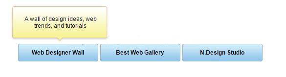
這個效果為什麼看起來順
關鍵在兩個 top 值:-85px 是氣泡的起始位置,-75px 是滑入後的位置,兩者相差 10px。滑入時用 "slow"、滑出時用 "fast",配上淡入淡出,就形成了「慢慢浮上、快速離開」的手感。這種進場慢、退場快的節奏,是很多精緻互動的共同特徵。
另外,.menu li 設為 position: relative,是為了讓 em 的 position: absolute 以各個 li 為定位參考,而不是以整個頁面為基準。z-index: 2 則確保氣泡浮在其他選單項之上。這三個屬性缺一不可,是 CSS 定位最典型的組合。
要現代化的話,這個效果完全可以純 CSS 完成:.menu li em 預設 opacity: 0 並 transform: translateY(10px),在 :hover 與 :focus-within 時改為 opacity: 1 與 translateY(0),加上 transition 即可。純 CSS 版本不需要 JS、效能更好,也能搭配鍵盤操作。順帶一提,若要兼顧無障礙,氣泡內容應該用 aria-describedby 與觸控框的 id 關聯,讓螢幕閱讀器也能讀到。
以上就是這個效果的完整分享,希望對你的介面設計有所幫助。
- 上一篇文章: jQuery Ajax 與後端以 JSON 互動的三種寫法(含 Servlet 範例)
- 下一篇文章: jQuery DataTables 搭配 Bootstrap:用伺服器端 JSON 建置表格