自製漂亮下拉框 ComboBox,可自由二次修改
編輯:JQuery特效代碼
繼續分享 web 前端自定義控件系列,這次要處理的是 ComboBox(下拉框)。以往用原生 select 最讓我困擾的就是樣式醜、無法客製,現在把這個自製版本分享出來,需要的朋友可以收藏或直接二次修改成你要的樣子。
先拆解要實作的功能
動手前先把需求切成五塊,一塊一塊做就不容易亂:
1. 建立建構函式,初始化賦值
2. 把控件呈現在前台
3. 點擊下拉框時展開列表
4. 再次點擊時收起列表
5. 點擊下拉項時觸發選取事件
HTML 與 CSS
HTML 只需要一個佔位元素,其餘由 JS 動態產生:
<b class="select_type"></b>
.dropdown span a{ float:left; background:url(/img/Icon_BG.png); }
/* 下拉框 */
.dropdown span a{ background-position:-213px -75px; }
.dropdown{ float:left; width:105px; }
.dropdown span{
  border:solid 1px #ccc; width:95%; height:28px;
  background:url(/img/tbline_bg.png); border-radius:8px; overflow:hidden;
  float:left; padding-left:10px; line-height:28px; cursor:pointer;
}
.dropdown span.active{ border-radius:8px 8px 0px 0px; }   /* 展開時上兩角不圓 */
.dropdown span font{ width:auto; margin-right:0px; float:left; }
.dropdown span a{ float:right; width:20px; height:20px; margin:4px 0; }
.dropdown p{
  border:solid 1px #ccc; border-top:0px; width:103px;
  display:none; position:absolute; margin-top:28px;
  background-color:#fff; z-index:3; max-height:280px;
  overflow-y:auto; overflow-x:hidden;
}
.dropdown p a{
  float:left; line-height:28px; height:28px; padding-left:10px;
  color:#666; font-size:14px; cursor:default; text-align:left;
  width:100%; overflow:hidden;
}
.dropdown p a:hover{ background:url(/img/tbline_bg.png); color:#666; }
幾個細節值得注意:.active 讓展開時上圓角消失,視覺上與列表連成一體;p 用 position:absolute 配合 margin-top:28px 緊貼在標題下方;max-height:280px 加 overflow-y:auto 則讓選項過多時出現捲軸而不撐破版面。
JS:自定義 ComboBox 類別
// 下拉框
var ComboBox = function () {
  this.tag;
  this.data_default;
  this.data_list;
  this.index = 0;

  var _this = this;
  var _index, _tag, _value;

  // 初始化
  this.init = function () {
    _tag   = _this.tag;
    _index = _this.index;

    _this.setDropdown(_this.data_default, _this.data_list);

    // 若已有選中值,取出它的 _id
    if (_tag.find('span font').length > 0) _value = _tag.find('span font').attr('_id');
    if (_tag == undefined) { return false; }

    _this.showEvent();
    _this.selectedIndex(_index);
    return true;
  };

  // 產生下拉列表 DOM
  this.setDropdown = function (default_data, list) {
    var css = _tag.attr('class');
    if (default_data == undefined) { default_data = { id: 'null', name: '' }; }

    var _html = '';
    if (_tag.find('p').length > 0 && _tag.find('span').length > 0) {
      // 已初始化過:只更新內容
      $.each(list, function (i, value) {
        _html += '<a _id="' + value.id + '">' + value.name + '</a>';
      });
      _tag.find('span font').replaceWith(
        '<font _id="' + default_data.id + '">' + default_data.name + '</font>');
      _tag.find('p').html(_html);
    } else {
      // 首次初始化:組出完整結構
      _html = '<div class="dropdown ' + css + '">';
      _html += '<span><font _id="' + default_data.id + '">'
             + default_data.name + '</font><a></a></span>';
      _html += '<p>';
      if (list) {
        $.each(list, function (i, value) {
          _html += '<a _id="' + value.id + '">' + value.name + '</a>';
        });
      }
      _html += '</p></div>';

      var parent = _tag.parent();
      _tag.replaceWith(_html);
      _tag = parent.find('.dropdown' + (css.length > 0 ? '.' + css.replace(' ', '.') : ''));
    }
  };

  // 展開/收合
  this.showEvent = function () {
    _tag.find('span').unbind('click').click(function () {
      var p = $(this).parent().find('p');
      if (p.css('display') == 'block') {
        p.css('display', 'none');
        $(this).removeClass('active');
      } else if (p.html().length > 0) {
        p.css('display', 'block');
        $(this).addClass('active');
      }
    });
  };

  // 選取
  this.selectedIndex = function (index) {
    _tag.find('p a').unbind('click').click(function () {
      var parent = $(this).parent().parent();
      if ($(this).text().length > 0) {
        var font = parent.find('font');
        font.text($(this).text());
        font.attr("_id", $(this).attr('_id'));
        _this.selectedIndexExpand(parent, $(this).index());
        parent.find('span').removeClass('active');
      }
      parent.find('p').css('display', 'none');
    });

    if (_tag.find('p a').length <= _index) _index = 0;
    if (_value && _value != '') {
      _index = _tag.find('p a[_id="' + _value + '"]').index();
    }
    _tag.find('p a:eq(' + _index + ')').click();
  };

  // 選取後的擴充點,預設什麼都不做
  this.selectedIndexExpand = function (tag, index) { }
}
使用範例
var array_state = [
  { id: -1, name: '狀態' },
  { id:  1, name: '未成功' },
  { id:  2, name: '成功' },
  { id:  3, name: '失敗' }
];

// 狀態下拉控件
var select_type = new ComboBox();
select_type.tag          = $('.select_type');
select_type.data_default = array_state[0];
select_type.data_list    = array_state;
select_type.selectedIndexExpand = function (tag, index) {
  // 在這裡接你自己的業務邏輯,例如重新查詢列表
}
select_type.init();
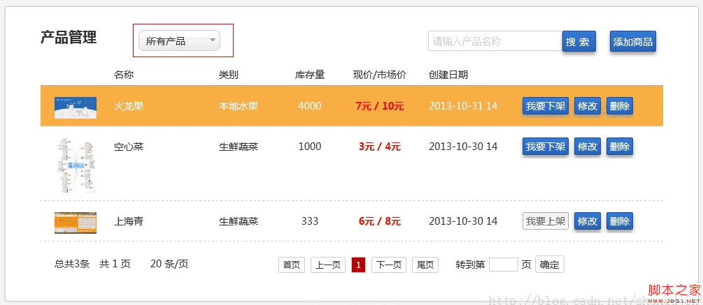
成果如下:
設計亮點與可改善處
這個元件最聰明的地方是 selectedIndexExpand 這個空的擴充點。元件本身只負責「讓使用者選到東西」,選完之後要做什麼完全交給呼叫方決定,符合開放封閉原則,也比在元件裡塞業務邏輯漂亮得多。
另外 setDropdown 裡區分「首次產生」與「後續更新」兩條路徑的做法很實際——更新時只替換 font 與 p 的內容,不必重建整個 DOM,也不會把已綁定的事件弄丟。
要再精進的話有幾處:自訂屬性建議改用 data-id 並以 .data() 讀取,而非 _id 這種私有命名;unbind('click').click() 請改寫為 .off('click').on('click');目前的實作點擊頁面其他地方不會自動收合,鍵盤上下鍵與 Enter 也無法操作,若要達到產品級的無障礙標準,這幾項都需補上。
- 上一篇文章: 用隱藏 iframe 觸發檔案下載,避免彈出新視窗
- 下一篇文章: 自製精緻單選鈕元件 RadioButton