jQuery 實現頁面滾動時元素智能浮動定位
編輯:JQuery特效代碼
在部落格或微博等頁面常看到這種效果:某個區塊(如側邊欄、工具列)原本在頁面某個位置,當捲動超過它時,就固定在視窗頂端隨頁面一起浮動。下面示範如何封裝成一個可重複使用的 smartFloat 方法。
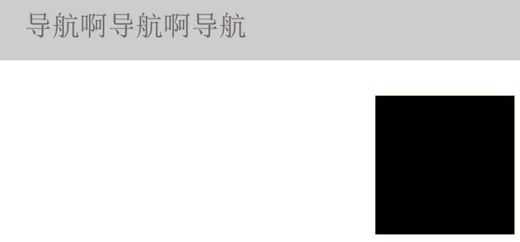
效果圖如下,捲動時黑色區塊的 top 固定為 0:
封裝 smartFloat
$.fn.smartFloat = function() {
  var position = function(element) {
    var top = element.position().top, pos = element.css("position");
    $(window).scroll(function() {
      var scrolls = $(this).scrollTop();
      if (scrolls > top) {
        if (window.XMLHttpRequest) {
          element.css({ position: "fixed", top: 0 });
        } else {
          element.css({ top: scrolls });
        }
      } else {
        element.css({ position: pos, top: top });
      }
    });
  };
  return $(this).each(function() {
    position($(this));
  });
  };
綁定使用
$("#float").smartFloat();
原理說明
方法會先記住元素原本的 top 與 position,接著監聽視窗捲動:當捲動距離超過元素原始位置時,就把元素改為 position:fixed; top:0,讓它固定在頂端;否則還原成原本的樣子。程式裡還針對不支援 fixed 的舊瀏覽器(透過 window.XMLHttpRequest 判斷)做了相容處理,改用動態計算 top 的方式。封裝成外掛後,只要一行 $("#float").smartFloat() 就能套用。
- 上一篇文章: jQuery 實現列表無縫向上滾動的完整代碼
- 下一篇文章: jQuery + .NET 實現「載入更多內容」(改編自 PHP 版)