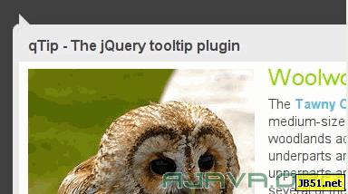
qTip 是少數在舊瀏覽器時代就把相容性做到位的 tooltip 插件。它支援的範圍相當廣:
- Internet Explorer 6.0+
- Firefox 2.0+
- Opera 9.0+
- Safari 3.0+
- Google Chrome 1.0+
- Konqueror 3.5+
除了位置與樣式可以自由定義,它還提供了一套完整的 API,能控制顯示時機、隱藏行為、動態載入內容等進階互動。
主頁:https://craigsworks.com/projects/qtip/
下載:https://craigsworks.com/projects/qtip/download
示例:https://craigsworks.com/projects/qtip/
一、引入
<script type="text/javascript" src="jquery-1.3.2.min.js"></script>
<script type="text/javascript" src="jquery.qtip-1.0.0-rc3.min.js"></script>
二、基礎文字提示
<div id="content">
  <a href=" ">Basic text</a>
</div>

<script type="text/javascript">
$(document).ready(function() {
  $('#content a[href]').qtip({
    content: 'Some basic content for the tooltip'
  });
});
</script>
三、沿用 title 屬性
把 content.text 設為 false,qTip 就會回頭去讀元素原本的 title 屬性,不必重複寫一份文字。
<div id="content">
  <a href=" " title="That sounds familiar...">Title attribute</a>
</div>

<script type="text/javascript">
$(document).ready(function() {
  $('#content a[href][title]').qtip({
    content: { text: false },
    style: 'cream'
  });
});
</script>
四、在提示裡放圖片
content 接受 HTML 字串,因此圖片、連結、表格都可以塞進去。
<div id="content"><a href=" ">Image</a></div>

<script type="text/javascript">
$(document).ready(function() {
  $('#content a[href]').qtip({
    content: '<img src="small.png" alt="Image" />'
  });
});
</script>
五、指定對角位置
position.corner 用「tooltip 的哪個角對準 target 的哪個角」來描述,這組語意一學就能通吃所有方位。
<div id="content" style="margin-top:200px;margin-left:200px;">
  <a href=" ">Corner values</a>
</div>

<script type="text/javascript">
var corners  = 'bottomLeft';
var opposites = 'topRight';

$(document).ready(function() {
  $('#content a').hover(function() {
    $(this).html(opposites).qtip({
      content: corners,
      position: {
        corner: { tooltip: corners, target: opposites }
      },
      show: { when: false, ready: true },
      hide: false,
      style: {
        border: { width: 5, radius: 10 },
        padding: 10,
        textAlign: 'center',
        tip: true,
        name: 'cream'
      }
    });
  });
});
</script>
六、固定顯示的操作提示
hide.fixed 設為 true 之後,tooltip 不會因為滑鼠移開而消失,適合做成圖片右上角那種「編輯/刪除」捷徑。
<div id="content">
  <img src="sample.jpg" alt="" height="200" />
</div>

<script type="text/javascript">
$(document).ready(function() {
  $('#content img').each(function() {
    $(this).qtip({
      content: '<a href=" ">Edit</a> | <a href=" ">Delete</a>',
      position: 'topRight',
      hide: { fixed: true },
      style: { padding: '5px 15px', name: 'cream' }
    });
  });
});
</script>

<style type="text/css">
#content img {
  float: left;
  margin-right: 35px;
  border: 2px solid #454545;
  padding: 1px;
}
</style>
七、動態載入 HTML 片段
content.url 會以 ajax 抓取該位址的內容並填入提示框,加上 title.button 可以附一個關閉鈕。
<div id="content">
  <a href="#" rel="sample.html">Click me</a>
</div>

<script type="text/javascript">
$(document).ready(function() {
  $('#content a[rel]').each(function() {
    $(this).qtip({
      content: {
        url: $(this).attr('rel'),
        title: {
          text: 'Wiki - ' + $(this).text(),
          button: 'Close'
        }
      },
      position: {
        corner: { target: 'bottomMiddle', tooltip: 'topMiddle' },
        adjust: { screen: true }
      },
      show: { when: 'click', solo: true },
      hide: 'unfocus',
      style: {
        tip: true,
        border: { width: 0, radius: 4 },
        name: 'light',
        width: 570
      }
    });
  });
});
</script>
八、模態提示
把 position 對準 document.body 並置中,再搭配 api 中的 beforeShow / beforeHide 控制一層遮罩,就形成類似 dialog 的效果。
<div id="content"><a href="#" rel="modal">Click here</a></div>

<script type="text/javascript">
$(document).ready(function() {
  $('a[rel="modal"]:first').qtip({
    content: {
      title: { text: 'Modal tooltips sample', button: 'Close' },
      text: 'hello world'
    },
    position: { target: $(document.body), corner: 'center' },
    show: { when: 'click', solo: true },
    hide: false,
    style: {
      width: { max: 350 },
      padding: '14px',
      border: { width: 9, radius: 9, color: '#666666' },
      name: 'light'
    },
    api: {
      beforeShow: function() {
        $('#qtip-blanket').fadeIn(this.options.show.effect.length);
      },
      beforeHide: function() {
        $('#qtip-blanket').fadeOut(this.options.hide.effect.length);
      }
    }
  });

  // 遮罩層
  $('<div id="qtip-blanket">').css({
    position: 'absolute',
    top: $(document).scrollTop(),
    left: 0,
    height: $(document).height(),
    width: '100%',
    opacity: 0.7,
    backgroundColor: 'black',
    zIndex: 5000
  }).appendTo(document.body).hide();
});
</script>
九、幾個實用提醒
show.solo 設為 true 時,同一時刻只會有一個提示存在,這在多元素頁面裡能避免視覺打結。adjust.screen 則會在提示即將超出視窗時自動翻轉方位,對靠邊的元素特別有用。
用 rel 屬性存放 URL 是當時的常見寫法,今天更建議改用 data-* 屬性,語意更清楚也不會與其他用途衝突。
最後要說明的是,範例對應的是 qTip 1.0.0-rc3,搭配 jQuery 1.3.2。這個系列後來發展為 qTip2,API 有相當大的變動(corner 改為 position.my / at,style 也重新設計過)。若你在新專案中要使用,請直接參考 qTip2 的文件,本頁內容適合作為理解設計思路的參考。