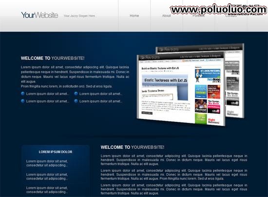
本系列第二篇,要示範如何把一個小型、現代的產品首頁,從 psd 檔一步步轉換成 XHTML / CSS 模板。
Demo
點擊下圖可看到本次製作的成品效果。
開始之前
如果你還沒準備好,建議先讀完系列第一部分《用 Photoshop 設計一個小型、現代的產品首頁》,因為本部分需要第一部分完成後的 psd 檔。若想跳過第一部分,可以直接在其中下載原始檔,後續會用到。
建立檔案結構
1. 在桌面建立新目錄,命名為 portfolio。
2. 在 portfolio 下再建一個 images 目錄存放圖片。
3. 建立兩個空白檔:styles.css 與 index.html。
4. 用最順手的文字編輯器打開 index.html(本教學使用 Adobe Dreamweaver)。
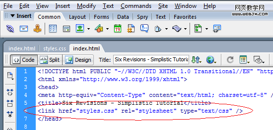
5. 在 <head> 中加入對樣式表的連結:
代碼段 1
<link href="styles.css" rel="stylesheet" type="text/css" />
頁面分區
以下是模板的基本結構,我們從建立各區塊開始。
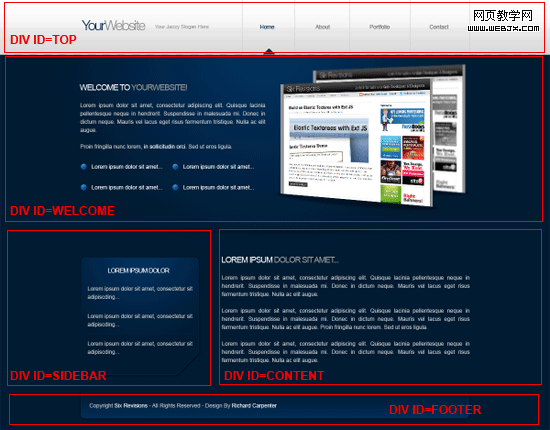
6. 從一個在瀏覽器中居中、包住整個文件的主容器開始(也就是所謂的 wrapper)。容器內部的五個 div 組成完整頁面:#top、#welcome、#sidebar、#content 與 #footer。
代碼段 2
<!--CONTAINER STARTS--> <div id="container"> <!--HEADER/NAVIGATION STARTS--> <div id="top"> </div> <!--HEADER/NAVIGATION ENDS--> <!--WELCOME AREA STARTS--> <div id="welcome"> </div> <!--WELCOME AREA ENDS--> <!--SIDEBAR STARTS--> <div id="sidebar"> </div> <!--SIDEBAR ENDS--> <!--CONTENT STARTS--> <div id="content"> </div> <!--CONTENT ENDS--> <!--FOOTER STARTS--> <div id="footer"> </div> <!--FOOTER ENDS--> </div> <!--CONTAINER ENDS-->
切出背景
7. 在把各個 div 轉成程式碼之前,先加入背景。用 Photoshop 打開 psd 檔,用矩形選框工具(M)選取頭部/導覽與背景的一小塊區域,寬度可以只有 1px(因為後面會用 CSS 水平重複它)。
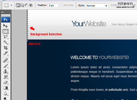
8. 在選取範圍的底部,用滴管工具(I)記下色彩的十六進位值。
9. 選好之後執行「編輯 > 合併拷貝」,建立一個新 Photoshop 檔(Ctrl+N),把選取範圍貼上新文件。新建畫布的長寬通常會等於剪貼簿中選取範圍的大小;若不是,請確認兩者一致。
10. 在新文件中執行「檔案 > 儲存為 Web 與裝置所用格式」(Alt+Shift+Ctrl+S),選擇 PNG-8 格式,存為 background.png,放在 images 目錄。
把背景轉成程式碼
11. 背景圖切好後就可以寫程式碼了。打開 styles.css,寫入:
代碼段 3
* { margin: 0px; padding: 0px; border: none; } body { background-image: url(images/background.png); background-repeat: repeat-x; background-color: #001b32; font-family: Arial, Helvetica, sans-serif; font-size: 12px; color: #c8c8c8; } #container { margin: auto; width: 850px; }
代碼段 3 說明
先把所有元素的 margin、padding、border 歸零,避免跨瀏覽器的預設值差異,這裡用的是 * 萬用選擇器。接著樣式化 body:把 background.png 設為背景並以 repeat-x 水平重複,同時把底色設為深藍(#001b32)。最後把 #container 的 margin 設為 auto 讓版面居中,寬度固定 850px。
切出 Logo 與站名
12. 接著製作 logo 與站點標題。用矩形選框工具(M)選取站點標題與標示文字區域。
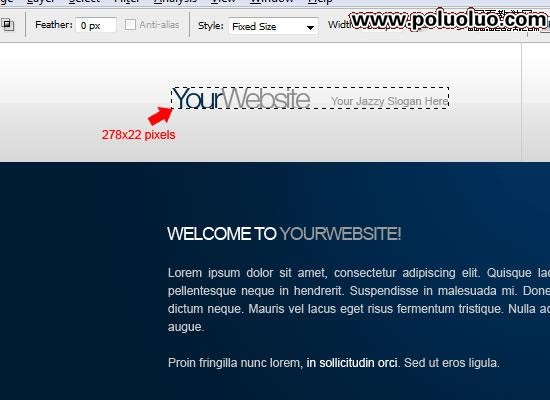
13. 和處理 background.png 一樣,把這個區域複製到新文件,存為 title.png 放進 images 目錄。
站名轉成程式碼
14. 回到 HTML,在 #top 裡建立一個 ID 為 title 的新 div。
15. 在 #title 中放入 <h1> 元素承載站名,並加上一個 <a> 連結到首頁。這裡先把 href 設為 #,實際上線時可改為斜線(/)。
代碼段 4
<!--HEADER/NAVIGATION STARTS--> <div id="top"> <!--WEBSITE TITLE STARTS--> <div id="title"> <h1><a href="#" title="Your Website Name">Your Website Name</a></h1> </div> <!--WEBSITE TITLE ENDS--> </div> <!--HEADER/NAVIGATION ENDS-->
16. 接著樣式化 #top 區域。
代碼段 5
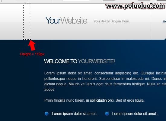
#top { float: left; width: 850px; height: 119px; } #title { float: left; width: 278px; height: 74px; padding-top: 45px; } #title h1 { display: block; float: left; width: 278px; height: 74px; text-indent: -9999px; } #title h1 a { display: block; width: 100%; height: 100%; background-image: url(images/title.png); background-repeat: no-repeat; background-position: 0 0; }
代碼段 5 說明
先把 #top 浮動到左邊並給定固定寬高:寬度與 #container 等寬(850px),高度與淺灰區域等高(119px)。接著使用背景圖取代文字的經典技巧——把 #title h1 中的文字以 text-indent: -9999px 推到視窗外的 -9999px。這個做法對螢幕閱讀器的可訪問性與搜尋引擎優化都有好處。
導覽轉成程式碼
17. 在 #top 裡、#title 之後建立一個 ID 為 navigation 的 div,裡面放一個無序列表,class 設為 nav-links。
代碼段 6
<!--NAVIGATION STARTS--> <div id="navigation"> <ul> <li><a href="#" title="home">home</a></li> <li><a href="#" title="about">about</a></li> <li><a href="#" title="portfolio">portfolio</a></li> <li><a href="#" title="contact">contact</a></li> </ul> </div> <!--NAVIGATION ENDS-->
代碼段 6 說明
替無序列表加上 nav-links 這個 class,主要目的是在連結 CSS 時不會波及頁面上的其他清單。另外,最後一個列表項要加上 borderx2 這個 class(意思是「邊框乘二」):因為導覽中的每個項目都有一條分隔線,最後一項的左右兩側都需要各補一個 1px 邊框。
切出 hover 指示器
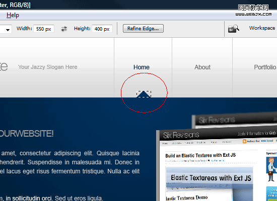
18. 在替導覽加上樣式之前,先把那個小小的三角形指示器切出來。回到 Photoshop 用矩形選框工具(M)選取三角形,複製到透明背景的新文件,存為 images 目錄下的 nav_hover.png。
導覽樣式化
19. 現在可以寫導覽的 CSS 了。
代碼段 7
.nav-links li a { float: left; width: 120px; height: 68px; text-decoration: none; text-transform: capitalize; color: #666666; font-size: 12px; text-align: center; padding-top: 51px; border-left-width: 1px; border-left-style: solid; border-left-color: #cecece; } .nav-links li a:hover { color: #00284a; background-image: url(images/nav_hover.png); background-repeat: no-repeat; background-position: center bottom; } li.borderx2 { border-right-width: 1px; border-right-style: solid; border-right-color: #cecece; }
代碼段 7 說明
先讓列表項向左浮動,使其並排顯示,再給定固定寬高讓彼此間距均衡。接著用 text-decoration: none 移除超連結預設的底線,並替每個項目加上 1px 灰色左邊框作為分隔線。然後用 :hover 偽類處理滑鼠移入的樣式:把背景換成 nav_hover.png。最後替 .borderx2 宣告右邊框,補上最後一項缺少的右側分隔線。
建立歡迎區域
歡迎區域會切成左右兩塊:左邊 #welcome-text,右邊 #welcome-image。
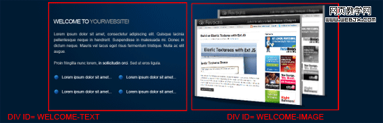
20. 在 index.html 的 #welcome 中加入這兩個 div,切圖完成後再填入內容。
切出歡迎圖
21. 回到 psd 檔,關閉除了帶漸層效果的深藍背景之外的所有圖層(點擊圖層左側的眼睛圖示)。
22. 用矩形選框工具(M)選取一個寬度不超過 850px 的矩形,可借助第一部分設好的參考線來定位。
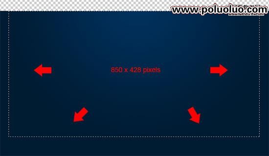
23. 把這個深藍背景輸出為 web 圖片 content_background.png 放進 images 目錄。用同樣的方法,只保留歡迎圖片圖層,切出藍點與歡迎圖。
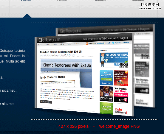
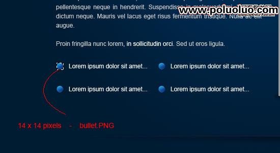
新區域的 HTML 如下:
代碼段 8
<!--WELCOME AREA STARTS--> <div id="welcome"> <!--WELCOME TEXT STARTS--> <div id="welcome-text"> </div> <!--WELCOME TEXT ENDS--> <!--WELCOME IMAGE STARTS--> <div id="welcome-image"> <img src="images/welcome_image.png" alt="Welcome..." /> </div> <!--WELCOME IMAGE ENDS--> </div> <!--WELCOME AREA ENDS-->
24. 在 #welcome-text 中加入歡迎文字:用 <h2> 當標題,下面接一段無序列表。
25. 在 #welcome-image 中放入歡迎圖片(本範例使用的是 Six Revisions 的網站截圖)。
代碼段 9
<!--WELCOME AREA STARTS--> <div id="welcome"> <!--WELCOME TEXT STARTS--> <div id="welcome-text"> <h2>welcome to <span>yourwebsite!</span></h2> <p>Lorem ipsum dolor sit amet, consectetur[...]</p> <p>Proin fringilla nunc lorem, in sollicitudin orci. Sed ut eros ligula.</p> <ul> <li>Lorem ipsum dolor sit amet...</li> <li>Lorem ipsum dolor sit amet...</li> <li>Lorem ipsum dolor sit amet...</li> <li>Lorem ipsum dolor sit amet...</li> </ul> </div> <!--WELCOME TEXT ENDS--> <!--WELCOME IMAGE STARTS--> <div id="welcome-image"> <img src="images/welcome_image.png" alt="Welcome..." /> </div> <!--WELCOME IMAGE ENDS--> </div> <!--WELCOME AREA ENDS-->
樣式化歡迎區域
26. 把下面的程式碼複製到 CSS 中。
代碼段 10
#welcome { float: left; width: 850px; background-image: url(images/content_background.png); background-repeat: no-repeat; height: 326px; padding-top: 40px; } h2 { text-transform: uppercase; color: #ffffff; font-size: 16px; margin-bottom: 15px; } .heading-color2 { color: #9a9a9a; } #welcome-text { width: 406px; line-height: 18px; padding-top: 50px; float: left; text-align: justify; margin-bottom:10px; } .list li { text-decoration: none; background-image: url(images/bullet.png); background-repeat: no-repeat; list-style-type: none; float: left; width: 180px; padding-left: 20px; margin-top: 10px; background-position: left center; } #welcome-image { float: right; height: 326px; width: 427px; }
代碼段 10 說明
先透過 background 屬性替 #welcome 加上漸層背景,並設為不重複,然後給定固定寬高(寬度等於內容寬 850px,高度對應歡迎圖的高度)。用 text-transform: uppercase 讓 <h2> 內的文字變成大寫,再把 'yourwebsite' 包進 class 為 heading-color2 的 span 中,賦予不同顏色。無序列表加上 class list,背景設為 bullet.png,並用 list-style-type: none 拿掉預設的項目圓點。最後讓 #welcome-image 向右浮動,就能顯示在 #welcome-text 右側。
切出 3D 分隔線
27. 對於 3D 分隔線,我打算用一個 class 為 separator 的 div 來實現,方便重複使用。用矩形選框工具(M)選取,寬度不能超過 850px,高度不能超出分隔線本身。
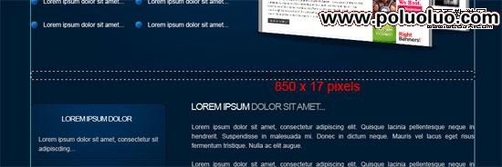
28. 用前面的方法存為 images 目錄下的 separator.png。
分隔線轉成程式碼
29. 分隔線的 HTML 與 CSS 都很簡單。在 index.html 的 #welcome 之後插入一個 div,並在 class 為 separator 的 div 中放入 。
代碼段 11
<!--WELCOME AREA ENDS--> <!--SEPARATOR STARTS--> <div> </div> <!--SEPARATOR ENDS-->
30. CSS 中加上:
代碼段 12
.separator { background-image: url(images/separator.png); background-repeat: no-repeat; float: left; height: 17px; width: 850px; margin-top: 20px; margin-bottom: 20px; }
代碼段 12 說明
把 .separator 的 background-image 設為 separator.png,寬度 850px 並向左浮動,height 等於 separator.png 的高度,最後給上下各 20px 的 margin,讓它與相鄰區塊之間留有間距。
切出側邊欄
31. 側邊欄只需要那個框。本教學中側邊欄框大小固定,但若要擴充其實很容易(這部分留給大家自行練習)。用矩形選框工具(M)選取側邊欄框,我的選取範圍是 259 × 259px。
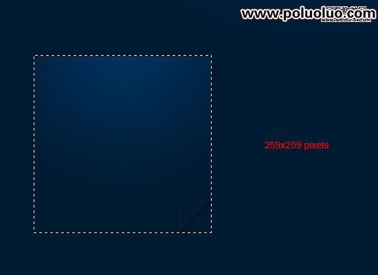
32. 存為 images 目錄下的 contentbox.png。
33. 再用矩形選框工具設定寬度 1px、高度 2px,選取文字之間的分隔線部分。
34. 一樣存為 images 目錄下的 divider.png。之所以只選很小一塊,是因為下面會用 CSS 把它水平重複。
撰寫側邊欄 HTML
35. 在 .separator 之後就是 #sidebar。用 <h3> 當側邊欄標題,並替無序列表加上 class sidebar-list 以便自訂樣式。
代碼段 13
<!--SEPARATOR ENDS--> <!--SIDEBAR STARTS--> <div id="sidebar"> <h3>lorem ipsum dolor</h3> <ul> <li>Lorem ipsum dolor sit amet, consectetur sit adipiscding...</li> <li>Lorem ipsum dolor sit amet, consectetur sit adipiscding...</li> <li>Lorem ipsum dolor sit amet, consectetur sit adipiscding...</li> </ul> </div> <!--SIDEBAR ENDS-->
用 CSS 樣式化側邊欄
36. CSS 中加入:
代碼段 14
#sidebar { float: left; height: 209px; width: 219px; background-image: url(images/contentbox.png); background-repeat: no-repeat; padding-top: 20px; padding-right: 20px; padding-bottom: 30px; padding-left: 20px; } h3 { text-transform: uppercase; color: #ffffff; text-align: center; margin-bottom: 20px; font-size: 12px; } .sidebar-list li { list-style-type: none; margin-top: 10px; padding-bottom: 10px; background-image: url(images/divider.png); background-repeat: repeat-x; background-position: bottom; }
代碼段 14 說明
給 #sidebar 與 contentbox.png 相同的寬高,向左浮動讓內容靠左,並設定 background-image 為 contentbox.png。用 text-transform 讓 h3 文字變大寫,text-align 讓標題居中。最後用 list-style-type: none 拿掉列表項的預設圓點,把 background-image 設為 divider.png 並水平重複(repeat-x),再給一些 margin 與 padding 讓各項之間留有呼吸空間。
內容區域轉為程式碼
37. 內容區域相對簡單,只包含一些段落與標題。在 #content 中放入二級標題 <h2>,並用 span.heading-color2 替後半段文字上色,段落先用 lorem ipsum 佔位文字填滿。
代碼段 15
<!--CONTENT STARTS--> <div id="content"> <h2>welcome to <span>yourwebsite!</span></h2> <p>Lorem ipsum dolor sit amet, consectetur adipiscing elit. Quisque.</p> <p>Lorem ipsum dolor sit amet, consectetur adipiscing elit. Quisque.</p> <p>Lorem ipsum dolor sit amet, consectetur adipiscing elit. Quisque.</p> </div> <!--CONTENT ENDS-->
內容區域樣式化
38. 加入:
代碼段 16
#content { float: right; width: 550px; text-align: justify; } #content p { margin-bottom: 10px; }
代碼段 16 說明
為了讓 #content 靠右顯示,我們讓它向右浮動並給定固定寬度。之所以不給固定高度,是因為想讓內容自身的文字量來決定高度。最後替 <p> 加上下 margin,讓段落之間留有間距——由於前面已把它們歸零,這一步是必須的。
切出頁腳
39. 快完成了,繼續加油!用矩形選框工具選取 850px × 60px 的頁腳背景圖。
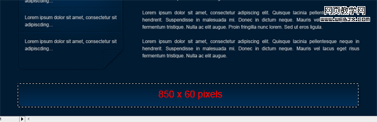
頁腳轉成程式碼
40. 頁腳很好轉換:直接用前面建立好的 #footer,裡面用 <p> 放版權文字。
代碼段 17
<!--FOOTER STARTS--> <div id="footer"> <p>Copyright © Six Revisions - Design By Richard Carpenter</p> </div> <!--FOOTER ENDS-->
樣式化頁腳
41. 加入:
代碼段 18
#footer { float: left; width: 850px; background-image: url(images/footer.png); background-repeat: no-repeat; height: 60px; margin-top: 40px; padding-top: 25px; text-align: center; }
代碼段 18 說明
把 #footer 的 background-image 設為 footer.png,向左浮動,用 no-repeat 確保背景不重複。寬高與 footer.png 相等,最後用 margin-top 在頂部留出空間。
完成!
到這裡就全部做完了。謝謝閱讀本教學,很期待大家的問題與回饋。如果每一步都跟著做,最終效果應該會像這樣:
(點擊圖片查看線上 demo)
- 上一篇文章: CSS 實作:用 dl、dt、dd 模擬表格版面
- 下一篇文章: CSS 多欄配置範例:兩欄、三欄與等高欄的寫法