自適應布局分兩類:高度和寬度,方法有很多,我用三列布局舉例,我就列幾個通俗易懂的例子呗,懂了三列的,兩列的原理一樣,呵呵哒。
效果圖如下:高度自適應——寬度自適應

1,高度自適應布局
原理就是把每個模塊設置為絕對定位,然後設置中間自適應的模塊的top和bottom屬性的值分別為頭部模塊和底部模塊的高,然後中間模塊的高度就自適應了。代碼如下:
html代碼:
<body>
        <div class="top">
            120px
        </div>
        <div class="main">
            自適應
        </div>
        <div class="bottom">
            120px
        </div>
</body>
css代碼:
.top{
    width: 100%;
    height: 120px;
    position: absolute;
    background-color: greenyellow;

}
.main{
    position: absolute;
    width: 100%;
    top: 120px;
    bottom: 120px;
    background-color: azure;
    height: auto;
}
.bottom{
    position: absolute;
    bottom: 0;//別漏了
    width: 100%;
    height: 120px;
    background-color:greenyellow ;
}
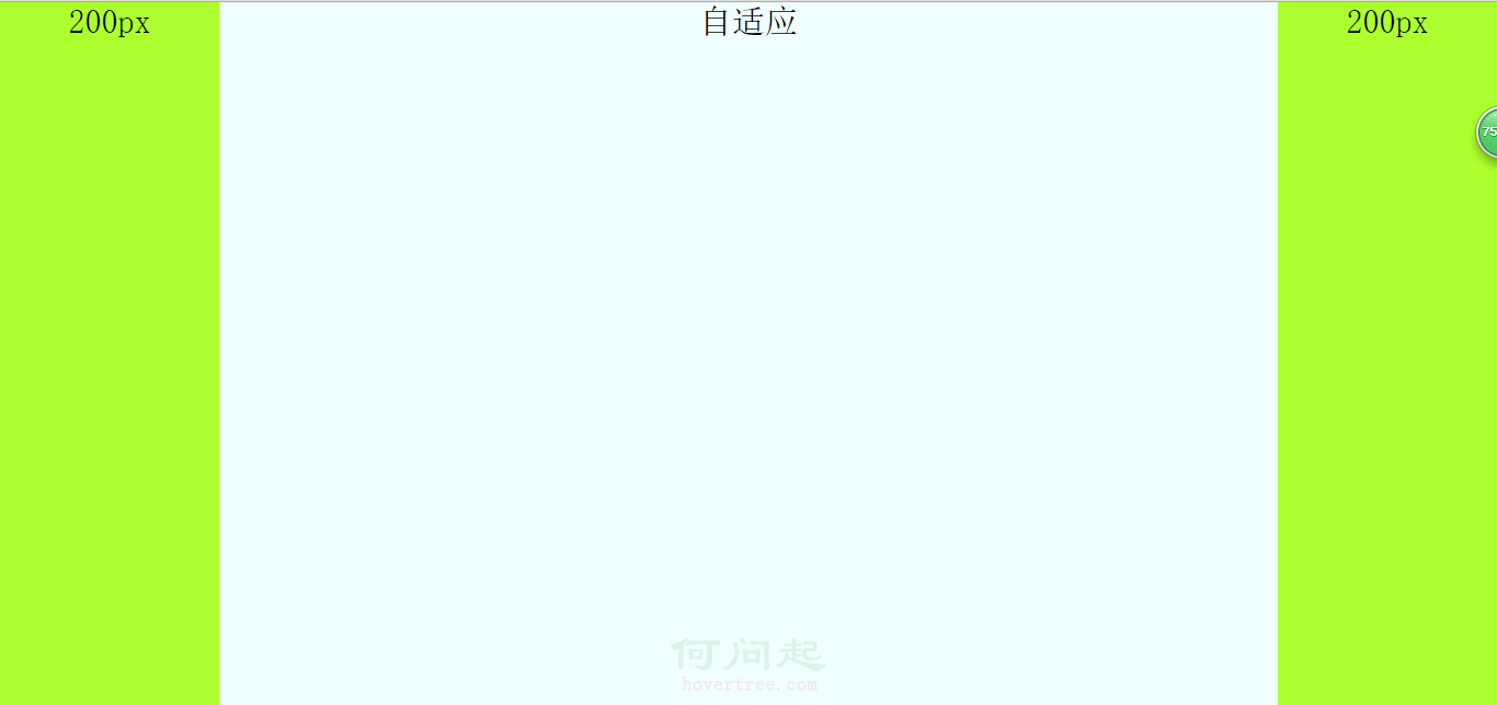
2,寬度自適應,有三種方法,分別是用絕對定位;利用margin,中間模塊先渲染;自身浮動。
a,用絕對定位來設置寬度自適應布局,原理:針對自適應模塊使用絕對定位,在把left和right設置為左右兩列的寬,其實原理和高度自適應一樣,另外左右兩列分別左右浮動。
html代碼:
<body>
        <div class="left">
            200px
        </div>
        <div class="main">
            自適應
        </div>
        <div class="right">
            200px
        </div>
</body>
css代碼:
html,
body {
    margin: 0;
    height: 100%;
    padding: 0;
    font-size: 30px;
    font-weight: 500;
    text-align: center;
}

.left,
.right {
    width: 200px;
    display: inline;
    height: 100%;
    background-color: greenyellow;
}

.left {
    float: left;
}

.right {
    float: right;
}

.main {
    position: absolute;
    left: 200px;
    right: 200px;
    height: 100%;
    background-color: azure;
    display: inline;
}
b,中間一列優先渲染的自適應三列布局,優先渲染(加載)的關鍵:內容在html裡面必須放在前面。自適應的div必須放在left和right前面且包含在一個父div裡。父div,left和right模塊都向左浮動,然後對自適應的div(就是父div裡的子div)設置margin:0 200px,然後對left的margin-left的屬性值設置為100%的負數,就是margin-left:-100%;對right的margin-left的屬性值設置為自身寬度的負數,就是margin-left:-200px。
注意:自適應的div必須放在left和right前面且包含在一個父div裡。
html代碼:
<body>
        <div class="main"> <!--看清楚,這裡用一個父div包住-->
            <div class="content">
                自適應
            </div>
        </div>
        <div class="left">
            200px
        </div>
        <div class="right">
            200px
        </div>
</body>
css代碼:
html,
body {
    margin: 0;
    height: 100%;
    padding: 0;
    font-size: 30px;
    font-weight: 500;
    text-align: center;
}

.main {
    width: 100%;
    height: 100%;
    float: left;
}

.main .content {
    margin: 0 200px;
    background-color: azure;
    height: 100%;
}

.left,
.right {
    width: 200px;
    height: 100%;
    float: left;
    background-color: greenyellow;
}

.left {
    margin-left: -100%; //important
}

.right {
    margin-left: -200px; //important
}
c,自身浮動,原理:中間列設置margin屬性,就是把左右列分別左右浮動。注意:使用這個方法布局自適應的話,必須把自適應的那一列在html中放在left和right後面。
html代碼:
<body>
        <div class="left">
            200px
        </div>
        <div class="right">
            200px
        </div>
        <div class="main">
            自適應
        </div>
</body>
css代碼:
html,
body {
    margin: 0;
    height: 100%;
    padding: 0;
    font-size: 30px;
    font-weight: 500;
    text-align: center;
}
.main {
    margin: 0 200px;
    height: 100%;
    background-color: azure;
}
.left,
.right {
    width: 200px;
    height: 100%;
    background-color: greenyellow;
}
.left {
    float: left;
}
.right {
    float: right;
}
- 上一頁:px,em和rem的區別
- 下一頁:BFC之寬度自適應布局篇