用CSS3 animation實現逐幀動畫
編輯:CSS特效代碼
CSS3裡的animation屬性非常強大,但我自己平時用得不多。最近一次面試正好被問到,趁現在有時間就對animation做個小總結,同時實現一個逐幀動畫的demo作為練習。
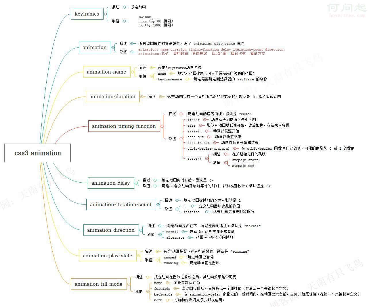
animation屬性一覽
由於animation的屬性比較多,在W3C上看著有點眼花,乾脆自己做了一份導圖,以後想查閱就一目了然了。
用animation實現逐幀動畫
熟悉了animation的屬性之後,得找個簡單的小項目練練手。逐幀動畫很有意思,先跑一個滿足一下自己。
思路很簡單:給元素一個雪碧圖作為背景,然後用關鍵幀動畫去改變background-position,關鍵代碼如下:
@keyframes run{ from{ background-position: 0 0; } to{ background-position: -1540px 0 ; } } div{ width:140px; height:140px; background: url(run.png) ; animation-name:run; animation-duration:1s; animation-iteration-count:infinite; }

但跑起來後我們發現,每一幀之間都是滑動過渡,並不是我們想要的效果,這是為什麼呢?
原來animation默認以ease方式過渡,它會在每個關鍵幀之間插入補間動畫,所以動畫效果是連貫的。
知道了原因就好辦了,解決思路就是:
@keyframes run{ 0%, 8%{ /*動作一*/ } 9.2%, 17.2%{ /*動作二*/ } ... }
step1:動作之間停留8幀,0%設置動作一,動作一結束在8%。
step2:動作之間過渡1.2幀,9.2%設置動作二,動作二結束在17.2%。
完整代碼:


<!DOCTYPE html> <html lang="en"> <head> <meta charset="UTF-8"> <title>css3逐幀動畫</title> <style> @keyframes run{ 0%, 8%{ background-position: 0 0; } 9.2%, 17.2%{ background-position: -140px 0; } 18.4%, 26.4%{ background-position: -280px 0 ; } 27.6%, 35.6%{ background-position: -420px 0 ; } 36.8%, 44.8%{ background-position: -560px 0 ; } 46%, 54%{ background-position: -700px 0 ; } 55.2%, 63.2%{ background-position: -840px 0 ; } 64.4%, 72.4%{ background-position: -980px 0 ; } 73.6%, 81.6%{ background-position: -1120px 0 ; } 82.8%, 90.8%{ background-position: -1400px 0 ; } 92%, 100%{ background-position: -1540px 0 ; } } @-webkit-keyframes run{ 0%, 8%{ background-position: 0 0; } 9.2%, 17.2%{ background-position: -140px 0; } 18.4%, 26.4%{ background-position: -280px 0 ; } 27.6%, 35.6%{ background-position: -420px 0 ; } 36.8%, 44.8%{ background-position: -560px 0 ; } 46%, 54%{ background-position: -700px 0 ; } 55.2%, 63.2%{ background-position: -840px 0 ; } 64.4%, 72.4%{ background-position: -980px 0 ; } 73.6%, 81.6%{ background-position: -1120px 0 ; } 82.8%, 90.8%{ background-position: -1400px 0 ; } 92%, 100%{ background-position: -1540px 0 ; } } div{ width:140px; height:140px; background: url(https://hovertree.com/hvtimg/bjafab/2ttynnpi.png) ; animation:run 1s infinite; -webkit-animation:run 1s infinite; animation-fill-mode : backwards; -webkit-animation-fill-mode : backwards; } </style> </head> <body> <div></div> </body> </html>
View Code
另外還有一種實現方法,就是利用steps(),也就是幀之間的階躍動畫,這個在W3C裡沒有寫,先貼個圖。
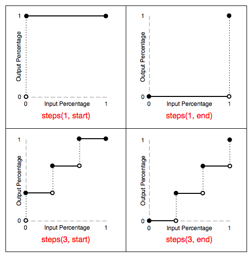
由上圖可知:
steps(1,start):動畫一開始就跳到100%,直到這一幀(不是整個週期)結束。
steps(1,end):保持0%的樣式直到這一幀(不是整個週期)結束。
另外也可以直接設置 animation-timing-function:step-start/step-end。
step-start效果等同於steps(1,start),step-end效果等同於steps(1,end)。
最終效果,由於錄製的問題可能有點卡頓,有興趣的同學可以直接複製代碼去跑一下:

完整代碼:
<!DOCTYPE html> <html lang="en"> <head> <meta charset="UTF-8"> <title>css3逐幀動畫</title> <style> @keyframes run{ 0%{ background-position: 0 0; } 8.333%{ background-position: -140px 0; } 16.666%{ background-position: -280px 0 ; } 25.0%{ background-position: -420px 0 ; } 33.333%{ background-position: -560px 0 ; } 41.666%{ background-position: -700px 0 ; } 50.0%{ background-position: -840px 0 ; } 58.333%{ background-position: -980px 0 ; } 66.666%{ background-position: -1120px 0 ; } 75.0%{ background-position: -1260px 0 ; } 83.333%{ background-position: -1400px 0 ; } 91.666%{ background-position: -1540px 0 ; } 100%{ background-position: 0 0 ; } } @-webkit-keyframes run{ 0%{ background-position: 0 0; } 8.333%{ background-position: -140px 0; } 16.666%{ background-position: -280px 0 ; } 25.0%{ background-position: -420px 0 ; } 33.333%{ background-position: -560px 0 ; } 41.666%{ background-position: -700px 0 ; } 50.0%{ background-position: -840px 0 ; } 58.333%{ background-position: -980px 0 ; } 66.666%{ background-position: -1120px 0 ; } 75.0%{ background-position: -1260px 0 ; } 83.333%{ background-position: -1400px 0 ; } 91.666%{ background-position: -1540px 0 ; } 100%{ background-position: 0 0 ; } } div{ width:140px; height:140px; background: url(https://hovertree.com/hvtimg/bjafab/2ttynnpi.png) ; animation:run 1s steps(1, start) infinite; -webkit-animation:run 1s steps(1, start) infinite; } </style> </head> <body> <div></div> </body>
View Code
- 上一篇文章: @import與link的區別及如何選擇
- 下一篇文章: CSS Flex 彈性盒模型布局應用:置中、對齊、等分與自適應