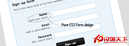
不少 CSS 使用者對 table 有抗拒感,尤其在表單上——明明已經是 XHTML+CSS 的時代,表單卻還普遍用 table 排版。本文示範一種更貼近語意的做法。
先說清楚立場
這不是要全面否定 table。表格在呈現表格資料時有其語意價值,該用的時候就該用。多數情況下我會用純 CSS 設計表單,但並不反對 table 本身——重點是在正確的地方使用正確的元素,而不是為了追求 DIV+CSS 的形式而刻意繞路。用 table 直接排版,有時確實比用 CSS 去「模擬」表格(display: table)更快。
第一步:HTML 結構
建立 index.html,把以下內容貼進 <body>:
<div id="stylized" class="myform">
  <form id="form" name="form" method="post" action="index.html">
    <h1>Sign-up form</h1>
    <p>This is the basic look of my form without table</p>

    <label>Name
      <span class="small">Add your name</span>
    </label>
    <input type="text" name="name" id="name" />

    <label>Email
      <span class="small">Add a valid address</span>
    </label>
    <input type="text" name="email" id="email" />

    <label>Password
      <span class="small">Min. size 6 chars</span>
    </label>
    <input type="text" name="password" id="password" />

    <button type="submit">Sign-up</button>
    <div class="spacer"></div>
  </form>
</div>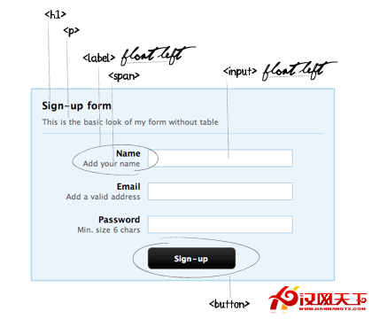
結構上有三個決定值得說明:
每個 input 都配一個 label,而且 label 緊接在 input 之前。這不只是為了排版方便——用 <label> 包住或對應輸入框,點擊文字就能聚焦到欄位,是無障礙的基本要求,也擴大了滑鼠操作的熱區。
用 <span> 承載輔助說明,而不是另開一個 <p>。因為這段文字語意上屬於該欄位的補充,不是獨立段落。
用 <button> 而非 <input type="submit">,因為 button 元素能容納更多樣式彈性。
第二步:CSS 樣式
body {
  font-family: "Lucida Grande", "Lucida Sans Unicode", Verdana, Arial, Helvetica, sans-serif;
  font-size: 12px;
}
p, h1, form, button { border: 0; margin: 0; padding: 0; }
.spacer { clear: both; height: 1px; }

/* ---------- 表單容器 ---------- */
.myform {
  margin: 0 auto;
  width: 400px;
  padding: 14px;
}

/* ---------- stylized ---------- */
#stylized {
  border: solid 2px #b7ddf2;
  background: #ebf4fb;
}
#stylized h1 {
  font-size: 14px;
  font-weight: bold;
  margin-bottom: 8px;
}
#stylized p {
  font-size: 11px;
  color: #666666;
  margin-bottom: 20px;
  border-bottom: solid 1px #b7ddf2;
  padding-bottom: 10px;
}
#stylized label {
  display: block;
  font-weight: bold;
  text-align: right;
  width: 140px;
  float: left;
}
#stylized .small {
  color: #666666;
  display: block;
  font-size: 11px;
  font-weight: normal;
  text-align: right;
  width: 140px;
}
#stylized input {
  float: left;
  font-size: 12px;
  padding: 4px 2px;
  border: solid 1px #aacfe4;
  width: 200px;
  margin: 2px 0 20px 10px;
}
#stylized button {
  clear: both;
  margin-left: 150px;
  width: 125px;
  height: 31px;
  background: #666666 url(img/button.png) no-repeat;
  text-align: center;
  line-height: 31px;
  color: #FFFFFF;
  font-size: 11px;
  font-weight: bold;
}
幾個關鍵技巧
label 浮動左側並固定 140px 寬,input 也浮動左側,兩者於是並排。140px 加上 input 的 margin-left: 10px,就是 150px——正好等於 button 的 margin-left,讓按鈕與輸入框的左邊界對齊。這些數字之間的關聯是刻意設計的,改動其中一項時要同步檢查其他兩項。
.small 設為 display: block,讓輔助說明換行顯示在欄位名稱下方,並靠 text-align: right 與主標籤右對齊。
.spacer 負責清除浮動。因為 label 與 input 都浮動了,若不清除,後續元素會往上貼。這是在 flex 普及前的標準做法。
button 用 line-height: 31px 搭配 height: 31px 做垂直居中,這招只對單行文字有效。
結語
以上只是一種排版方式,你可以依自己的設計調整。如果你有更簡潔或更嚴謹的表單佈局做法,歡迎對照自己的專案驗證——畢竟表單的無障礙細節(label 關聯、錯誤提示、鍵盤順序)比視覺排版更值得花時間。
原文:Clean and Pure CSS Form Design