本文示範如何僅用 CSS 背景圖設計搜尋框,重點是解決「圖片按鈕與輸入框對不齊」這個老問題。
原本的寫法與它的問題
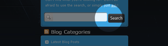
過去我會這樣做:
<form method="get" id="searchform" action="https://example.com/">
  <fieldset>
    <input type="text" value="" name="s" id="s" />
    <input type="image" src="img_url" id="searchsubmit" value="Search" class="btn" />
  </fieldset>
</form>視覺上看起來沒問題,但有一個麻煩:<input type="image"> 產生的圖片按鈕不會與文字欄自動對齊,必須靠負的 margin-top 硬拉回來。這種用魔法數字補洞的做法,只要字級或行高變了就會再次歪掉。
改良做法
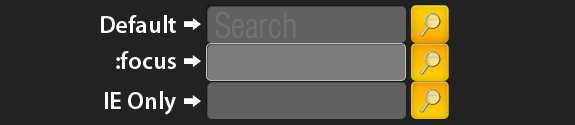
改用 <button> 標籤並以 CSS 掛背景圖,讓輸入框與按鈕自然對齊。同時加上 :focus 偽類提升可用性。
這個做法的好處:
- 對齊是自然發生的,不需要負 margin
- 按鈕與輸入框共用同一張背景圖(CSS Sprite)
- 支援
:focus的瀏覽器會有焦點狀態 - 按鈕可以有 hover 效果
HTML
<form method="get" id="searchform" action="https://example.com/">
  <fieldset class="search">
    <input type="text" class="box" />
    <button class="btn" title="Submit Search">Search</button>
  </fieldset>
</form>
CSS
fieldset.search {
  border: none;
  width: 243px;
  margin: 0 auto;
  background: #222;
}
.search input, .search button {
  border: none;
  float: left;
}
.search input.box {
  color: #fff;
  font-size: 1.2em;
  width: 190px;
  height: 30px;
  padding: 8px 5px 0;
  background: #616161 url(search_bg.gif) no-repeat;
  margin-right: 5px;
}
.search input.box:focus {
  background: #616161 url(search_bg.gif) no-repeat left -38px;
  outline: none;
}
.search button.btn {
  width: 38px;
  height: 38px;
  cursor: pointer;
  text-indent: -9999px;
  background: #fbc900 url(search_bg.gif) no-repeat top right;
}
.search button.btn:hover {
  background: #fbc900 url(search_bg.gif) no-repeat bottom right;
}
程式碼裡的三個關鍵設計
① 用一個 background-position 切出四種狀態
整張 search_bg.gif 是一張垂直排列的 sprite:上方是輸入框的正常狀態,-38px 處是聚焦狀態,右側上下兩格則是按鈕的正常與 hover 狀態。透過 left/right 與不同的 Y 偏移,一張圖就切出四種外觀,只發一個 HTTP 請求。
② text-indent: -9999px 隱藏文字但保留語意
按鈕裡的「Search」文字在視覺上被推走,但螢幕閱讀器與搜尋引擎仍讀得到。這比用 display: none 好,後者會讓輔助工具完全略過該文字。
③ 尺寸要算清楚
width: 243px 的 fieldset = 190(輸入框)+ 5(margin)+ 38(按鈕)+ 10(內距餘裕)。任何一項改動,總寬都要重算,否則會出現一條突兀的深色底露出來。
IE 的特別處理
條件註釋
<!--[if lte IE 7]>
<link rel="stylesheet" type="text/css" href="ie.css" />
<![endif]-->
ie.css
.search input.box {
  background: url(search_bg_ie.gif) no-repeat right bottom;
  /* 專為 IE 準備的獨立背景圖,且必須右對齊 */
}
問題是這樣的:IE6 與 IE7 在輸入過長文字時,會讓背景圖隨內容水平捲動,視覺上很糟。解法是給 IE 一張獨立的背景圖,並把對齊方式反轉為 right bottom——這樣即使捲動,露出的仍是圖片的固定端。
順手提一件事
範例中的 outline: none 會移除鍵盤使用者的焦點提示,對無障礙有負面影響。實務上建議改為保留 outline,或另外提供明顯的 :focus-visible 樣式。視覺乾淨與可用性之間,後者應該優先。
- 上一篇文章: 打造可重複使用的空白 CSS 模板:Reset、目錄註釋與常用類
- 下一篇文章: CSS 裡的黃金比例:用 1.62 決定欄寬、行高與間距