margin 負值的妙用:八個實戰案例
編輯:CSS詳解
關於 margin 負值,相信每個人都有自己的一套用法。這裡把日常最常派上用場的幾種效果整理出來,與大家分享。
先看原理圖:
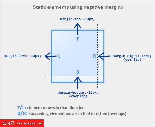
先搞懂它怎麼運作
一、top/left 的負值會讓元素往該方向位移。
/* 元素向上位移 10px */
.demo { margin-top: -10px; }
二、bottom/right 的負值不會讓元素自己移動,而是把後面的元素「拉」過來,覆蓋在自己上層。
/* 所有緊隨 .demo 之後的元素向上位移 10px */
.demo { margin-bottom: -10px; }
補充:若元素沒有設定寬度,給它左右負 margin 會同時往兩側擴展寬度,視覺上看起來就像加了 padding。
案例一:三欄顯示(不用浮動、不用額外標籤)
清單太長時我們直覺會用浮動分欄,但其實換個思路也行。
<!doctype html>
<html lang="en">
<head>
<meta charset="UTF-8">
<title>negative margin 之列表三欄顯示</title>
<style>
*{margin:0;padding:0;font-size:14px;}
.goback{clear:both;height:30px;line-height:30px;text-align:center;}
ul {list-style:none;}
li {width:100px;overflow:hidden;white-space:nowrap;text-overflow:ellipsis;line-height:1.3em;}
.col2 {margin-left:120px;}
.col3 {margin-left:240px;}
.top {margin-top:-2.6em;}
</style>
</head>
<body>
<ul>
<li class="col1">第一欄項目一</li>
<li class="col1">第一欄項目二</li>
<li class="col2 top">第二欄項目一</li>
<li class="col2">第二欄項目二</li>
<li class="col3 top">第三欄項目一</li>
<li class="col3">第三欄項目二</li>
</ul>
</body>
</html>
思路是:第二、三欄用 margin-left 推開,再用一個負的 margin-top 把它們拉回第一欄的高度起點,於是看起來就成了並排的三欄。
案例二:選項卡的疊加效果
最常見的應用場景就是 Tab:選中項要「壓」住下方的邊框線。
<!doctype html>
<html lang="en">
<head>
<meta charset="UTF-8">
<title>negative margin 之疊加</title>
<style>
*{list-style:none;margin:0;padding:0;font-size:12px;}
.clearfix:after { clear:both; display:block; height:0; line-height:0; visibility:hidden; content:""; }
.clearfix {*zoom:1;}
.goback{clear:both;height:30px;line-height:30px;text-align:center;}
.demo{width:400px;}
.tab{ border-bottom:1px solid #66CC66; }
.tab li{ float:left; display:inline; margin-left:8px; }
.tab li a{ background-color:#CCFFCC; border:1px solid #66CC66; color:#666; display:block; margin-bottom:-1px; padding:0 5px; line-height:20px; float:left; font-weight:bold; text-decoration:none; }
.tab li .current, .tab li a:hover{ background-color:#fff; border-bottom:1px solid #fff; _position:relative; }
.cont{padding:10px;border:1px solid #6c6;border-top:0;}
</style>
</head>
<body>
<div class="demo">
<div id="demo2">
<ul class="tab clearfix">
<li><a href="#" class="current">Tab One</a></li>
<li><a href="#">Tab Two</a></li>
<li><a href="#">Tab Three</a></li>
<li><a href="#">Tab Four</a></li>
</ul>
</div>
<div class="cont">內容區</div>
</div>
</body>
</html>
關鍵就是 margin-bottom:-1px:讓 Tab 往下多長 1px,正好蓋住容器上邊框,選中狀態自然浮現。
案例三:兩欄流式布局
固定寬度的兩欄很簡單,配合浮動就搞定;要自適應則可以借負 margin 幫忙。
<!doctype html>
<html lang="en">
<head>
<meta charset="UTF-8">
<title>negative margin 之兩列自適應布局</title>
<style>
*{list-style:none;margin:0;padding:0;font-size:12px;}
.goback{clear:both;height:30px;line-height:30px;text-align:center;}
.layout{width:960px;margin:0 auto;background:#f5f5f5;}
.main{float:left;width:100%;height:300px;margin:0 -200px 0 0;background:#ccc;}
.main-wrap{margin:0 210px 0 0;}
.aside{float:left;width:200px;height:300px;background:#f5f5f5;}
</style>
</head>
<body>
<div class="layout">
<div class="main">
<div class="main-wrap">main</div>
</div>
<div class="aside">aside</div>
</div>
</body>
</html>
主欄先浮動並佔滿 100% 寬度,再用 margin-right:-200px 把右側讓出的空間「吃掉」,讓側欄得以疊上去;主欄內容則靠內層容器的 margin 避開重疊區。三欄同理。
案例四:去掉多餘的外邊距
圖文並排時,每行最後一個元素的右 margin 該怎麼處理?單獨設一個類把它歸零?靠父層裁切?其實用負 margin 最省事。
<!doctype html>
<html lang="en">
<head>
<meta charset="UTF-8">
<title>negative margin 之去除多余外邊距</title>
<style>
*{list-style:none;margin:0;padding:0;font-size:12px;}
.clearfix:after { clear:both; display:block; height:0; line-height:0; visibility:hidden; content:""; }
.clearfix {*zoom:1;}
.goback{clear:both;height:30px;line-height:30px;text-align:center;}
.demo{width:320px;margin:0 auto;padding:10px 0;*overflow:hidden;background:green;}
.figure-list{margin:0 -10px 0 0;}
.figure-list li{float:left;width:100px;height:100px;margin:0 10px 10px 0;background:#f5f5f5;}
</style>
</head>
<body>
<div class="demo">
<ul class="figure-list clearfix">
<li>item-1</li>
<li>item-2</li>
<li>item-3</li>
<li>item-4</li>
<li>item-5</li>
<li>item-6</li>
</ul>
</div>
</body>
</html>
把清單的 margin-right 設為 -10px,剛好抵掉每行最後一項多出的 10px,容器寬度就不會被擠到換行。
- 上一篇文章: 加快瀏覽器頁面渲染速度的實用建議
- 下一篇文章: 純 CSS 做出提示氣泡的三種方法