在網站上經常會看到如下圖這樣的常用組件模塊,這也是我近期一個專案裡的實作。這裡把自己的做法整理出來,與大家分享。

每個區域模塊的長度和高度都不一樣,那麼用 CSS 該怎麼實現這類可擴展的組件,讓它無論寬窄都能自適應呢?
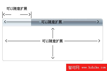
先看模塊的 title 部分
先做一張足夠寬的 title 背景圖片,如下圖(bg_title.gif):

1. 定義 title 的背景和高度,讓圖片從右邊開始顯示:
.title { background:url(bg_title.gif) no-repeat top right; height:26px}

2. 定義標題部分,我們用 h1 標籤,同樣定義背景、高度與其他樣式,讓圖片從底部開始顯示:
.title h1 { margin:0; padding:0; background:url(bg_title.gif) no-repeat left bottom; height:26px; line-height:26px; text-align:center; color:#000; font-weight:700}

3. 根據實際需要,分別定義 title 背景的寬度和 h1 標題的寬度:
.title_width1 { width:300px}
.h1_width1 { width:80px}
再看圓角的內容部分
把內容區切成兩張圖:一張從右邊圓角開始、足夠大的圖片(bg1.gif):
還有一張左邊圓角細線圖片(bg2.gif):

1. 定義右側大圖背景(bg1.gif)。2. 定義左邊圓角細線圖片背景(bg2.gif),這裡用 p 標籤:
.box { background:url(bg1.gif) right bottom; margin-bottom:15px}
.box p { margin:0; padding:10px; background:url(bg2.gif) no-repeat left bottom; line-height:20px;}
.box_width1 { width:300px}
實現原理與 title 部分完全一致:都是靠兩張背景圖分居左右、各自對齊一側,再透過外層與內層標籤疊加拼出完整的圓角效果,寬度則交由外掛的 width 類自由控制,從而能輕鬆適配不同長度的內容。
完整示例代碼
<!DOCTYPE html PUBLIC "-//W3C//DTD XHTML 1.0 Transitional//EN" "https://www.w3.org/TR/xhtml1/DTD/xHtml1-transitional.dtd">
<html xmlns="https://www.w3.org/1999/xhtml">
<head>
<meta http-equiv="Content-Type" content="text/html; charset=utf-8" />
<title>網站常用組件的擴展性做法</title>
<style type="text/css">
<!--
* { font-size:12px}
.title { background:url(bg_title.gif) no-repeat top right; height:26px}
.title h1 { margin:0; padding:0; background:url(bg_title.gif) no-repeat left bottom; height:26px; line-height:26px; text-align:center; color:#000; font-weight:700}
.title_width1 { width:300px}
.h1_width1 { width:80px}
.title_width2 { width:350px}
.h1_width2 { width:100px}
.title_width3 { width:400px}
.h1_width3 { width:140px}
.box { background:url(bg1.gif) right bottom; margin-bottom:15px}
.box p { margin:0; padding:10px; background:url(bg2.gif) no-repeat left bottom; line-height:20px;}
.box_width1 { width:300px}
.box_width2 { width:350px}
.box_width3 { width:400px}
-->
</style>
</head>
<body>
<div class="title title_width1">
<h1 class="h1_width1">四字標題</h1>
</div>
<div class="box box_width1">
<p>我們站的流量在短短4個月內增加了3倍,廣告盈利也翻倍了。很高興得到易聞公司的服務,希望易聞在搜索引擎營銷的道路上越走越好!</p>
</div>
<div class="title title_width2">
<h1 class="h1_width2">六字標題標題</h1>
</div>
<div class="box box_width2">
<p>……(內容略,可重複堆疊以測試不同高度)</p>
</div>
<div class="title title_width3">
<h1 class="h1_width3">八個字長度的標題</h1>
</div>
<div class="box box_width3">
<p>……(內容略)</p>
</div>
</body>
</html>
瀏覽顯示效果如下:
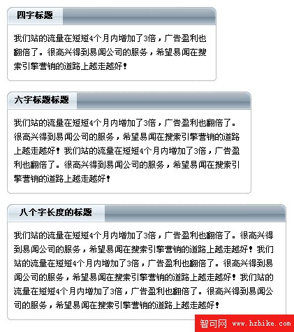
透過這種「背景圖左右分置 + 外掛寬度類」的做法,同一套組件就能輕鬆適配不同標題長度與內容多寡,兼具擴展性與美感,非常適合用在需要大量重複區塊的頁面中。
- 上一篇文章: 用 CSS 標示導航條當前所在頻道
- 下一篇文章: 用純CSS打造具有立體感的輸入框