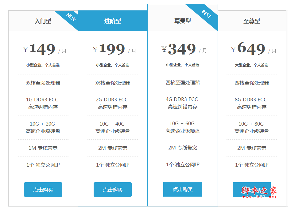
產品頁通常有多套價格方案,並排展示讓使用者直接比較,是最有效的呈現方式。主機商的方案頁就是典型場景。本文用純 HTML + CSS3 實作一個含陰影、圓角與 hover 動畫的價格表。
HTML:其實不是 table
所渭的「價格表」並不是 table 元素,而是 ul + li 的組合,靠 CSS 排成並列的卡片。這樣做的好處是資料本身就是清單語意,樣式完全不受限。
<div id="pricePlans">
  <ul id="plans">
    <li class="plan">
      <ul class="planContainer">
        <li class="title"><h2>入門型 VPS</h2></li>
        <li class="price"><p>¥149/<span>月</span></p></li>
        <li>
          <ul class="options">
            <li>小型企業、個人首選</li>
            <li>雙核至強處理器</li>
            <li>1G DDR3 ECC <span>高速糾錯記憶體</span></li>
            <li>10G + 20G <span>高速企業級硬碟</span></li>
            <li>1M <span>專線頻寬</span></li>
            <li>1 個 <span>獨立公網 IP</span></li>
          </ul>
        </li>
        <li class="button"><a href="#">點擊購買</a></li>
      </ul>
    </li>
    <!-- 其餘方案結構重複 -->
  </ul>
</div>
CSS:排版與動畫
#plans, #plans ul, #plans ul li {
  margin: 0; padding: 0; list-style: none;
}

/* 清除浮動 */
#pricePlans:after {
  content: ''; display: table; clear: both;
}
#pricePlans { zoom: 1; max-width: 69em; margin: 2em auto; }

/* 卡片本體 */
#pricePlans #plans .plan {
  background: #fff;
  float: left;
  text-align: center;
  border-radius: 5px;
  border: 1px solid #d3d3d3;
  -webkit-box-shadow: 0 1px 3px rgba(0,0,0,0.1);
  box-shadow: 0 1px 3px rgba(0,0,0,0.1);
  width: 23%;
  margin: 0 1.33% 20px 0;
  -webkit-transition: all .25s;
  -moz-transition: all .25s;
  -ms-transition: all .25s;
  -o-transition: all .25s;
  transition: all .25s;
}

/* hover 放大:最關鍵的動畫 */
#pricePlans #plans .plan:hover {
  -webkit-transform: scale(1.04);
  -moz-transform: scale(1.04);
  -ms-transform: scale(1.04);
  -o-transform: scale(1.04);
  transform: scale(1.04);
}

/* 方案名稱 */
.planContainer .title h2 {
  font-size: 2.125em; font-weight: 300; color: #3e4f6a;
  margin: 0; padding: .6em 0;
}
.planContainer .title h2.bestPlanTitle {
  background: #3e4f6a;
  background: -webkit-linear-gradient(top, #475975, #364761);
  background: linear-gradient(top, #475975, #364761);
  color: #fff;
  border-radius: 5px 5px 0 0;
}

/* 價格區 */
.planContainer .price p {
  background: #3e4f6a;
  background: -webkit-linear-gradient(top, #475975, #364761);
  background: linear-gradient(top, #475975, #364761);
  color: #fff;
  font-size: 1.2em; font-weight: 700;
  height: 2.6em; line-height: 2.6em;
  margin: 0 0 1em;
}
.planContainer .price p.bestPlanPrice { background: #f7814d; }  /* 推薦方案用橘色凸顯 */
.planContainer .price p span { color: #8394ae; }
幾個值得學的細節
1. 用百分比而非固定像素:width: 23% 搭配 margin: 0 1.33%,四張卡片剛好排成一列且留有間距。這比 width: 300px 靈活得多,視窗縮放不會破版。
2. transition + transform 做 hover:transition: all .25s 搭配 transform: scale(1.04),滑過時卡片平滑放大。用 transform 而非改 width,是因為 transform 不觸發重排(reflow),動畫更順。
3. 用 class 標記推薦方案:bestPlanTitle 與 bestPlanPrice 兩個 class 把推薦方案的標題與價格換成橘色,視覺焦點自然集中。
4. 漸層的標準寫法:範例保留了 -webkit- 等前綴,但 linear-gradient 的舊語法 linear-gradient(top, ...) 已不適用於標準。請改用 linear-gradient(to bottom, #475975, #364761)。
可以再進一步的地方
範例用的是 float 排版。今天更推薦 Grid,程式碼少一半且能輕鬆做響應式:
#plans {
  display: grid;
  grid-template-columns: repeat(auto-fit, minmax(220px, 1fr));
  gap: 20px;
}
這段一行取代所有 float、width 百分比與清除浮動的程式碼,視窗變窄時還會自動換行。另外記得為 hover 效果加上 @media (prefers-reduced-motion: reduce) 的降級處理,尊重使用者對動態效果的偏好。
- 上一篇文章: CSS + jQuery 實作網頁在線答題功能
- 下一篇文章: 近期值得參考的 15 組 CSS / jQuery 酷炫動畫