純手寫 CSS 導航條:不使用任何圖片(附效果圖)
編輯:布局實例
下面透過循序漸進的步驟,帶你用純 CSS 手寫一條不使用任何圖片的橫向導航條。
第一步:建立 my.html,寫入基本結構:
<!DOCTYPE html PUBLIC "-//W3C//DTD XHTML 1.0 Transitional//EN" "https://www.w3.org/TR/xhtml1/DTD/xhtml1-strict.dtd">
<html xmlns="https://www.w3.org/1999/xhtml">
<head>
<link rel="stylesheet" type="text/css" href="xin.css">
</head>
<body>
<div class="nav">
  <ul>
    <li><a href="#">辛星PHP</a></li>
    <li><a href="#">辛星Python</a></li>
    <li><a href="#">辛星CSS</a></li>
    <li><a href="#">辛星HTML</a></li>
    <li><a href="#">辛星jQuery</a></li>
    <li><a href="#">辛星Java</a></li>
  </ul>
</div>
</body>
</html>第二步:新建 xin.css,先去掉列表的小圓點:
.nav ul{list-style-type: none;}第三步:讓列表項由縱向改為橫向排列,透過浮動實現:
.nav ul{list-style-type: none;}
.nav li{float:left;}第四步:此時各項連在一起,為它們設定寬度與背景色使其分開:
.nav li{float:left;width: 100px;background:#CCC;}第五步:設定鏈接的鼠標樣式並去掉下劃線:
.nav a:link{color:#666;background: #CCC;text-decoration: none;}
.nav a:visited{color: #666;text-decoration: none;}
.nav a:hover{color: #FFF;font-weight: bold;text-decoration: underline;background: #0F0;}第六步:調整 a 的尺寸,讓它撐滿並居中:
.nav a{display: block;text-align: center;height: 30px;font-weight: bold;}第七步:最後為 li 加上間距與合適的行高,讓各項之間有呼吸感:
.nav ul{list-style-type: none;}
.nav li{float:left;width: 100px;margin-left: 3px;line-height: 30px;}
.nav a:link{color:#666;background: #CCC;text-decoration: none;}
.nav a:visited{color: #666;text-decoration: none;}
.nav a:hover{color: #FFF;font-weight: bold;text-decoration: underline;background: #0F0;}
.nav a{display: block;text-align: center;height: 30px;font-weight: bold;}
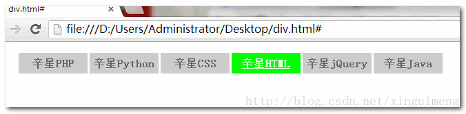
至此,一條完全不依賴圖片、純手寫的 CSS 導航條就完成了:
- 上一篇文章: 用 CSS 為表格實現背景顏色漸變效果
- 下一篇文章: 用 display:table-cell 實現 DIV 垂直居中的方法