CSS 虛線邊框設定:border dashed 完整教學
編輯:布局基本知識
邊框常見的樣式有實線與虛線兩種。虛線由 border 的樣式值 dashed 負責,語法與實線幾乎一樣,只是把 solid 換掉。
一、關鍵值對照
dashed:虛線。
solid:實線。
其他如 dotted、double、groove 在部分瀏覽器上呈現不一致,需要精準還原設計稿時,建議以 dashed 為主。
二、四邊虛線
border: 1px dashed #333;
四邊皆為 1px 寬的深灰虛線。
三、單邊虛線
border-left: 1px dashed #333;   /* 左邊框 */
border-right: 1px dashed #333;  /* 右邊框 */
border-top: 1px dashed #333;    /* 上邊框 */
border-bottom: 1px dashed #333; /* 下邊框 */
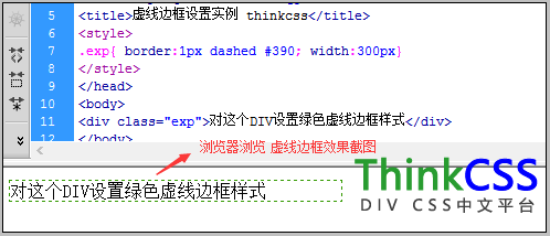
四、實作範例
<!DOCTYPE html>
<html>
<head>
<meta http-equiv="Content-Type" content="text/html; charset=utf-8" />
<title>虛線邊框設定範例</title>
<style>
.exp { border: 1px dashed #390; width: 300px; }
</style>
</head>
<body>
<div class="exp">這個 DIV 設定了綠色虛線邊框</div>
</body>
</html>
五、組合技巧
虛線很適合做「區塊之間的輕分隔」,因為視覺重量比實線低。常見組合是只設一條邊:
.item + .item { border-top: 1px dashed #EEE; }
這行讓相鄰的列表項之間出現虛線分隔,首項不會多一條線。
另外,若需要不同邊用不同樣式(例如上實下虛),也可以拆開寫:
.box { border-top: 2px solid #333; border-bottom: 1px dashed #999; }
掌握 border 的三要素——寬度、樣式、顏色——任何邊框組合都能自由變化。
- 上一篇文章: CSS overflow:auto 超出範圍自動出現捲軸
- 下一篇文章: width:auto 是可以省略的寬度設定