用 React + CSS3 復刻微信拆紅包動畫
編輯:關於CSS
微信紅包曾經引發過一連串的營銷熱潮,這種交互形式大家都不陌生。本文本著娛樂與學習的精神,用 React 配合 CSS3 簡單復刻拆紅包的動畫效果。
第一步:用 CSS3 畫出紅包
.redpack {
  height: 450px;
  background: #A5423A;
  width: 300px;
  left: 0;
  top: 0;
  border-radius: 10px;
  margin: 0 auto;
}
.topcontent {
  height: 300px;
  border: 1px solid #BD503A;
  background-color: #BD503A;
  border-radius: 10px 10px 50% 50% / 10px 10px 15% 15%;
  box-shadow: 0px 4px 0px -1px rgba(0, 0, 0, 0.2);
}
#redpack-open {
  width: 100px;
  height: 100px;
  border: 1px solid #FFA73A;
  background-color: #FFA73A;
  border-radius: 50%;
  color: #fff;
  font-size: 20px;
  display: inline-block;
  margin-top: -50px;
  box-shadow: 0px 4px 0px 0px rgba(0, 0, 0, 0.2);
}
<div class='redpack'>
  <!-- 紅包的頂部蓋子 -->
  <div class="topcontent"></div>
  <!-- 拆紅包的按鈕 -->
  <div id="redpack-open"></div>
</div>
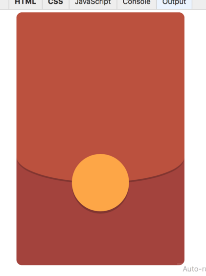
這裡有個小技巧:topcontent 的 border-radius 用了斜槓語法 10px 10px 50% 50% / 10px 10px 15% 15%,讓頂部保持小圓角、底部呈現大弧度的橢圓收口,紅包蓋子的獨特造型就是這麼來的。按鈕則用負的 margin-top 疊上去,形成半嵌的效果。
效果預覽
第二步:用 React 管理狀態切換
用 React 實現的關鍵在於用 state 控制紅包當前的階段:是等待拆開,還是已經拆開並展示結果。核心代碼如下:
import React from 'react';

class ReadPacket extends React.Component {
  constructor(props) {
    super(props);
    this.state = {
      animation: false,
      status: 0   // 0: 等待拆開  1: 拆開後
    };
  }

  render() {
    var bonus = this.props.thanks ? 0 : parseFloat(this.props.surveyInfo.bonus);

    if(this.state.status == 0) {
      return (
        <div className='redpack-container' id='redpack-container'>
          <div className='redpack'>
            <div className='topcontent'>
              <div id='redpack-opened'>
                <div className='redpack-avatar'>
                  <img src='https://placehold.it/80x80' alt='頭像' width='80' height='80'/>
                </div>
              </div>
              <h2 style={{marginTop: 80, color: 'white'}}>獎勵</h2>
              <span className='redpack-text'>點擊下方按鈕領取紅包</span>
              <div className='redpack-description white-text'>恭喜發財 大吉大利</div>
            </div>
            <div id='redpack-open'
                 className={this.state.animation ? 'rotate' : ''}
                 onClick={this.openRedPacket.bind(this)} >
              <span>拆紅包</span>
            </div>
          </div>
        </div>
      );
    }
    else if (bonus == 0) {
      // 謝謝參與
      return (
        <div className='redpack-container' id='redpack-container'>
          <div className='redpack'>
            <div className='topcontent-open'>
              <div className='redpack-avatar'>
                <span id='close'></span>
              </div>
              <h1 style={{marginTop: 180, color: 'white'}}> 謝謝參與 </h1>
              <span className='redpack-text'>多多參與的獎勵的機會更多哦</span>
              <br/>
              <a onClick={this._toWallet.bind(this)}
                 style={{cursor:'pointer', textDecoration: 'underline', color: 'white'}}>
                去我的賬戶查看
              </a>
            </div>
            <div id='redpack-opened'>
              <div className='redpack-avatar'>
                <img src='https://placehold.it/80x80' alt='頭像' width='80' height='80'/>
              </div>
            </div>
          </div>
        </div>
      );
    }
    else {
      // 顯示獎勵金額
      return (
        <div className='redpack-container' id='redpack-container'>
          <div className='redpack'>
            <div className='topcontent-open'>
              <div className='redpack-avatar'>
                <span id='close'></span>
              </div>
              <h1 className='white-text' style={{marginTop: 180}}> {bonus.toFixed(2)} </h1>
              <span className='redpack-text'>獎勵積分已經存入您的賬戶</span>
              <a className='btn-flat white-text'
                 onClick={this._toWallet.bind(this)}
                 style={{textDecoration: 'underline'}}>
                去我的賬戶查看積分
              </a>
            </div>
            <div id='redpack-opened'>
              <div className='redpack-avatar'>
                <img src='https://placehold.it/80x80' alt='頭像' width='80' height='80'/>
              </div>
            </div>
          </div>
        </div>
      );
    }
  }

  stopAnimation() {
    this.setState({ animation: false });
  }

  showResult() {
    this.setState({ status: 1 });
  }

  openRedPacket() {
    this.setState({ animation: true });
    setTimeout(this.stopAnimation.bind(this), 3000);
    setTimeout(this.showResult.bind(this), 4000);
  }

  _toWallet() {
    // 跳轉到錢包
    window.location.hash = '/wallet';
  }
}

export default ReadPacket;
實現思路拆解
整個交互被拆成了三個狀態分支:status 為 0 時渲染未拆開的紅包,bonus 為 0 時渲染「謝謝參與」,其餘情況渲染具體金額。
動畫的觸發鏈路是:點擊按鈕 → 把 animation 置為 true,CSS 類名 rotate 生效,蓋子開始旋轉 → 3 秒後停止動畫狀態 → 4 秒後把 status 切成 1,畫面切換到結果頁。用兩個 setTimeout 串起節奏,簡單有效。
如果要在正式項目中使用,這裡有幾處值得改進:把 setTimeout 換成 CSS animationend 事件回調會更精確(避免動畫被中斷時定時器仍然觸發);把魔法數字 3000 和 4000 抽成常量;另外打開紅包是一個典型的「一次性操作」,真實場景下需要請求服務端接口來決定結果,前端狀態只是表現層。
- 上一篇文章: CSS3 實現頭像 hover 旋轉效果
- 下一篇文章: CSS3 類選擇器進階:結合元素選擇器與多類選擇器