用 CSS 畫六邊形,聽起來像幾何作圖,實際上只需要兩個技巧的組合:以偽元素 :before 與 :after 在元素前後各產生一個方塊,再用 border 把它們變成三角形,分別貼在元素左右兩端。整個圖形就是「矩形 + 左三角形 + 右三角形」。
之所以特別偏愛六邊形,是因為它貼近生物分子、基因這類視覺語彙。在相關產業的網站上做功能導航或標籤時,六邊形比方形更有辨識度,也能靠不同填色清楚區分各模組。
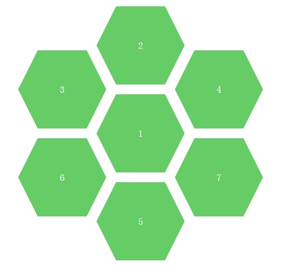
完整頁面其實就是七個六邊形以絕對定位排成蜂巢狀。拆出其中任何一個來看,結構都一樣:
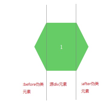
第一步:用 border 畫三角形
這是最經典的 CSS 圖形技巧。把一個元素的寬高設為 0,然後給它四邊不同顏色的粗 border,每條邊就會呈現梯形,兩兩相接後在四個角形成三角形。
.arrow {
    display: inline-block;
    width: 0;
    height: 0;
    border-style: solid;
    border-width: 100px;               /* 順序同 padding:上、右、下、左 */
    border-color: red blue orange gray; /* 同樣是上、右、下、左 */
}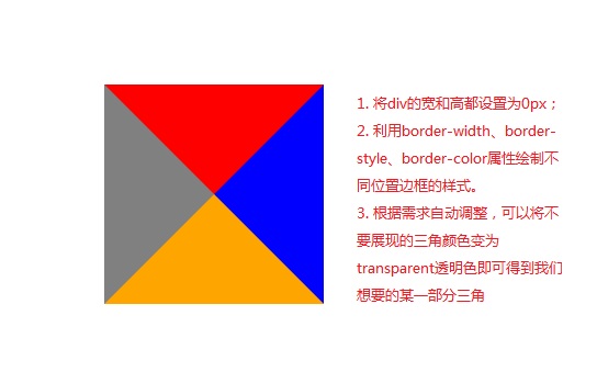
接著,把不想要的三邊設成 transparent,只留下需要的那一個三角形:
.arrow {
    display: inline-block;
    width: 0;
    height: 0;
    border-top: 100px solid transparent;
    border-bottom: 100px solid transparent;
    border-right: 100px solid transparent;
    border-left: 100px solid gray;     /* 只保留右向三角形 */
}
第二步:用偽元素補上兩端
:before 會在元素內容之前插入一個偽元素,:after 則插在之後。若要插入文字,可以在 content 屬性中寫入,例如 content: "HELLO WORLD";但我們這裡不需要額外內容,所以 content 留成空字串即可,重點是把這兩個偽元素變成三角形並定位到左右兩側。
完整代碼
.sharp {
    min-width: 100px;
    height: 160px;
    background: #6c6;
    display: inline-block;
    position: absolute;
    line-height: 160px;   /* 讓文字垂直居中 */
    color: #FFF;
    font-size: 20px;
    text-align: center;
}

/* 左側三角形 */
.sharp:before {
    content: "";
    width: 0;
    border-top: 80px solid transparent;
    border-bottom: 80px solid transparent;
    border-right: 40px solid #6c6;
    position: absolute;
    left: -40px;
    top: 0;
}

/* 右側三角形 */
.sharp:after {
    content: "";
    width: 0;
    border-top: 80px solid transparent;
    border-bottom: 80px solid transparent;
    border-left: 40px solid #6c6;
    position: absolute;
    right: -40px;
    top: 0;
}
這裡有個數字關係值得注意:元素高度 160px,上下三角形各取 80px,正好等於高度的一半;左右突出 40px,則決定六邊形斜邊的斜率。若想讓六邊形更「瘦長」或更「扁平」,只要調整這兩個比例即可,不必重畫。
排列成蜂巢
多個六邊形要拼在一起,靠的是絕對定位。為容器設定 position: relative(或讓容器成為定位父元素),再給每個六邊形一組 top / left 座標:
#sharpContainer {
    width: 100%;
    height: 600px;
    position: relative;
}

#sharpContainer .center      { top: 200px; left: 300px; }
#sharpContainer .top         { top: 20px;  left: 300px; }
#sharpContainer .top-left    { top: 110px; left: 140px; }
#sharpContainer .top-right   { top: 110px; left: 460px; }
#sharpContainer .bottom      { top: 380px; left: 300px; }
#sharpContainer .bottom-left { top: 290px; left: 140px; }
#sharpContainer .bottom-right{ top: 290px; left: 460px; }
結構上只要準備一個容器 div,裡面放七個同時帶有 sharp 類別與位置類別的 div 即可。由於每個六邊形共用同一份 .sharp 樣式,要區分不同模組時,只要額外指定 background-color 與對應的三角形 border-color(記得偽元素的填色也要一起換)就能完成配色。
歸根究柢,六邊形只是「三角形 + 偽元素定位」的組合技。把這兩個基礎技巧吃透之後,箭頭、對話框尖角、五邊形標籤、甚至更複雜的不規則裝飾,都能用同樣的思路自己推導出來,不必再處處依賴圖片。