30 個出色的下拉選單與滑動選單設計案例
編輯:關於網頁技巧
每次幫客戶做網站,我都得為「水平選單的二級導覽到底怎麼呈現最好」糾結一陣,而且還不能看起來像十年前那種風格。於是我就開始四處找靈感,找到了一批使用下拉選單或滑動選單的網站。想來你也會對這些案例有興趣。
歡迎告訴我你怎麼看這些選單設計:好在哪裡、壞在哪裡,各有什麼優缺點。如果你手上有很棒的中文網站選單案例,也歡迎寫在留言裡,對我和大家都會有幫助。
Carreras Con Futuro

Apple Reviews

Archer Group

Energy Cell

Artkasa

Bnet

BuySellAds

Ink'd

Daily RT

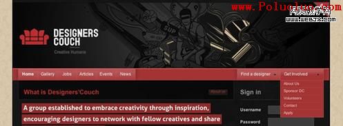
Designers Couch
Design Slurp

Behance Network

EctoMachine

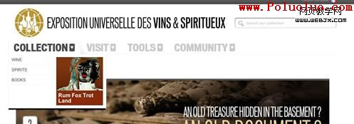
Exposition Universelle Des Vins & Spiritueux
Explovent

Hungry For Change – Food Inc. Movie

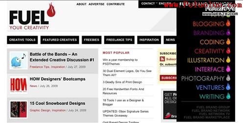
Fuel Your Creativity
Freelance Switch

Ipix Solutions

Koodoz Design

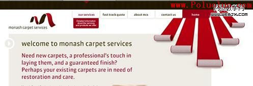
Monash Carpet Services
Mac Appstorm

Media Temple
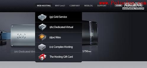
Website Temple

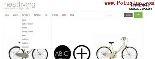
Nest Living
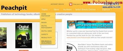
Peachpit
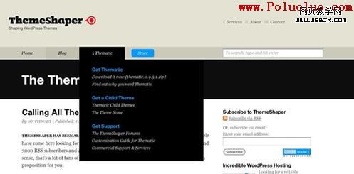
Theme Shaper
Threadless

Vimeo

Washington State Leadership Academy

- 上一篇文章: 狹窄版面裡放一張大照片:三種實用的處理方法
- 下一篇文章: 25 個雜誌與新聞風格網站設計靈感