關於 display: box 與 box-flex 的實測筆記
編輯:HTML5教程
這兩天做手機專案時用到了這組 CSS3 新屬性。由於當時尚未被所有瀏覽器支援,使用時需要加上前綴。以下是實際案例。
HTML 結構:
<div class="s-indLine">
  <div class="s-indNav s-indIntro">
    <span class="s-icon"></span>
    <p>品牌介紹</p>
  </div>
  <div class="s-indNav s-indInfo">
    <span class="s-icon"></span>
    <p>優惠資訊</p>
  </div>
</div>
<div class="s-indLine">
  <div class="s-indNav s-indShop">
    <span class="s-icon"></span>
    <p>門店查找</p>
  </div>
  <div class="s-indNav s-indGoods">
    <span class="s-icon"></span>
    <p>熱賣商品</p>
  </div>
</div>
CSS:
.s-indLine{
  display: -webkit-box;
  display: -moz-box;
  display: box;
  margin-bottom: 10px;
  -moz-box-orient: horizontal;
  -webkit-box-orient: horizontal;
  box-orient: horizontal;
}
.s-indLine .s-indNav{
  -webkit-box-flex: 5;
  -moz-box-flex: 5;
  box-flex: 5;
  -webkit-box-sizing: border-box;
  -moz-box-sizing: border-box;
  box-sizing: border-box;
  border-radius: 10px;
  color: #ffffff;
  text-align: center;
  height: 105px;
  padding: 15px 0px;
  font-size: 1.5rem;
}
.s-indLine .s-indNav:first-child{ margin-right: 10px; }
.s-indIntro{ background: #4eb566; }
.s-indInfo{ background: #ffa422; }
.s-indShop{ background: #7788f2; }
.s-indGoods{ background: #ef604d; }
.s-indLine .s-indNav .s-icon{
  width: 50px; height: 50px;
  display: inline-block;
  background-repeat: no-repeat;
  background-size: 100% 100%;
  background-position: center;
}
.s-indIntro .s-icon{ background-image: url("group.png"); }
.s-indInfo .s-icon{ background-image: url("group.png"); }
.s-indShop .s-icon{ background-image: url("group.png"); }
.s-indGoods .s-icon{ background-image: url("group.png"); }
也可以不給子元素設 box-flex,直接用 width 代替,margin 與 padding 同樣照常使用。效果如下:
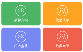
在 Chrome 或其他以 -webkit 為核心的瀏覽器上測試,上面的程式碼沒有問題;但在 Firefox 下卻出現了狀況:

解法是必須幫父元素補上 width,例如 width: 100% 即可。
另外 Firefox 還有一個差異:前面提到「可以不設 box-flex 而改用 width」,但 Firefox 並不認 width,必須明確設定 box-flex 才會生效。
- 上一篇文章: 用 HTML5 + JS 三步做出像素風頭像生成器
- 下一篇文章: H5 行動端頁面設計實戰心得:字體、排版、動效到想法