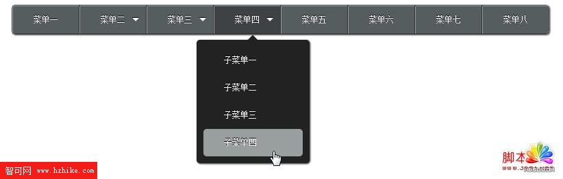
下拉式選單過去多半得靠 JavaScript 控制顯示與隱藏,但有了 CSS3 的 :hover、transition、transform 與 nth-child 之後,完全不用一行 JavaScript 就能做出層層展開的效果。以下拆解實作要點。
HTML 結構
主選單用 nav 包 ul,每個有子項目的 li 裡再嵌一組 dl:dt 放那個向上的小三角箭頭,各個 dd 則是子選單項目。
<!DOCTYPE html>
<html>
<head>
  <meta charset="UTF-8" />
  <title>純 HTML + CSS 導航選單</title>
  <style>
    /* 樣式見下方 */
  </style>
</head>
<body>
<nav>
  <ul class="clear">
    <li class="first"><a href="#">選單一</a></li>

    <li>
      <span class="Darrow"></span>
      <a href="#">選單二</a>
      <dl>
        <dt><span class="arrow"></span></dt>
        <dd><a href="#">子選單一</a></dd>
        <dd><a href="#">子選單二</a></dd>
        <dd><a href="#">子選單三</a></dd>
      </dl>
    </li>

    <li>
      <span class="Darrow"></span>
      <a href="#">選單三</a>
      <dl>
        <dt><span class="arrow"></span></dt>
        <dd><a href="#">子選單一</a></dd>
        <dd><a href="#">子選單二</a></dd>
        <dd><a href="#">子選單三</a></dd>
      </dl>
    </li>

    <li>
      <span class="Darrow"></span>
      <a href="#">選單四</a>
      <dl>
        <dt><span class="arrow"></span></dt>
        <dd><a href="#">子選單一</a></dd>
        <dd><a href="#">子選單二</a></dd>
        <dd><a href="#">子選單三</a></dd>
        <dd><a href="#">子選單四</a></dd>
      </dl>
    </li>

    <li><a href="#">選單五</a></li>
    <li><a href="#">選單六</a></li>
    <li><a href="#">選單七</a></li>
    <li class="last"><a href="#">選單八</a></li>
  </ul>
</nav>
</body>
</html>
CSS 樣式
* { margin: 0; padding: 0; }

/*  clearfix:讓 nav 正確包住浮動的 li */
.clear:after {
  clear: both;
  content: ".";
  display: block;
  height: 0;
  visibility: hidden;
}

nav {
  display: inline-block;
  border: 1px solid #505255;
  border-bottom: 1px solid #282C2F;
  border-radius: 5px;
  margin: 50px;
  box-shadow: 1px 1px 3px #292929;
}

li {
  list-style: none;
  float: left;
  border-right: 1px solid #2E3235;
  position: relative;      /* 關鍵:作為子選單的定位基準 */
  background: #555D5F;
}

li:hover {
  background: #3E4245;
  transition: background 1s ease-out;
}

/* 一級選單連結 */
li > a {
  display: block;
  height: 40px;
  line-height: 40px;
  padding: 0 30px;
  font-size: 12px;
  color: #fff;
  text-shadow: 0 -1px 0 #000;
  text-decoration: none;
  white-space: nowrap;
  border-left: 1px solid #999E9F;
  border-top: 1px solid #999E9F;
  position: relative;
  z-index: 100;
}

/* 首項與末項的圓角修飾 */
li.first a { border-radius: 4px 0 0 4px; }
li.last   { border-right: 0 none; }

/* 二級選單容器 */
dl {
  position: absolute;
  top: 40px;
  left: -25px;
  width: 165px;
  background: #222;
  border-radius: 5px;
  box-shadow: 1px 1px 3px #292929;
  z-index: 10;
}

li:hover dl {
  top: 50px;
  display: block;
  width: 145px;
  padding: 10px;
}

dl a {
  background: transparent;
  border: 0 none;
  border-radius: 5px;
  transition: background 0.5s ease-out;
  z-index: 50;
}

dl a:hover {
  color: #FFF;
  background: #999E9F;
  transition: background 0.3s ease-in-out, color 0.3s ease-in-out;
}

/* 子項目:靠 opacity 與 margin 做出逐個滑入的錯落感 */
dd {
  margin-top: -40px;
  opacity: 0;
  width: 145px;
  transition-property: all;
}

li:hover dd {
  margin-top: 0;
  opacity: 1;
}

/* 用 nth-child 給每個項目不同的過渡時間,形成依序展開 */
li dd:nth-child(1) { transition-duration: 0.1s; }
li dd:nth-child(2) { transition-duration: 0.2s; }
li dd:nth-child(3) { transition-duration: 0.3s; }
li dd:nth-child(4) { transition-duration: 0.4s; }

/* 展開時才顯示的小三角 */
dt {
  display: none;
  margin-top: -25px;
  padding-top: 15px;
  height: 10px;
}

li:hover dt { display: block; }

/* 純 CSS 向下箭頭:用 border 三角形拼出來 */
.Darrow {
  float: right;
  margin: 18px 10px 0 0;
  border-width: 5px;
  border-color: #FFF transparent transparent transparent;
  border-style: solid;
  width: 0;
  height: 0;
  line-height: 0;
  overflow: hidden;
  cursor: pointer;
}

/* 展開後指向下方的箭頭:用 transform 旋轉正方形 */
.arrow {
  display: block;
  width: 10px;
  height: 10px;
  margin: -5px auto 0;
  background: #222;
  transform: rotate(45deg);
}
幾個關鍵技巧說明
定位基準。每個 li 都設了 position: relative,二級選單 dl 才能以該項目為基準做絕對定位,準確貼在主選單下方。
逐項展開的錯落感。子項目預設 opacity: 0 並以負的 margin-top 收疊;滑入時改為 opacity: 1、margin-top: 0。再透過 nth-child 給每一項不同的 transition-duration,就會產生由上而下依序滑出的層次感——這是整份程式最精彩的地方,完全不需要 JavaScript 排定計時器。
純 CSS 箭頭。.Darrow 用「四邊 border、上下左右透明」的常見手法做出三角形;.arrow 則是把一個正方形 rotate(45deg) 轉成菱形,只露出上半部遮住的部分形成尖角。
z-index 的分工。一級連結給 z-index: 100、二級容器 10、二級連結 50,確保展開的選單永遠壓在其他元素之上,不會被蓋住。
相容性提醒
原始範例的註解寫著「只支援 Chrome、Firefox」,這是因為它大量依賴 opacity 過渡、transform 與 nth-child 等 CSS3 特性,IE8 及以下並不支援。以今天的標準來看,這些屬性都已是 Baseline 功能,可以直接使用;若仍需兼顧舊版 IE,建議改用 jQuery 的 hover() 搭配 slideDown() 做為降級方案,或是以 CSS 提供「直接顯示、不做動畫」的簡化版本。另外要留意觸控裝置並沒有 hover 行為,行動版通常需要改用點擊展開(例如 :focus-within 或 <details> 元素)來處理。
- 上一篇文章: 用 HTML5 + CSS3 打造一個會自我驗證的註冊表單
- 下一篇文章: HTML5 Canvas API 完整圖解:從路徑到像素操作