手機頁面 rem 適配方案:從原理到完整範例
編輯:HTML5詳解
手機頁面的設計稿一般是以 640 為基準,但實際的手機螢幕尺寸千差萬別。那麼,要怎麼做出一份能適配所有機型的頁面呢?
常見的解法有兩種:rem 布局與百分比布局。這兩套我都實作過,目前更推薦 rem——它的控制粒度更細,尺寸換算也更直觀。
rem 的相容性
rem 支援 Mozilla Firefox 3.6+、Apple Safari 5+、Google Chrome、IE9+、Opera 11+。至於 IE6~IE8,就别硬上了。好消息是現在的行動裝置瀏覽器基本都支援,多數情況下你完全不必再為 IE 核心的內建瀏覽器操心。
rem 的計算公式
舉例來說,若 html 設定 font-size: 16px,那麼 1rem = 16px,換算下來 640px = 640 / 16 = 40rem。
個人建議把基準值設成 100px,後續換算會輕鬆很多——像素值除以 100 就是 rem 值,幾乎不用動腦。
首先在 CSS 中替 html 定義一個 100px 的基準:
html { font-size: 100px; } /* 設定基礎 rem */
接著是最核心的一段 JS:它會依據頁面實際寬度動態調整基礎 rem 值。
new function () {
  var _self = this;
  _self.width = 640;      // 設定預設最大寬度
  _self.fontSize = 100;   // 預設字體大小
  _self.widthProportion = function () {
    var p = (document.body && document.body.clientWidth
      || document.getElementsByTagName("html")[0].offsetWidth) / _self.width;
    return p > 1 ? 1 : p < 0.5 ? 0.5 : p;
  };
  _self.changePage = function () {
    document.getElementsByTagName("html")[0].setAttribute(
      "style",
      "font-size:" + _self.widthProportion() * _self.fontSize + "px !important"
    );
  };
  _self.changePage();
  window.addEventListener("resize", function () { _self.changePage(); }, false);
};
這段腳本的邏輯並不複雜:先算出當前視窗寬度與設計基準寬度的比例,再乘上基準字級寫回 html 的 font-size。同時把上下限鎖在 0.5 到 1 之間,避免在超窄或超寬螢幕上出現比例失控的情況。最後掛上 resize 監聽,讓橫向旋轉或視窗縮放時也能即時重算。
Demo 預覽:
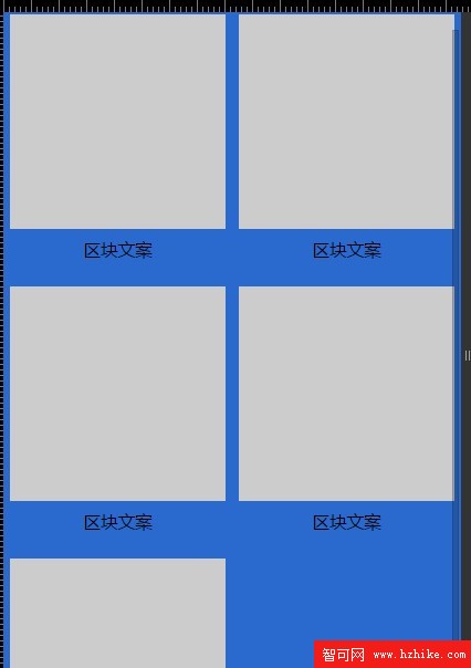
以下是完整可執行的範例:
<!DOCTYPE html>
<html>
<head>
<meta name="viewport" content="width=device-width, initial-scale=1.0, user-scalable=0, minimum-scale=1.0, maximum-scale=1.0">
<meta charset="utf-8">
<title>rem 基礎布局</title>
<script type="text/javascript">
new function () {
  var _self = this;
  _self.width = 640;      // 設定預設最大寬度
  _self.fontSize = 100;   // 預設字體大小
  _self.widthProportion = function () {
    var p = (document.body && document.body.clientWidth
      || document.getElementsByTagName("html")[0].offsetWidth) / _self.width;
    return p > 1 ? 1 : p < 0.5 ? 0.5 : p;
  };
  _self.changePage = function () {
    document.getElementsByTagName("html")[0].setAttribute(
      "style",
      "font-size:" + _self.widthProportion() * _self.fontSize + "px !important"
    );
  };
  _self.changePage();
  window.addEventListener("resize", function () { _self.changePage(); }, false);
};
</script>
<style type="text/css">
/*=== base style ===*/
* { margin: 0px; padding: 0px; }
ul { list-style: none; }
.wrap {
  min-width: 320px;
  max-width: 640px;
  width: 100%;
  margin: 0px auto;
  background: #2a6ace;
  font-family: "微軟雅黑", "helvetica neue", tahoma, "hiragino sans gb", stheiti,
    "wenquanyi micro hei", \5FAE\8F6F\96C5\9ED1, \5B8B\4F53, sans-serif;
  font-size: 12px;
}
.pro { width: 6.2rem; margin: 0px auto; padding-top: 20px; overflow: hidden; }
.clearfix:after { content: ""; height: 0; display: block; clear: both; }
.clearfix { zoom: 1; }
.pro ul { width: 6.4rem; }
.pro li { width: 3rem; height: 3.6rem; float: left; margin: 0 0.2rem 0.2rem 0; }
.pro li .box { width: 3rem; height: 3rem; background: #ccc; }
.pro li p { font-size: 0.24rem; line-height: 0.6rem; text-align: center; }
</style>
</head>
<body>
<div class="wrap">
  <div class="pro">
    <ul class="clearfix">
      <li><div class="box"></div><p>區塊文案</p></li>
      <li><div class="box"></div><p>區塊文案</p></li>
      <li><div class="box"></div><p>區塊文案</p></li>
      <li><div class="box"></div><p>區塊文案</p></li>
      <li><div class="box"></div><p>區塊文案</p></li>
    </ul>
  </div>
</div>
</body>
</html>
把這份程式碼存成 html 檔,用手機或瀏覽器的裝置模擬模式打開,再來回拖動視窗寬度,你就能看到所有以 rem 為單位的區塊同步縮放——這正是 rem 布局有別於固定像素的核心價值。
- 上一篇文章: 移動端前端實戰筆記:那些反覆踩到的 JS 與 CSS 地雷
- 下一篇文章: 用自訂字體做小圖示:CSS3 Icon Font 實作全流程
熱門推薦
HTML5 Canvas 標籤全解:起源、與 SVG/VML 的差異及繪圖 API
HTML 特殊符號怎麼寫?實體名稱與十進位編碼對照表
HTML5 JavaScript API 擴充(二):地理位置 API 完整學習筆記
在 Android 應用中嵌入 Mugeda HTML5 動畫
用 HTML5 做一個能離線運行的 iPhone 應用:實作俄羅斯方塊
HTML5 建立 Canvas 元素的基礎示例
HTML5 遊戲開發實作:用 jQuery 打造乒乓 Ping Pong 遊戲(二)
HTML5 技術教學:跨螢幕互動三消遊戲怎麼做
HTML5 本地儲存與用戶端資料庫實戰:Web Storage、SQLite 與表單應用