為什麼要寫這篇
之前寫過一篇關於 WebApp 自適應螢幕的文章,但內容偏技術細節,多數人讀起來吃力。所以有了這份圖文並茂的實作版:做一個簡單頁面,把切圖、切版、雪碧圖、自適應腳本串成完整流程,中間踩到的坑也一併記下來。
範例原始碼:
https://github.com/iwangx/WebApp
線上預覽:
https://CSSsprite.herokuapp.com/
前置準備
PSD 稿:最重要的東西,用來量尺寸與切圖。這裡用的是網路上找來的稿子,寬度 640px。切圖這件事我傾向自己做,而不是丟回給 UI——量過、切過,寫 CSS 時心裡才有底。
CSS 雪碧圖製作工具:把多張小圖拼成一張並同時產生 CSS 程式碼的小程式(自行開發)。
WebStorm:前端開發主力工具。
MarkMan:量尺寸、取顏色。
Photoshop:切圖。
Sass:CSS 預處理器。
第一步:切圖
用 Photoshop 依照 PSD 把需要的圖片一張張切出來:
畫面偏白,在這裡看不太清楚,實際檔案本身是乾淨的。
第二步:搭建目錄框架
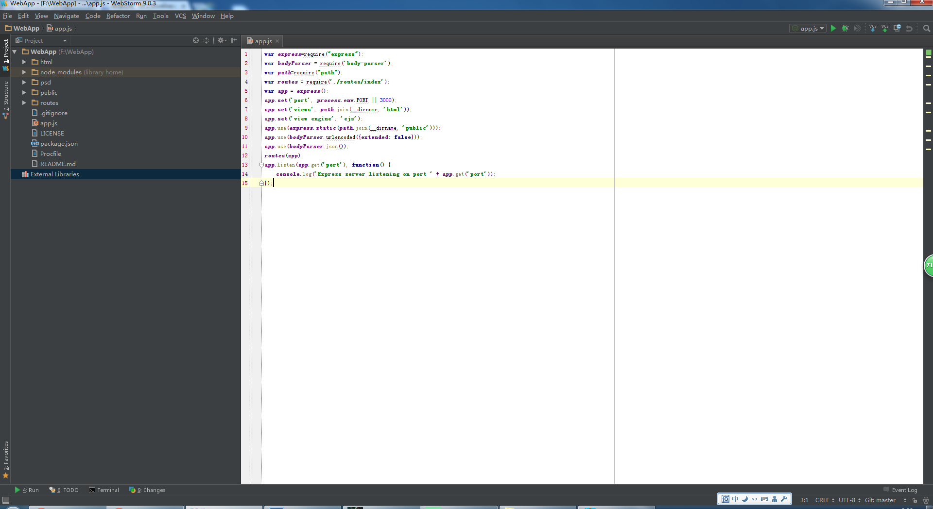
整體結構大致如上,對應原始碼 https://github.com/iwangx/WebApp
第三步:CSS 結構
樣式以 Sass 作為預處理工具,拆成三個檔案:
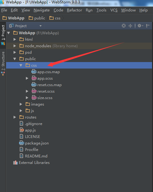
reset.sCSS:元素樣式重置,把各瀏覽器預設值拉平。
app.sCSS:單一頁面的樣式。
size.sCSS:存放手機端自適應用的 1–400 尺寸變數。
把尺寸抽成變數是整套做法的關鍵:設計稿量出來多少就寫多少,實際輸出時再由變數換算成相對單位,之後要調整基準不必翻遍整份樣式表。
第四步:JS 結構
JS 裡最重要的是自適應的那段腳本(resize.js)。這個範例刻意保持極簡,沒有引入 zepto 或其他函式庫——目的只是示範,不需要額外依賴。
第五步:HTML 頁面結構

版面切成四塊:
header:頂部標題列。
nav:主要導覽。
controller:中間的列表內容。
footer:底部標籤列。
第六步:產生雪碧圖
把切好的小圖丟進雪碧圖工具,產出合併圖與對應的 CSS:
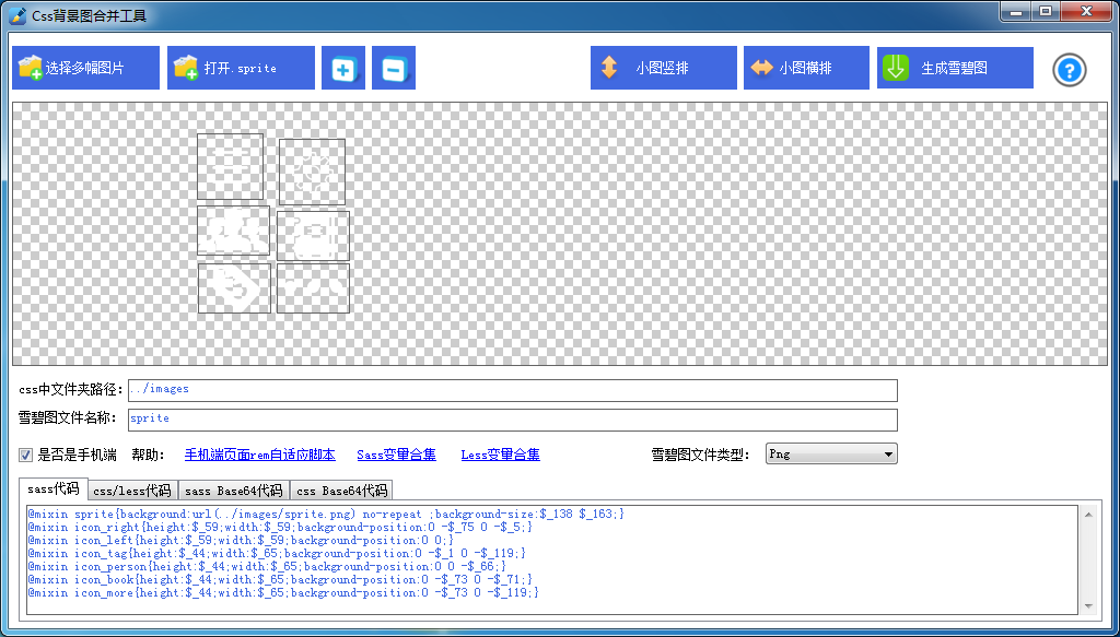
接著把產生的程式碼貼進 css 目錄下的 app.sCSS:
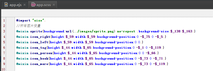
前提是先引入定義變數的 size 檔,否則 $_* 這類變數無法解析,編譯就會直接報錯。
第七步:頁面與樣式編碼
Sass 部分。所有尺寸都寫成 $_* 變數,也就是量出來的原始像素值,連字級也一樣:
@import "size";

// 所有圖片變數
@mixin sprite { background: url(../images/sprite.png) no-repeat; background-size: $_138 $_163; }
@mixin icon_right { height: $_59; width: $_59; background-position: 0 -$_75; }
@mixin icon_left  { height: $_59; width: $_59; background-position: 0 0; }
@mixin icon_tag   { height: $_44; width: $_65; background-position: 0 -$_119; }
@mixin icon_person{ height: $_44; width: $_65; background-position: 0 -$_66; }
@mixin icon_book  { height: $_44; width: $_65; background-position: 0 -$_73; }
@mixin icon_more  { height: $_44; width: $_65; background-position: 0 -$_119; }

body { background: #fbfbfb }
.sprite { @include sprite; }

.header {
  position: fixed; background: #dd3131; height: $_90; line-height: $_90;
  width: 100%; left: 0; top: 0; font-size: $_40; color: #fff; text-align: center;
  button { position: absolute; top: $_16; border: $_2 solid #fff; border-radius: 50%; box-sizing: content-box }
}
.btn-left  { @include icon_left;  left: $_16; }
.btn-right { @include icon_right; right: $_16; }

.nav {
  display: -webkit-box; position: fixed; left: 0; top: $_90;
  color: #3d3d3d; font-size: $_30; width: 100%; border-bottom: $_1 solid #e7e5e6;
  a {
    display: block; height: $_60; line-height: $_60; text-align: center;
    background: #fff; -webkit-box-flex: 1; border-right: $_1 solid #e7e5e6; box-sizing: border-box;
  }
}

.controller { padding: $_151 0 $_100 0; }

.list {
  li { border-bottom: $_1 solid #cfcfcf }
  a { display: -webkit-box; padding: $_16; }
  img { height: $_122; width: $_122; display: block }
}
.list-right {
  -webkit-box-flex: 1; padding-left: $_15;
  h1 { color: #555; font-size: $_24; }
  p  { color: #878787; font-size: $_18; margin-top: $_15; line-height: 1.5 }
}

.footer {
  height: $_100; position: fixed; left: 0; bottom: 0; width: 100%;
  display: -webkit-box; background: #4a4a4a; text-align: center;
  a {
    display: block; -webkit-box-flex: 1; box-sizing: border-box; padding-top: $_10;
    border-right: $_1 solid #fff;
    &:last-child { border-right: none }
  }
  i { display: block; margin: 0 auto }
  span { color: #fff; font-size: $_24; display: block; margin-top: $_5; }
}

.icon_book { @include icon_book }
.icon_tag { @include icon_tag }
.icon_person { @include icon_person }
.icon_more { @include icon_more }
HTML 部分:
<!DOCTYPE html>
<html>
<head>
  <meta charset="UTF-8">
  <meta name="viewport" content="initial-scale=0.5, minimum-scale=0.5, maximum-scale=0.5, user-scalable=no, minimal-ui">
  <meta name="author" content="wangxing">
  <meta name="screen-orientation" content="portrait">
  <meta name="x5-orientation" content="portrait">
  <meta name="format-detection" content="telephone=no">
  <title>app 自適應</title>
  <link rel="stylesheet" href="/css/reset.css">
  <link rel="stylesheet" href="/css/app.css">
  <script src="/js/lib/resize.js"></script>
</head>
<body>
  <header class="header">
    <button class="sprite btn-left"></button>
    <span>遠程酒業</span>
    <button class="sprite btn-right"></button>
  </header>

  <nav class="nav">
    <a href="javascript:;">資訊</a>
    <a href="javascript:;">產品</a>
    <a href="javascript:;">實戰</a>
    <a href="javascript:;">討論</a>
  </nav>

  <section class="controller">
    <ul class="list">
      <li>
        <a href="#">
          <img src="src" alt="圖片">
          <div class="list-right">
            <h1>酒名</h1>
            <p>提升白酒等傳統酒類生產機械化水平,成為行業未來研究工作的重點,從而促進釀酒裝備與技術的快速發展……</p>
          </div>
        </a>
      </li>
    </ul>
  </section>

  <footer class="footer">
    <a href="#"><i class="sprite icon_book"></i><span>資訊</span></a>
    <a href="#"><i class="sprite icon_tag"></i><span>產品</span></a>
    <a href="#"><i class="sprite icon_person"></i><span>實戰</span></a>
    <a href="#"><i class="sprite icon_more"></i><span>討論</span></a>
  </footer>
</body>
</html>
用到圖片的地方一律掛兩個 class:一個是雪碧圖的共用 class(帶背景圖與 background-size),一個是該圖示自己的定位 class,兩者組合出最終結果。
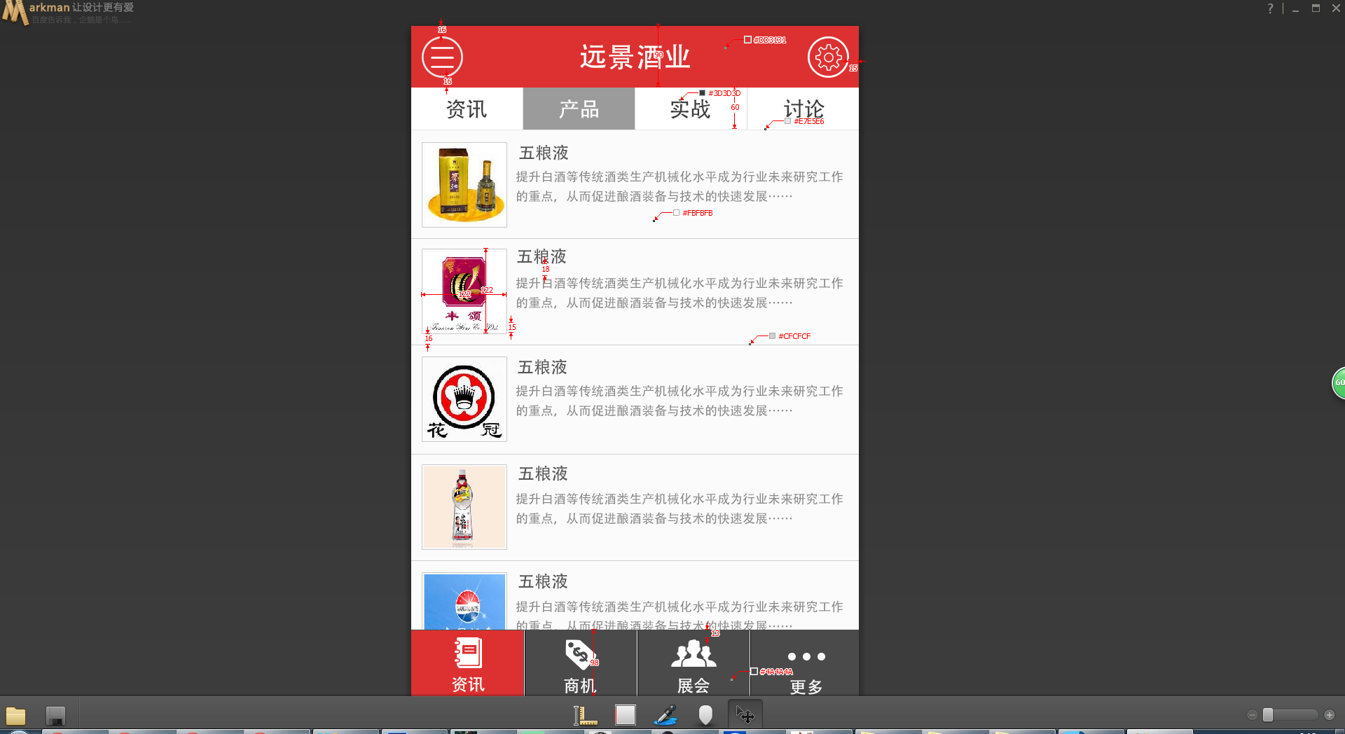
再強調一次:樣式裡的大小全部都是 $_*,也就是設計稿上量出來的原值,字級也不例外。換算交給變數與自適應腳本處理,寫 CSS 時就完全不用在腦中做除法。
這樣就構成了一個可運作的 WebApp。
實際在各尺寸上的表現
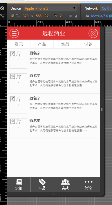
iPhone 5:
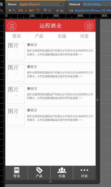
iPhone 6:
平板:
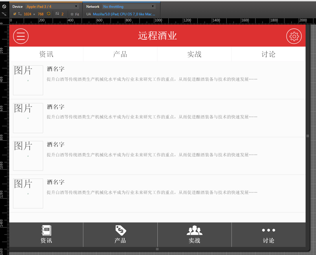
幾點補充
這套做法是典型的 rem/scale 自適應思路:以設計稿寬度為基準,透過根元素字級縮放讓所有尺寸等比伸縮。它的優點是還原度高、切版時思維單純;限制也很明確——同一份版面在大螢幕上只會被整體放大,不會重新編排。若頁面需要在手機與桌面呈現截然不同的資訊層級,仍然得靠 media query 做真正的響應式斷點。
另外,範例中的 -webkit-box 伸縮佈局與多個 meta 標籤帶有明顯的年代色彩,今天重做時改用 flexbox 與標準 viewport 設定即可,視覺效果不變,程式碼會乾淨不少。
- 上一篇文章: HTML5 地理位置 API 實作指南:getCurrentPosition 與 watchPosition
- 下一篇文章: 移動端圖片壓縮上傳實作:Canvas、FileReader 與 FormData 的完整流程