倒數日曆網頁實作:用 CSS3 做會抖動的聖誕節翻牌
編輯:HTML5詳解
這是一個很有節日氣氛的小專案:把 12 月 1 日到 25 日做成一格格的小門,點一下門就會以 3D 翻轉的方式打開;而「今天」對應的那一格,會持續左右輕輕抖動提醒你。整個效果靠 HTML + CSS3 就能完成,不需要 JavaScript 也可以有基本的翻牌動畫。
先看效果
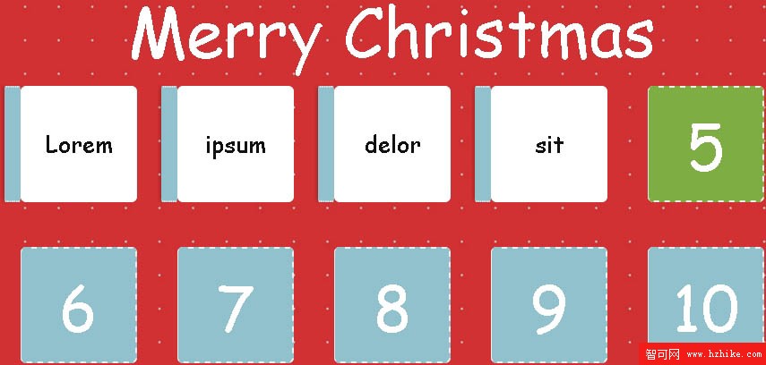
滑鼠點擊 5 號之前
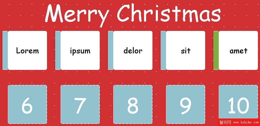
滑鼠點擊 5 號之後
HTML 結構
標題加上一個清單,每個項目裡的 .door 就是那扇門;最後再留一個 #message 放祝賀訊息:
<h1>Merry Christmas</h1>

<ul>
  <li><div class="door">1</div></li>
  <li><div class="door">2</div></li>
  <li><div class="door">3</div></li>
  <!-- ... 一路到 25 ... -->
  <li><div class="door">25</div></li>
</ul>

<p id="message"></p>
25 個 li 內容完全同構,這裡以省略方式表示,實作時複製貼上即可。
版面與卡片樣式
body {
  background: url("xmas.jpg");
  color: #fff;
  font-family: 'Oleo Script', cursive;
  padding: 20px;
  font-weight: 400;
}

h1 {
  margin: 0;
  font-size: 75px;
  line-height: 75px;
  text-align: center;
  font-weight: 400;
}

ul {
  margin: 0 auto 30px auto;
  padding: 0;
  list-style-type: none;
  max-width: 900px;
  width: 100%;
  text-align: center;
  user-select: none;
}

li {
  background-color: #fff;
  box-sizing: border-box;
  border-radius: 6px;
  display: inline-block;
  color: #111;
  cursor: pointer;
  font-size: 26px;
  padding: 15px;
  margin: 25px 12px;
  width: 130px;
  height: 130px;
  line-height: 100px;
  text-align: center;
  position: relative;
  vertical-align: top;
  user-select: none;
  perspective: 800px;              /* 透視距離,決定 3D 翻轉的景深 */
  transition: all 0.4s ease-in-out;
}
最後一格(25 號)要放大成主視覺,所以另外覆寫尺寸:
ul li:last-child {
  background-size: cover;
  display: block;
  clear: both;
  margin: 20px auto 0 auto;
  width: 200px;
  height: 275px;
}

ul li:last-child .door {
  font-size: 100px;
  width: 200px;
  height: 275px;
  line-height: 240px;
}

ul li:last-child .revealed {
  line-height: 123px;
}
門本體與 3D 翻轉
門用絕對定位蓋住整個格子,transform-origin 設在左側,翻開時就像真的門軸在左邊一樣:
.door {
  user-select: none;
  color: #fff;
  font-size: 70px;
  position: absolute;
  top: 0;
  left: 0;
  background-color: #91c1cc;
  box-sizing: border-box;
  border-top: 2px #eee dashed;
  border-right: 2px #eee dashed;
  border-bottom: 2px #eee dashed;
  border-left: 1px #eee solid;
  border-radius: 6px;
  padding: 15px;
  width: 130px;
  height: 130px;
  transform-origin: 0 40%;
  transition: all 0.4s ease-in-out;
  transform-style: preserve-3d;
}

/* 當天的那一格:門變色 */
.current .door {
  background-color: #7EAD44;
}

.current .door.open {
  color: #7EAD44;
}

/* 打開狀態:繞 Y 軸轉 -98 度,並加上陰影增加立體感 */
.open {
  box-shadow: 14px 0px 15px -1px rgba(0, 0, 0, 0.2);
  color: #91c1cc;
  transform: rotate3d(0, 1, 0, -98deg);
}
那個 box-shadow 很重要——少了它,翻開的門會看起來像「消失」而不是「打開」。
抖動動畫
當天格子的抖動,本質上就是一個來回切換 -1 度與 1 度的 keyframes:
.jiggle {
  animation: jiggle 0.2s infinite;
  transform: rotate(-1deg);
}

@keyframes jiggle {
  0%   { transform: rotate(-1deg); }
  50%  { transform: rotate(1deg); }
}
0.2 秒的週期配上無限迴圈,就會得到那種「迫不及待想被點開」的細微晃動。
訊息區與響應式
#message {
  box-sizing: border-box;
  color: #222;
  display: none;
  font-size: 24px;
  padding: 20px;
  background: #eddecb;
  max-width: 500px;
  width: 100%;
  border-radius: 15px;
  margin: 0 auto;
}

@media screen and (min-width: 480px) {
  li { margin: 25px 20px; }
}

@media screen and (min-width: 768px) {
  body { background-size: 150px; }
  p {
    right: 6%;
    top: 20%;
    bottom: auto;
    margin-left: auto;
    left: auto;
  }
}
互動的部分怎麼補
純 CSS 只能做到 hover 翻開,如果要「點一下才開、開完顯示訊息」,加上幾行 JavaScript 就足夠:
document.querySelectorAll('li').forEach(function (item) {
  var door = item.querySelector('.door');
  door.addEventListener('click', function () {
    door.classList.toggle('open');
    item.classList.toggle('revealed');
  });
});
想讓 25 號那天出現祝賀訊息,只要幫最後一個項目額外綁一個事件,把 #message 的 display 改成 block 即可。
這個範例學到什麼
表面上做的是一个日曆,實際上把三個很實用的 CSS3 技巧串在一起:perspective + rotate3d 做 3D 翻轉、transform-origin 決定旋轉軸、以及用 @keyframes 做細微的無限循環動畫。把配色與字型換一換,這套結構改成年曆、盲盒或抽獎卡片都完全適用。
- 上一篇文章: 用 Canvas 做時鐘動畫:刻度、指針與旋轉的實作拆解
- 下一篇文章: HTML5 頁面切換效果與模態對話框用法完整整理
熱門推薦
移動端圖片壓縮上傳實作:Canvas、FileReader 與 FormData 的完整流程
HTML5 video 標籤使用指南:屬性、格式相容與降級策略
HTML5 Canvas 以路徑描繪圓弧的方法
HTML5 全螢幕功能實作:requestFullscreen 跨瀏覽器範例
HTML5 影片現況實測:跨瀏覽器與裝置的支援報告
HTML5 中 div、section、article 的差異與正確用法
HTML5 Notification 桌面通知實作:讓網頁跳出瀏覽器提醒你
HTML5 進度條特效:用 Canvas 做出帶粒子飛散的載入動畫
《精通 HTML5 編程》第八章:HTML5 Web Worker API