JavaScript 插件化開發(四):為 Tab 插件加上「更多模組」收合機制
編輯:關於JavaScript
這一階段的目標
上一篇文章把 Tab 插件的程式碼組織與實作走過一遍,也說明了「程序化設計」與「物件導向設計」兩種思路該如何取長補短。這次繼續沿用同一個 Tab 實例,替它加上一個新能力:初始化時若模組項目的數量超過指定上限,超出的部分自動收進「更多模組」的隱藏清單裡。
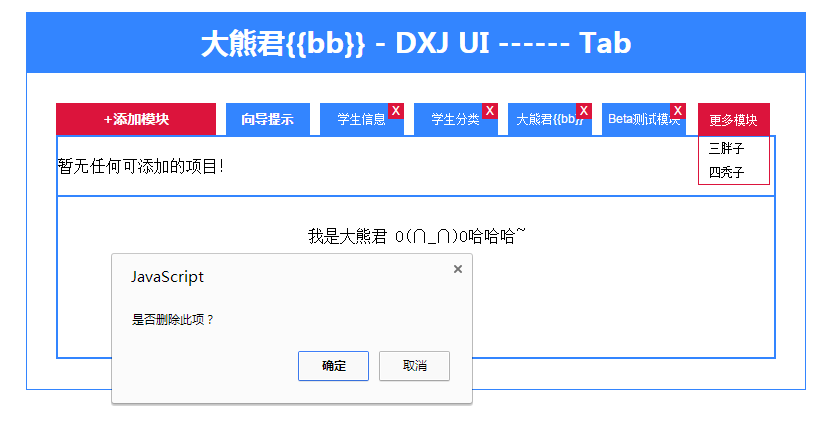
為此初始化參數也做了調整:新增 displayMax 用來指定同時顯示的項目數;status 屬性則不再由呼叫方配置,改為程式在執行階段動態維護,讓插件更靈活。
一、參數約定
{
    buttonText: "添加模塊",
    result: [
        { text: "向導提示",    url: "help.html",     showClose: "0" },
        { text: "學生信息",    url: "info.html",     showClose: "1" },
        { text: "學生分類",    url: "category.html", showClose: "1" },
        { text: "大熊君{{bb}}", url: "bb.html",      showClose: "1" },
        { text: "Beta測試模塊", url: "test.html",    showClose: "1" },
        { text: "三胖子",      url: "help.html",     showClose: "1" },
        { text: "四禿子",      url: "help.html",     showClose: "1" }
    ],
    displayMax: 5   // 最多顯示項目
}
createTab 收兩個參數:DOM 節點與選項物件。buttonText 是操作按鈕的文字;result 是選項卡項目清單,每項含文字、點擊時請求的 url,以及 showClose 決定是否顯示關閉鈕;status 由程式動態寫入,1 代表顯示中、0 代表已關閉、2 代表超出上限而被收起。
二、初始化與事件綁定
tabProto.init = function () {
    if (this._isEmptyResult()) {
        this._setContent("暫無任何模塊!");
    }

    var that = this;

    // 「添加模塊」按鈕:滑出面板
    this.getElem().find(".title .adder")
        .text("+" + this.getOpts()["buttonText"])
        .on("click", function () {
            that.getElem().find(".console-panel").slideToggle(function () {
                that._renderConsolePanel("0");
            });
        });

    // 逐項渲染,並依上限決定 status
    $.each(this.getOpts()["result"], function (i, item) {
        if (that._isDisplayMax(i + 1)) {
            that._saveOrUpdateStatus(item, "1");
        } else {
            that._saveOrUpdateStatus(item, "2");
        }
        that._render(item);
    });

    // 有超出上限的項目時,才顯示「更多模塊」
    if (!that._isDisplayMax(this.getOpts()["result"].length)) {
        this.getElem().find(".title .more-mod").fadeIn(function () {
            $(this).find(".tag").on("click", function () {
                var root = $(this).next();
                root.empty();

                $.each(that._getItemListByStatus("2"), function (i, data) {
                    $("<div></div>").text(data["text"])
                        .on("click", function () {
                            if (that._getItemListByStatus("1").length < that.getOpts()["displayMax"]) {
                                that.getElem().find(".title .items div").eq(data["index"]).fadeIn(function () {
                                    that._saveOrUpdateStatus(data, "1");
                                });
                            } else {
                                alert("不能添加任何模塊,目前已經是最大數量!");
                            }
                        })
                        .appendTo(root);
                });

                root.toggle();
            });
        });
    }

    // 預設觸發第一項(至少要有一項,否則插件沒有意義)
    this.getElem().find(".title .items div").eq(0).trigger("click");
};
三、切換與內容渲染
tabProto._setCurrent = function (index) {
    var items = this.getElem().find(".title .items div").removeClass("active");
    items.eq(index).addClass("active");

    var contents = this.getElem().find(".content .c").hide();
    contents.eq(index).show();
};

item.on("click", function () {
    that._setCurrent($(this).index());
    that._getContent(data["url"]).done(function (result) {
        that._setContent(result);
    }).fail(function () {
        throw new Error("Net Error !");
    });
});

tabProto._setContent = function (html) {
    this.getElem().find(".content").html(html);
};

tabProto._getContent = function (url) {
    return $.ajax({ url: url });
};
四、純資料層的輔助方法
這幾個方法完全不碰 DOM,只處理資料,因此最容易測試也最該保持單一職責。
tabProto._isDisplayMax = function (size) {
    var displayMax = this.getOpts()["displayMax"] || 5;
    return (size <= displayMax) ? true : false;
};

tabProto._isEmptyResult = function () {
    if (!this.getOpts()["result"].length) {
        return false;
    }
    return true;
};

tabProto._saveOrUpdateStatus = function (item, status) {
    item["status"] = status;
};

tabProto._getItemListByStatus = function (status) {
    var list = [];
    var result = this.getOpts()["result"];
    $.each(result, function (i, item) {
        if (status == item["status"]) {
            list.push(item);
        }
    });
    return list;
};

tabProto._getStatusByIndex = function (index) {
    var status = null;
    var result = this.getOpts()["result"];
    $.each(result, function (i, item) {
        if (index == item["index"]) {
            status = item["status"];
        }
    });
    return status;
};
五、結構與樣式要點
HTML 骨架分為四塊:.title .adder(新增按鈕)、.title .items(已顯示的頁籤)、.title .more-mod(更多模組的收合區,內含 .tag 觸發點與 .mods 清單容器)、.console-panel(可勾選的模組面板)與 .content(內容區)。
CSS 上幾個關鍵:.more-mod 用 position:absolute; right:0 固定在標題列右側並預設 display:none;頁籤的關閉鈕 span.del 以 position:absolute; right:0; top:0 貼在右上角;.console-panel 預設 display:none,靠 slideToggle 帶動畫;.active 類別只負責加重字體以標示當前頁。
六、小結
- 用物件導向的角度先拆解功能需求,再決定類別邊界。
- 以「類」的方式組織插件邏輯,把 DOM 操作與資料處理分開。
- 持續重構,但不要設計過度;程序化設計與物件導向思路結合,往往比純粹哪一種更好維護。