Bootstrap 表格元件:附加樣式、行狀態與響應式設計
編輯:關於JavaScript
表格元件部分,Bootstrap 提供了:1 種基礎 .table 樣式、4 種附加樣式(.table-striped / .table-bordered / .table-hover / .table-condensed),以及 1 種響應式容器 .table-responsive。
table 基礎樣式
//源碼 table { background-color: transparent; } caption { padding-top: 8px; padding-bottom: 8px; color: #777; text-align: left; } th { text-align: left; } .table { width: 100%; max-width: 100%; margin-bottom: 20px; } .table > thead > tr > th, .table > tbody > tr > th, .table > tfoot > tr > th, .table > thead > tr > td, .table > tbody > tr > td, .table > tfoot > tr > td { padding: 8px; line-height: 1.42857143; vertical-align: top; border-top: 1px solid #ddd; } /* 表頭用較粗的底線分隔 */ .table > thead > tr > th { vertical-align: bottom; border-bottom: 2px solid #ddd; } /* 首列不出現多餘的上框線 */ .table > caption + thead > tr:first-child > th, .table > colgroup + thead > tr:first-child > th, .table > thead:first-child > tr:first-child > th, .table > caption + thead > tr:first-child > td, .table > colgroup + thead > tr:first-child > td, .table > thead:first-child > tr:first-child > td { border-top: 0; } .table > tbody + tbody { border-top: 2px solid #ddd; } .table .table { background-color: #fff; }
table-striped:帶條紋背景的表格
//源碼 .table-striped > tbody > tr:nth-of-type(odd) { background-color: #f9f9f9; }
table-bordered:帶邊框的表格
為所有儲存格加上 1px 邊框:
//源碼 .table-bordered { border: 1px solid #ddd; } .table-bordered > thead > tr > th, .table-bordered > tbody > tr > th, .table-bordered > tfoot > tr > th, .table-bordered > thead > tr > td, .table-bordered > tbody > tr > td, .table-bordered > tfoot > tr > td { border: 1px solid #ddd; } .table-bordered > thead > tr > th, .table-bordered > thead > tr > td { border-bottom-width: 2px; }
table-hover:滑鼠移入高亮
加上 .table-hover 後,游標停留的那一列會變色,適合資料量大的表格。
table-condensed:緊湊型表格
//源碼 .table-condensed > thead > tr > th, .table-condensed > tbody > tr > th, .table-condensed > tfoot > tr > th, .table-condensed > thead > tr > td, .table-condensed > tbody > tr > td, .table-condensed > tfoot > tr > td { padding: 5px; }
列層級的狀態樣式
Bootstrap 為 tr 提供了五種背景色樣式:active、success、info、warning、danger。程式碼很長但規律單純——每個 class 都要同時對應 td 與 th,並在 .table-hover 下另外定義 hover 時的深色版本。
//源碼 .table > thead > tr > td.active, .table > tbody > tr > td.active, .table > tfoot > tr > td.active, .table > thead > tr > th.active, .table > tbody > tr > th.active, .table > tfoot > tr > th.active, .table > thead > tr.active > td, .table > tbody > tr.active > td, .table > tfoot > tr.active > td, .table > thead > tr.active > th, .table > tbody > tr.active > th, .table > tfoot > tr.active > th { background-color: #f5f5f5; } .table-hover > tbody > tr > td.active:hover, .table-hover > tbody > tr > th.active:hover, .table-hover > tbody > tr.active:hover > td, .table-hover > tbody > tr:hover > .active, .table-hover > tbody > tr.active:hover > th { background-color: #e8e8e8; } .table > thead > tr > td.success, .table > tbody > tr > td.success, .table > tfoot > tr > td.success, .table > thead > tr > th.success, .table > tbody > tr > th.success, .table > tfoot > tr > th.success, .table > thead > tr.success > td, .table > tbody > tr.success > td, .table > tfoot > tr.success > td, .table > thead > tr.success > th, .table > tbody > tr.success > th, .table > tfoot > tr.success > th { background-color: #dff0d8; } .table-hover > tbody > tr > td.success:hover, .table-hover > tbody > tr > th.success:hover, .table-hover > tbody > tr.success:hover > td, .table-hover > tbody > tr:hover > .success, .table-hover > tbody > tr.success:hover > th { background-color: #d0e9c6; } .table > thead > tr > td.info, .table > tbody > tr > td.info, .table > tfoot > tr > td.info, .table > thead > tr > th.info, .table > tbody > tr > th.info, .table > tfoot > tr > th.info, .table > thead > tr.info > td, .table > tbody > tr.info > td, .table > tfoot > tr.info > td, .table > thead > tr.info > th, .table > tbody > tr.info > th, .table > tfoot > tr.info > th { background-color: #d9edf7; } .table-hover > tbody > tr > td.info:hover, .table-hover > tbody > tr > th.info:hover, .table-hover > tbody > tr.info:hover > td, .table-hover > tbody > tr:hover > .info, .table-hover > tbody > tr.info:hover > th { background-color: #c4e3f3; } .table > thead > tr > td.warning, .table > tbody > tr > td.warning, .table > tfoot > tr > td.warning, .table > thead > tr > th.warning, .table > tbody > tr > th.warning, .table > tfoot > tr > th.warning, .table > thead > tr.warning > td, .table > tbody > tr.warning > td, .table > tfoot > tr.warning > td, .table > thead > tr.warning > th, .table > tbody > tr.warning > th, .table > tfoot > tr.warning > th { background-color: #fcf8e3; } .table-hover > tbody > tr > td.warning:hover, .table-hover > tbody > tr > th.warning:hover, .table-hover > tbody > tr.warning:hover > td, .table-hover > tbody > tr:hover > .warning, .table-hover > tbody > tr.warning:hover > th { background-color: #faf2cc; } .table > thead > tr > td.danger, .table > tbody > tr > td.danger, .table > tfoot > tr > td.danger, .table > thead > tr > th.danger, .table > tbody > tr > th.danger, .table > tfoot > tr > th.danger, .table > thead > tr.danger > td, .table > tbody > tr.danger > td, .table > tfoot > tr.danger > td, .table > thead > tr.danger > th, .table > tbody > tr.danger > th, .table > tfoot > tr.danger > th { background-color: #f2dede; } .table-hover > tbody > tr > td.danger:hover, .table-hover > tbody > tr > th.danger:hover, .table-hover > tbody > tr.danger:hover > td, .table-hover > tbody > tr:hover > .danger, .table-hover > tbody > tr.danger:hover > th { background-color: #ebcccc; }
響應式表格
把 .table 包在 .table-responsive 容器裡即可。小螢幕(<768px)時會出現水平捲動,大螢幕則捲軸消失。
<div class="table-responsive"> <table class="table"> </table> </div>
//源碼 .table-responsive { min-height: .01%; overflow-x: auto; } /* 在斷點內,原本 .table 的 margin-bottom:20px 被改為 0,目的是消除捲軸造成的上下高度差; 同時 .table-responsive 自己加上 margin-bottom:15px,避免與後方元素重疊。 */ @media screen and (max-width: 767px) { .table-responsive { width: 100%; margin-bottom: 15px; overflow-y: hidden; -ms-overflow-style: -ms-autohiding-scrollbar; border: 1px solid #ddd; } .table-responsive > .table { margin-bottom: 0; } /* 強制儲存格不換行,才能觸發水平捲動 */ .table-responsive > .table > thead > tr > th, .table-responsive > .table > tbody > tr > th, .table-responsive > .table > tfoot > tr > th, .table-responsive > .table > thead > tr > td, .table-responsive > .table > tbody > tr > td, .table-responsive > .table > tfoot > tr > td { white-space: nowrap; } /* table-responsive 自己有 1px 外框,若 table 再套 table-bordered 會重疊變粗, 因此這裡先把 table-bordered 的框移除 */ .table-responsive > .table-bordered { border: 0; } /* 再逐一拿掉最左、最右與最後一列的邊框 */ .table-responsive > .table-bordered > thead > tr > th:first-child, .table-responsive > .table-bordered > tbody > tr > th:first-child, .table-responsive > .table-bordered > tfoot > tr > th:first-child, .table-responsive > .table-bordered > thead > tr > td:first-child, .table-responsive > .table-bordered > tbody > tr > td:first-child, .table-responsive > .table-bordered > tfoot > tr > td:first-child { border-left: 0; } .table-responsive > .table-bordered > thead > tr > th:last-child, .table-responsive > .table-bordered > tbody > tr > th:last-child, .table-responsive > .table-bordered > tfoot > tr > th:last-child, .table-responsive > .table-bordered > thead > tr > td:last-child, .table-responsive > .table-bordered > tbody > tr > td:last-child, .table-responsive > .table-bordered > tfoot > tr > td:last-child { border-right: 0; } .table-responsive > .table-bordered > tbody > tr:last-child > th, .table-responsive > .table-bordered > tfoot > tr:last-child > th, .table-responsive > .table-bordered > tbody > tr:last-child > td, .table-responsive > .table-bordered > tfoot > tr:last-child > td { border-bottom: 0; } }
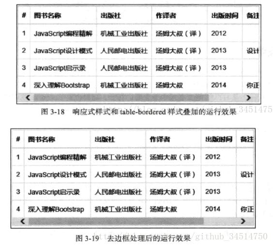
最後提一個實務陷阱:.table-responsive 只在 max-width: 767px 生效,也就是說它只處理「小螢幕」情境;若表格在中大型螢幕上依然過寬,就得自行加上外層容器與 overflow 處理。另外,響應式表格靠的是 white-space: nowrap,儲存格內容很長時務必自行規劃欄位寬度。