Bootstrap 插件筆記(16):模態對話框 Modal 完整用法
編輯:關於JavaScript
Bootstrap 內建了大量 jQuery 插件,引入方式有兩種:一是只載入需要的單一 *.js,但要注意插件之間可能有相依關係,得把依賴項一起引入;二是直接載入完整的 bootstrap.js 或壓縮版 bootstrap.min.js——兩者只能擇一,不可同時引入。
以下從模態對話框(Modal)開始整理。
基本樣式
模態框是覆蓋在父窗體之上的子窗體,常用來在不離開當前頁面的情況下承載額外內容或互動。
<!DOCTYPE html>
<html lang="zh-cn">
<head>
<meta charset="UTF-8">
<meta name="viewport" content="width=device-width, initial-scale=1">
<link href="../../css/bootstrap.min.css" rel="stylesheet">
<script src="https://cdn.bootcss.com/jquery/1.11.1/jquery.min.js"></script>
<script src="../../js/bootstrap.min.js"></script>
<title>模態對話框</title>
</head>
<body>
<div class="container">
  <div class="page-header"><h1>模態對話框基本</h1></div>
  <button type="button" class="btn btn-primary btn-lg" data-toggle="modal" data-target="#myModal">
    打開模態框
  </button>
  <div class="modal fade" id="myModal" aria-labelledby="myModalLabel" aria-hidden="true">
    <div class="modal-dialog">
      <div class="modal-content">
        <div class="modal-header">
          <button type="button" class="close" data-dismiss="modal" aria-hidden="true">×</button>
          <h4 class="modal-title" id="myModalLabel">標題</h4>
        </div>
        <div class="modal-body">內容內容內容內容</div>
        <div class="modal-footer">
          <button type="button" class="btn btn-default" data-dismiss="modal">關閉</button>
          <button type="button" class="btn btn-primary">提交</button>
        </div>
      </div>
    </div>
  </div>
</div>
</body>
</html>
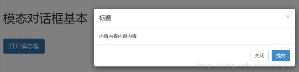
屬性逐一說明
data-toggle="modal":觸發器標記,用來打開模態框。data-target="#myModal":指定要載入的模態框目標。.modal:讓該<div>被識別為模態框。.fade:切換時產生淡入淡出效果。.modal-header / .modal-body / .modal-footer:分別對應頭部、主體與底部的樣式。.close:關閉按鈕的樣式類別。data-dismiss="modal":點擊後關閉模態框。
用 JS 方式載入
除了宣告式的 data 屬性,也可以透過 JS 呼叫 .modal()。下面做一個登入視窗,順便示範寬度調整與事件綁定。
<!DOCTYPE html>
<html lang="zh-cn">
<head>
<meta charset="UTF-8">
<meta name="viewport" content="width=device-width, initial-scale=1">
<link href="../../css/bootstrap.min.css" rel="stylesheet">
<script src="https://cdn.bootcss.com/jquery/1.11.1/jquery.min.js"></script>
<script src="../../js/bootstrap.min.js"></script>
<style>
  .col-center-block{ float: none; display: block; margin-left: auto; margin-right: auto; }
</style>
<title>js 加載例子</title>
</head>
<body>
<div class="container">
  <div class="page-header"><h1>js 加載模態對話框</h1></div>
  <button type="button" class="btn btn-lg btn-primary btn-myModal" data-toggle="modal">彈出對話框</button>
  <div id="myModal" class="modal fade">
    <div class="modal-dialog" style="width: 20%">
      <div class="modal-content">
        <div class="modal-header">
          <button type="button" class="close" data-dismiss="modal" aria-hidden="true">×</button>
          <h4 class="modal-title">用戶登錄</h4>
        </div>
        <div class="modal-body">
          <form>
            <div class="form-group">
              <label class="control-label" for="UserName">用戶名</label>
              <input type="text" class="form-control" id="UserName" placeholder="用戶名">
            </div>
            <div class="form-group">
              <label class="control-label" for="Password">密碼</label>
              <input type="password" class="form-control" id="Password" placeholder="密碼">
            </div>
            <div class="form-group">
              <label><input type="checkbox"> 下次自動登錄 </label>
              <a href="#" class="pull-right">忘記密碼</a>
            </div>
            <div class="form-group">
              <button type="submit" class="btn btn-primary form-control">登錄</button>
            </div>
          </form>
        </div>
      </div>
    </div>
  </div>
</div>
<script>
$(function () {
  $(".btn-myModal").click(function () {
    $("#myModal").modal({ keyboard: true });
  });
  $("#myModal").on("hidden.bs.modal", function () {
    // 模態框完全關閉後的處理
  });
})
</script>
</body>
</html>
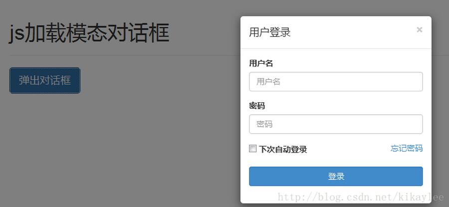
常用的方法呼叫:
$("#myModal").modal({ keyboard: true }); // 以選項物件啟動
$("#myModal").modal('toggle');          // 切換顯示/隱藏
$("#myModal").modal('show');            // 手動打開
$("#myModal").modal('hide');            // 手動隱藏
四個事件鉤子
// 呼叫 show 方法後立即觸發
$('#myModal').on('show.bs.modal', function () { /* ... */ })

// 模態框對使用者可見時觸發(會等 CSS 過渡完成)
$('#myModal').on('shown.bs.modal', function () { /* ... */ })

// 呼叫 hide 方法時觸發
$('#myModal').on('hide.bs.modal', function () { /* ... */ })

// 模態框完全隱藏後觸發
$('#myModal').on('hidden.bs.modal', function () { /* ... */ })
實務上最常用的是 hidden.bs.modal:例如關閉視窗後清空表單、把焦點還給觸發按鈕,或釋放開啟時才建立的動態內容。
相關文章
-
JS 模態對話框 showModalDialog 用法總結 showModalDialog 模態對話框使用詳解與瀏覽器兼容 用 JavaScript 打開模態對話框的實現方式 用層與 Ajax 自製模態對話框,取代瀏覽器的 alert HTML5 頁面切換效果與模態對話框用法完整整理 showModalDialog 參數用法詳解:外觀、傳值與回傳 showModalDialog 模態對話框完整用法與跨瀏覽器相容處理 jQuery 彈出層元件:可調尺寸、Ajax 內容與背景樣式 修正 Bootstrap Modal 按 Esc 無法關閉的問題 HTML5 頁面切換效果、模態對話框與 jQuery Mobile 元件用法總結