進度條幾乎是每個 Web 專案都會用到的元件,無論是檔案上傳、資料載入還是動畫過場。以下整理三種常見做法,從純 CSS 裁剪一路寫到串接伺服器進度事件。
方案一:利用 CSS2 的 clip 屬性做裁剪
先認識一下 clip。這個屬性在 CSS 2.1 裡其實很少被提到,主流瀏覽器卻都支援。W3C 的定義是:透過裁剪元素來控制可視區域,預設不做任何裁剪。
語法如下:
.xx { clip: rect(<top>, <right>, <bottom>, <left>) }
rect() 需要 top、right、bottom、left 四個值,以逗號分隔,順序就跟 margin、padding 一樣是順時針方向。在 CSS 2.1 的規格中,top 與 bottom 的偏移量從元素盒子的上緣算起,left 與 right 則從左緣算起。
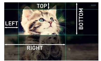
來看一個簡單的裁剪示範:
 p#one { clip: rect(5px, 40px, 45px, 5px); }
p#two { clip: rect(5px, 55px, 45px, 5px); }
這段程式在一個 50×55px 的長方形盒子中做剪切,最後得到虛線框住的長方形:

接著看進度條的 HTML 結構:
 <h2>使用 clip 實現裁剪 demo</h2>
<div id="progress-box" class="progress-box">
    <div id="progress-bar" class="progress-bar"></div>
    <div id="progress-text" class="progress-text">0%</div>
</div>
CSS 部分:
 .progress-box{position:absolute;left:0;width:300px;height:60px;border:1px solid #000;margin-left:20px;}
.progress-bar{position:absolute;left:0;top:0;width:300px;height:60px;clip:rect(0px,0px,60px,0px);background:red;}
.progress-text{position:absolute;left:0;top:0;width:300px;height:60px;color:black;text-align:center;line-height:60px;font-family:Georgia;font-size:2em;font-weight:bold;}
三個 div 各司其職:progress-box 是容器,靠邊框讓使用者知道 100% 有多寬;progress-bar 是會不斷變化的紅色進度條;progress-text 則負責顯示百分比數字。
最後用 setInterval 驅動動畫:
 var bar = document.getElementById("progress-bar"),
    text = document.getElementById("progress-text");
var cent = 0, max = 300;
var timer = setInterval(progressFn, 30);

function progressFn() {
    if (cent > max) {
        cent = 0;
        timer = setInterval(progressFn, 30);
    } else {
        bar.style.clip = "rect(0px," + cent + "px,60px,0px)";
        text.innerHTML = Math.ceil((cent / max) * 100) + "%";
        cent++;
    }
}

方案二:用進度事件與伺服器互動
HTML5 定義了六個與「客戶端—伺服器通訊」相關的進度事件:
- loadstart:接收到第一個位元組時觸發。
- progress:接收資料的過程中持續觸發。
- error:請求發生錯誤時觸發。
- abort:呼叫 abort() 中止連線時觸發。
- load:完整回應資料接收完畢時觸發。
- loadend:通訊結束,或觸發 error、abort、load 之後觸發。
每個請求都以 loadstart 開場,接著是一個或多個 progress,然後觸發 error、abort、load 三者之一,最後以 loadend 收尾。Firefox 3.5+、Safari 4+、Chrome、iOS Safari 與 Android WebKit 都支援前五個事件。
onprogress 處理函式收到的 event 物件,其 target 是 XHR 物件,另外還帶有三個關鍵屬性:lengthComputable(進度資訊是否可用的布林值)、position(已接收的位元組數)與 totalSize(依 Content-Length 推估的總位元組數)。有了這三個值,進度指示器就完成了。
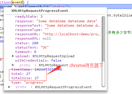
 <h2>使用 clip 實現裁剪 demo</h2>
<div id="progress-box" class="progress-box">
    <div id="progress-bar" class="progress-bar"></div>
    <div id="progress-text" class="progress-text">0%</div>
</div>
<div id="status"></div>
 var divbar = document.getElementById("progress-bar"),
    divText = document.getElementById("progress-text");
var cent = 0, max = 300;

function createXHR(){
    var xhr;
    if (window.XMLHttpRequest){          // IE7+、Firefox、Chrome、Opera、Safari
        xhr = new XMLHttpRequest();
    } else {                             // IE6、IE5
        xhr = new ActiveXObject("Microsoft.XMLHTTP");
    }
    return xhr;
}

var xhr = createXHR();
xhr.onload = function() {
    if ((xhr.status >= 200 && xhr.status < 300) || xhr.status == 304) {
        alert(xhr.responseText);
    } else {
        alert("Request was unsuccessful: " + xhr.status);
    }
};

xhr.onprogress = function(event) {
    var divStatus = document.getElementById("status");
    if (event.lengthComputable) {
        divStatus.innerHTML = "Received " + event.position + " of " + event.totalSize + " bytes";
        console.log(event.target);
        var percentComplete = Math.round(event.loaded / event.total);
        // event.loaded 是已載入位元組數,event.total 是總位元組數
        console.log(event.loaded, event.total, 300 * percentComplete);
        progressFn(300 * percentComplete, max);
    }
};

xhr.open("get", "progress.php", true);
xhr.send(null);

function progressFn(cent, max) {
    if (cent < max) {
        divbar.style.clip = "rect(0px," + cent + "px,60px,0px)";
        divText.innerHTML = Math.ceil((cent / max) * 100) + "%";
    }
}
伺服器端這裡只用 PHP 隨手輸出幾段內容做模擬,實務上當然不是這樣寫的:
 <?php
header("Content-Type: text/plain");
header("Content-Length: 27");
echo "Some data"; flush();
echo "Some data"; flush();
echo "Some data"; flush();
?>
方案三:純 CSS3 動畫與漸層
如果進度是假的、只需要視覺效果,那用 CSS3 的 transition 與 keyframes 就足夠了。
 <div id="loading-status">
    <div id="process"></div>
</div>
 #loading-status {
    width: 300px;
    border: 1px solid #669CB8;
    -webkit-box-shadow: 0px 2px 2px #D0D4D6;
    -moz-box-shadow: 0px 2px 2px #D0D4D6;
    border-radius: 10px;
    height: 20px;
    padding: 1px;
}
#process {
    width: 80%;
    height: 100%;
    border-radius: 10px;
    background: -webkit-gradient(linear, 0 0, 0 100%, from(#7BC3FF), color-stop(0.5,#42A9FF), to(#7BC3FF));
    -webkit-animation: load 3s ease-out infinite;
}
@-webkit-keyframes load {
    0%   { width: 0%; }
    100% { width: 80%; }
}

三種方案各有場景:純視覺效果用 CSS3 最省事,需要真實進度就靠 progress 事件,而 clip 的好處是相容性廣、實現直觀。
相關文章
-
JavaScript 檔案上傳實作:影片、圖片與壓縮檔 Ajax 載入進度條的呈現方式 改造 prototype.js:加入進度條與輸入框驗證 以 AJAX 實作網頁無刷新進度條 Ajax 搭配 JSF 自訂組件實作高效能檔案上傳(二):組件與三階段編碼 Ajax 搭配 JSF 自訂組件實作高/Contents>
<xID>69483</xID>
<xTitle>Ajax 搭配 JSF 自訂組件實作高效能檔案上傳(三):解碼與進度回饋 自己動手做播放器控制面板:播放、暫停、音量與進度都能拉 DIV 佈局屬性詳解(2):height、overflow 與 clip 加載進度頁面的設置方法 HTML5 自定義播放器核心程式碼