小米官網給我的感覺是大氣又乾淨,恰到好處的特效讓人耳目一新,質感十足。看到他們首頁的輪播圖實作得頗有意思,於是我便模仿著寫了一個。
大致的感覺出來了,先貼張圖看看:

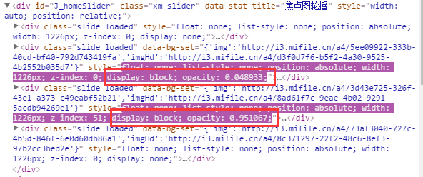
透過前端神器 Chrome 的 F12 觀察小米官網的 HTML,不難發現他們用 5 個 div 包裹圖片並搭配定位,透過 z-index 控制 div 的層級,再藉由每個 div 的 opacity 與 display 屬性來切換元素的顯示與隱藏。
截圖如下(紅框內即為 opacity 屬性):
好的,既然知道了實作手法,那就先把頁面布局搭起來。
<!DOCTYPE HTML PUBLIC "-//W3C//DTD HTML 4.01 Transitional//EN" "https://www.w3.org/TR/html4/loose.dtd"> <html> <head> <meta http-equiv="Content-Type" content="text/html; charset=UTF-8"/> <title>Mking_js_</title> <script type="text/javascript" src="js/moveopacity_1.js"></script> <style type="text/css"> #warp{ width:800px; height: 400px; margin: 20px auto; position: relative;} #imgWarp{ width:600px; height: 400px; position: absolute; top:0; left: 100px; display: inline-block; } .btn:hover{cursor: pointer;} .btn{line-height: 30px; text-align: center;font-size: 25px; font-weight: bold; color: #fff;width:80px; height: 30px;top:185px;background: #5f7c8a;position: absolute; border-radius: 3px; } .btn:nth-of-type(1){ left: 0; } .btn:nth-of-type(2) { right: 0; } img { position: absolute; width:600px; height: 400px; background-size:contain; opacity: 0; display: none; z-index: 0; } img:nth-of-type(1) { opacity: 1; display: block; z-index:5; } .links{ width:300px; height: 30px; position: absolute; right:100px; bottom: 10px; z-index: 10; } em{font-style: normal; display: inline-block; height: 30px; width: 30px; margin-right: 15px; border: 1px solid #000000; vertical-align: top; line-height: 30px; font-size: 20px; text-align: center;color: #fff; font-weight: bold; border-radius: 50%; background-color: #008000; border-color: #c0c0c0; box-sizing: border-box; } em.active{ background-color: #fff; color: #000000; } </style> </head> <body> <div id="warp"> <div id="imgWarp" > <img id="img1" src="product/1.jpg" TITLE="img1" /> <img id="img2" src="product/2.jpg" TITLE="img2"/> <img id="img3" src="product/3.jpg" TITLE="img3"/> <img id="img4" src="product/4.jpg" TITLE="img4"/> <img id="img5" src="product/5.jpg" TITLE="img5" /> </div> <span class="btn" id="left">left</span> <span class="btn" id="right">right</span> <div class="links"> <em class="active"></em> <em></em> <em></em> <em></em> <em></em> </div> </div> </body> </html> 結構有了,接下來就是加入 JS 讓它動起來。
頁面中的 JS:
window.onload = function(){ var oLeft = document.getElementById("left"); var oRight = document.getElementById("right"); var oWarp = document.getElementById("imgWarp"); var aImg = oWarp.getElementsByTagName("img"); var aEm = document.getElementsByTagName("em"); var i = 5; btn = true; oLeft.onclick = function(){ clearInterval(autoTimer); if(btn){ btn=false; fnAutoLeft(); } }; function fnAutoLeft(){ var a = i % 5; i-=1; var b = i % 5; startOpacMove(aImg[a],0,aImg[b],100); setStyle(b); } oRight.onclick = function(){ if(btn){ //單位時間內只能觸發一次元素的顯示隱藏 clearInterval(autoTimer); btn=false; fnAutoRight(); } }; var count =0; function fnAutoRight(){ var a = i % 5; i+=1; var b = i % 5; startOpacMove(aImg[a],0,aImg[b],100); setStyle(b); if(i==10){ i=5; for(var j = 0;j<aImg.length;j++){ if(j==0){ aImg[0].style.cssText ="opacity: 1; z-index: 5; display: block;"; } else{ aImg[j].style.cssText ="opacity: 0; z-index: 0; display: none;"; } } } } var autoTimer = setInterval(fnAutoRight,5000); function setStyle(a){ for(var i=0;i<aEm.length;i++){ aEm[i].className=""; } aEm[a].className="active"; } } 負責運動的 JS:
function startOpacMove(obj1,tag1,obj2,tag2) { var iCur1 = 0; var iCur2 = 0; var iTimer = null; var iSpeed1 = -2; var iSpeed2 = 2; clearInterval(iTimer); iTimer = setInterval(function(){ var iBtn = true; iCur1 = css(obj1,'opacity')*100; iCur2 = css(obj2,'opacity')*100; iCur1 = Math.floor(iCur1); iCur2 = Math.floor(iCur2); if(iCur1 != tag1 && iCur2 != tag2){ iBtn = false; obj1.style.opacity = (iCur1+iSpeed1)/100; // console.log("隱藏元素時候的透明度值:"+(iCur1+iSpeed1)/100); obj1.style.filter = 'alpha(opacity='+(iCur1+iSpeed1)+')'; obj1.style.zIndex = 0; obj2.style.opacity = (iCur2+iSpeed2)/100; obj2.style.filter = 'alpha(opacity='+(iCur2+iSpeed2)+')'; obj2.style.zIndex = 5; obj2.style.display ="block"; } if(iBtn){ clearInterval(iTimer); obj1.style.display ="none"; obj1.style.opacity =0; obj2.style.opacity =1; btn = true; } },10); } function css(obj,attr){ if(obj.currentStyle){ //當前浏覽器下存在currentStyle屬性 return obj.currentStyle[attr]; }else{ return getComputedStyle(obj,false)[attr]; } } 來看看 JS 是怎麼讓畫面動起來的。
先思考一個問題:畫面是如何左右切換的,完成這一步的必要條件是什麼?假設當前顯示的是第一張圖,向右切換時要隱藏第一張、顯示第二張,那麼要做的就是讓索引為 0 的圖片隱藏、索引為 1 的圖片顯示;再次點擊向右,索引為 1 的隱藏、索引為 2 的顯示,後續依此類推。需要拿到的索引就是 0、1、2、3、4,最後再留意一下右側的邊界問題就 OK 了。
好的,貼程式碼:
var i = 5; function fnAutoRight(){ var a = i % 5; i+=1; var b = i % 5; } 用變數 i 對 5 取餘,得到的值剛好落在 0 到 4 之間,正是我們想要的結果,對應的 a、b 也剛好是要隱藏與要顯示的圖片索引。再呼叫寫好的運動 JS 與下方更新當前位置的函式,向右這塊就完成了。
接著看圖片向左移動時,要隱藏與顯示的索引是什麼。假設當前是第一張,點擊向左時,隱藏索引為 0、顯示索引為 4;再次點擊,隱藏索引為 4、顯示為 3。顯而易見,我們需要的索引順序是 0、4、3、2、1。
程式碼如下:
var i=5; function fnAutoLeft(){ var a = i % 5; i-=1; var b = i % 5; } 同樣是 i=5,先對 5 取餘得到 a(當前要隱藏的索引),讓 i 減一之後再對 5 取餘,得到的就是需要顯示的索引。這樣向左的問題也迎刃而解。
最後再寫一個 setInterval 定時播放的函式,設定好間隔時間,自動播放的功能就完成了。整體而言,這個輪播的精髓就在於用取餘運算把索引「捲」在 0 到 4 之間循環,再透過 opacity 的漸變達成淡入淡出的效果。
- 上一篇文章: 用 JavaScript 打造可拖動滾動條的評分效果
- 下一篇文章: JavaScript 獲取 URL 中 Get 參數值的方法