Bootstrap 入門(二):一文看懂內建的固定樣式
編輯:關於JavaScript
本文是 Bootstrap 入門系列的第二篇,上一篇我們聊過可視化布局,這次則來梳理 Bootstrap 內建的一些基礎樣式與設定,這些都是往後開發的地基。
HTML5 文檔類型
Bootstrap 用到了不少 HTML5 元素與 CSS 屬性,因此需要使用 HTML5 的文檔類型宣告。
<!DOCTYPE html> <html> .... </html>
行動裝置優先
<meta name=”viewport” content=”width=device-width, initial-scale=1.0”>
把寬度設為 device-width,能確保頁面在不同裝置上正確呈現;initial-scale=1.0 則保證載入時以 1:1 的比例顯示。若想禁止使用者縮放,可加上 user-scalable=no:
<meta name="viewport" content="width=device-width, initial-scale=1.0, maximum-scale=1.0, user-scalable=no">
響應式圖像
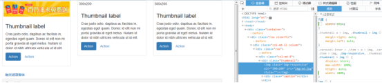
<img src="..." class="img-responsive" alt="響應式圖像"> bootstrap.css裡設置了img-responsive的屬性: .img-responsive { display: inline-block; height: auto; max-width: 100%; }
基本的全域樣式
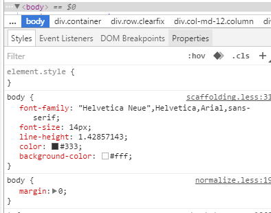
body { font-family: "Helvetica Neue", Helvetica, Arial, sans-serif; font-size: 14px; line-height: 1.428571429; color: #333333; background-color: #ffffff; } body {margin:0}
連結樣式
a:hover, a:focus { color: #2a6496; text-decoration: underline; } a:focus { outline: thin dotted #333; outline: 5px auto -webkit-focus-ring-color; outline-offset: -2px; }
這些預設設定有好有壞,難免嘛。若不想要連結的底線,可以在 a 標籤上加一個名為 btn 的 class。
另外,Bootstrap 引入了 Normalize.css,用以抹平不同瀏覽器之間的樣式差異,帶來更好的跨瀏覽器一致性。
容器 Container
<div class=”container”> .. </div>
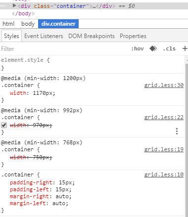
.container 的樣式如下:
.container { padding-right: 15px; padding-left: 15px; margin-right: auto; margin-left: auto; }
左右外边距交由瀏覽器自動決定;由於內距是固定寬度,預設情況下容器並不建議嵌套。
.container:before,.container:after { display: table; content: " "; }
把 display 設為 table,會建立一個匿名 table-cell 與新的區塊格式化上下文::before 偽元素用來防止上边距塌陷,:after 偽元素則負責清除浮動,而 content:" " 則是為了修復部分 Opera 的 bug。
.container:after { clear: both; }
此外還搭配了對應的媒體查詢:
@media (min-width: 768px) { .container { width: 750px; } }
瀏覽器與裝置支援
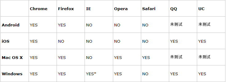
* Bootstrap 支援 Internet Explorer 8 及更高版本。
參考:https://www.runoob.com/bootstrap/bootstrap-css-overview.html
以上就是 Bootstrap 內建固定樣式的重點整理,希望對你有所幫助。若有疑問,歡迎留言交流。
- 上一篇文章: React Native 入門實作:打造一個簡潔的登入畫面
- 下一篇文章: Bootstrap 入門(一):從環境建置到可視化布局上手
相關文章
-
深入理解 Bootstrap 框架:入門準備篇 Bootstrap 入門必修課:環境搭建與第一個 Hello World Bootstrap 入門(零):框架簡介、下載與標準模板 第一章:初識 Bootstrap —— 起源、特性、目錄結構與第一個頁面 學 Bootstrap 前該先懂的事:box-sizing: border-box 到底是什麼 Bootstrap 網頁框架快速上手:從引入檔案到第一個響應式頁面 Bootstrap 快速入門:半小時搞懂它的六大組成部分 Bootstrap 實戰入門:第一次接觸 Bootstrap Bootstrap 前端實作案例(一):從基本範本到導航列與輪播 Bootstrap 零基礎實戰:用網格與 Ajax 讀取 JSON 資料