本文為大家介紹 Bootstrap 表單樣式的使用知識,一起來看看吧!
表單
<form role="form"> <div class="form-group"> <label for="exampleInputEmail1">郵箱:</label> <input type="email" class="form-control" id="exampleInputEmail1" placeholder="請輸入您的郵箱地址"> </div> <div class="form-group"> <label for="exampleInputPassword1">密碼</label> <input type="password" class="form-control" id="exampleInputPassword1" placeholder="請輸入您的郵箱密碼"> </div> <div class="checkbox"> <label> <input type="checkbox"> 記住密碼 </label> </div> <button type="submit" class="btn btn-default">進入郵箱</button> </form>
效果圖:

class: form-control
1、寬度變成 100%;2、加上淺灰色(#ccc)邊框;3、具有 4px 圓角;4、有陰影效果,且元素獲得焦點時陰影與邊框會變化;5、把 placeholder 的顏色設為 #999。
2、水平表單:
Bootstrap 預設的表單是垂直風格,但很多時候我們需要水平表單(標籤居左、表單控制項居右):
<form class="form-horizontal" role="form"> <div class="form-group"> <label for="inputEmail3" class="col-sm-2 control-label">郵箱</label> <div class="col-sm-10"> <input type="email" class="form-control" id="inputEmail3" placeholder="請輸入您的郵箱地址"> </div> </div> <div class="form-group"> <label for="inputPassword3" class="col-sm-2 control-label">密碼</label> <div class="col-sm-10"> <input type="password" class="form-control" id="inputPassword3" placeholder="請輸入您的郵箱密碼"> </div> </div> <div class="form-group"> <div class="col-sm-offset-2 col-sm-10"> <div class="checkbox"> <label> <input type="checkbox"> 記住密碼 </label> </div> </div> </div> <div class="form-group"> <div class="col-sm-offset-2 col-sm-10"> <button type="submit" class="btn btn-default">進入郵箱</button> </div> </div> </form>
效果圖:

在 Bootstrap 中要實現水平表單,必須滿足兩個條件:
1、在 form 元素上使用類名「form-horizontal」。
2、搭配 Bootstrap 的網格系統。
在 form 上添加「form-horizontal」主要有兩個作用:一是設定表單控制項的 padding 與 margin 值;二是改變「form-group」的呈現方式,使其類似網格系統的「row」。
3、內嵌表單
在 Bootstrap 中實現這種表單輕而易舉,只要在 form 上添加「form-inline」類名即可。內嵌表單的原理很簡單:要把表單控制項排在一行,就把它們設為內嵌塊元素(display:inline-block)。
<form class="form-inline" role="form"> <div class="form-group"> <label class="sr-only" for="exampleInputEmail2">郵箱</label> <input type="email" class="form-control" id="exampleInputEmail2" placeholder="請輸入你的郵箱地址"> </div> <div class="form-group"> <label class="sr-only" for="exampleInputPassword2">密碼</label> <input type="password" class="form-control" id="exampleInputPassword2" placeholder="請輸入你的郵箱密碼"> </div> <div class="checkbox"> <label> <input type="checkbox"> 記住密碼 </label> </div> <button type="submit" class="btn btn-default">進入郵箱</button> </form>
效果圖:

4、輸入框 input
單行輸入框,也就是常見的 text 輸入框。在 Bootstrap 中使用 input 時也必須加上 type 型別,否則將無法得到正確樣式。
<form role="form"> <div class="form-group"> <input type="email" class="form-control" placeholder="Enter email"> </div> <div class="form-group"> <input type="text" class="form-control" placeholder="請輸入用戶名"/> </div> </form>
效果圖:

5、下拉選擇框 select
Bootstrap 中的下拉選擇框用法與原生一致,多行選擇只要把 multiple 屬性設為 multiple 即可。Bootstrap 會為這些元素提供統一樣式。
<form role="form"> <div class="form-group"> <select class="form-control"> <option>1</option> <option>2</option> <option>3</option> <option>4</option> <option>5</option> </select> </div> <div class="form-group"> <select multiple class="form-control"> <option>1</option> <option>2</option> <option>3</option> <option>4</option> <option>5</option> </select> </div> </form>
效果圖:

6、文本域 textarea
文本域用法與原生一致,可用 rows 定義高度、cols 定義寬度。但若 textarea 加了「form-control」類名,就無需設定 cols,因為「form-control」的表單控制項寬度為 100% 或 auto。
<form role="form"> <div class="form-group"> <textarea class="form-control" rows="3"></textarea> </div> </form>
效果圖:

7. 複選框 checkbox 與單選按鈕 radio
Bootstrap 中 checkbox 與 radio 有點特殊,因為它們與 label 標籤搭配使用時會出現一些小問題(最頭痛的是對齊問題)。使用 Bootstrap 時開發人員無需想太多,照下面的方法使用即可。
<form role="form"> <h3>案例 1</h3> <div class="checkbox"> <label> <input type="checkbox" value=""> 記住密碼 </label> </div> <div class="radio"> <label> <input type="radio" name="optionsRadios" id="optionsRadios1" value="love" checked> 喜歡 </label> </div> <div class="radio"> <label> <input type="radio" name="optionsRadios" id="optionsRadios2" value="hate"> 不喜歡 </label> </div> </form>
效果圖:

8. 複選框與單選按鈕水平排列
有時為了排版需要,會把複選框與單選按鈕水平排列,Bootstrap 也做了相應考量:
1、若 checkbox 需要水平排列,只要在 label 標籤上添加「checkbox-inline」;
2、若 radio 需要水平排列,只要在 label 標籤上添加「radio-inline」。
<form role="form"> <div class="form-group"> <label class="checkbox-inline"> <input type="checkbox" value="option1">遊戲 </label> <label class="checkbox-inline"> <input type="checkbox" value="option2">攝影 </label> <label class="checkbox-inline"> <input type="checkbox" value="option3">旅遊 </label> </div> <div class="form-group"> <label class="radio-inline"> <input type="radio" value="option1" name="sex">男性 </label> <label class="radio-inline"> <input type="radio" value="option2" name="sex">女性 </label> <label class="radio-inline"> <input type="radio" value="option3" name="sex">中性 </label> </div> </form>
效果圖:

9. 按鈕
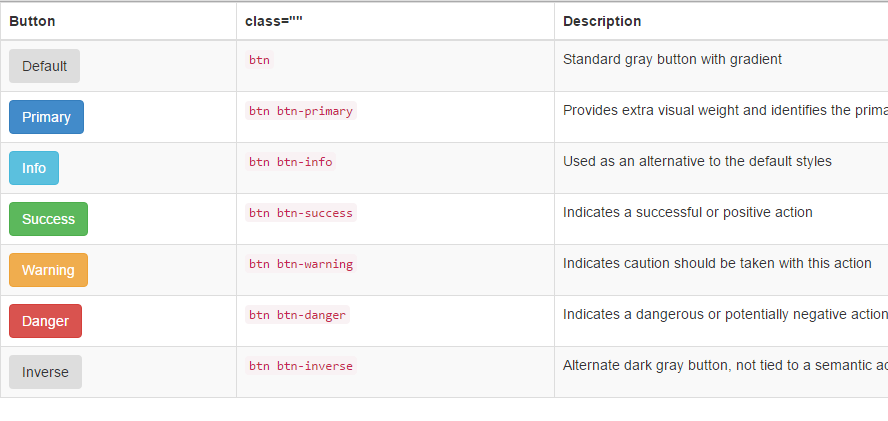
Bootstrap 中的按鈕透過 class 來實現,常見的樣式對照如下:
<table class="table table-bordered table-striped"> <thead> <tr> <th>Button</th> <th>class=""</th> <th>Description</th> </tr> </thead> <tbody> <tr> <td><button class="btn" href="#">Default</button></td> <td><code>btn</code></td> <td>Standard gray button with gradient</td> </tr> <tr> <td><button class="btn btn-primary" href="#">Primary</button></td> <td><code>btn btn-primary</code></td> <td>Provides extra visual weight and identifies the primary action in a set of buttons</td> </tr> <tr> <td><button class="btn btn-info" href="#">Info</button></td> <td><code>btn btn-info</code></td> <td>Used as an alternative to the default styles</td> </tr> <tr> <td><button class="btn btn-success" href="#">Success</button></td> <td><code>btn btn-success</code></td> <td>Indicates a successful or positive action</td> </tr> <tr> <td><button class="btn btn-warning" href="#">Warning</button></td> <td><code>btn btn-warning</code></td> <td>Indicates caution should be taken with this action</td> </tr> <tr> <td><button class="btn btn-danger" href="#">Danger</button></td> <td><code>btn btn-danger</code></td> <td>Indicates a dangerous or potentially negative action</td> </tr> <tr> <td><button class="btn btn-inverse" href="#">Inverse</button></td> <td><code>btn btn-inverse</code></td> <td>Alternate dark gray button, not tied to a semantic action or use</td> </tr> </tbody> </table>
效果圖:
10. 表單控制項大小
前面的表單控制項都是正常大小。可以透過設定 height、line-height、padding、font-size 等屬性來調整高度,不過 Bootstrap 還提供了兩個類名來控制表單控制項高度:
1、input-sm:讓控制項比正常大小更小;
2、input-lg:讓控制項比正常大小更大。
這兩個類適用於表單中的 input、textarea 與 select 控制項。
<form role="form"> <div class="form-group"> <label class="control-label">控制項變大</label> <input class="form-control input-lg" type="text" placeholder="添加.input-lg,控制項變大"> </div> <div class="form-group"> <label class="control-label">正常大小</label> <input class="form-control" type="text" placeholder="正常大小"> </div> <div class="form-group"> <label class="control-label">控制項變小</label> <input class="form-control input-sm" type="text" placeholder="添加.input-sm,控制項變小"> </div> </form>
效果圖:

11. 表單控制項狀態(禁用狀態)
Bootstrap 表單控制項的禁用狀態與一般表單相同,只要在相應控制項上添加「disabled」屬性即可。禁用單個標籤,只需在標籤屬性中加入 disabled:
<form role="form" class="form-horizontal"> <div class="form-group"> <div class="col-xs-6"> <input class="form-control input-lg" id="disabledInput" type="text" placeholder="表單已被禁用,不可輸入" disabled> </div> </div> </form>
效果圖:

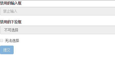
在 Bootstrap 中,若 fieldset 設定了 disabled 屬性,整個域都將處於禁用狀態。
<form role="form"> <fieldset disabled> <div class="form-group"> <label for="disabledTextInput">禁用的輸入框</label> <input type="text" id="disabledTextInput" class="form-control" placeholder="禁止輸入"> </div> <div class="form-group"> <label for="disabledSelect">禁用的下拉框</label> <select id="disabledSelect" class="form-control"> <option>不可選擇</option> </select> </div> <div class="checkbox"> <label> <input type="checkbox"> 無法選擇 </label> </div> <button type="submit" class="btn btn-primary">提交</button> </fieldset> </form>
效果圖:
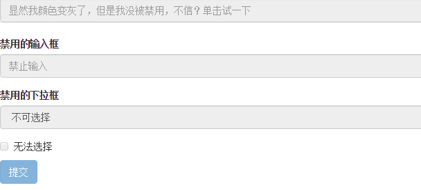
據說在整個被禁用的域中,若 legend 裡有輸入框,這個輸入框是無法被禁用的。
<form role="form"> <fieldset disabled> <legend><input type="text" class="form-control" placeholder="顯然我顏色變灰了,但是我沒被禁用,不信?單擊試一下" /></legend> <div class="form-group"> <label for="disabledTextInput">禁用的輸入框</label> <input type="text" id="disabledTextInput" class="form-control" placeholder="禁止輸入"> </div> <div class="form-group"> <label for="disabledSelect">禁用的下拉框</label> <select id="disabledSelect" class="form-control"> <option>不可選擇</option> </select> </div> <div class="checkbox"> <label> <input type="checkbox"> 無法選擇 </label> </div> <button type="submit" class="btn btn-primary">提交</button> </fieldset> </form>
效果圖:
表單驗證狀態
製作表單時難免要做驗證,同樣也需要提供驗證狀態樣式,Bootstrap 提供了這幾種效果:
1、.has-warning:警告狀態(黃色);
2、.has-error:錯誤狀態(紅色);
3、.has-success:成功狀態(綠色)。
很多時候,表單驗證時不同狀態會提供不同的圖示,例如成功是對號(√)、錯誤是叉號(×)等。Bootstrap 也提供了這樣的效果:若想讓表單在對應狀態下顯示圖示,只需在該狀態下添加「has-feedback」類名,並與「has-error」、「has-warning」和「has-success」一起使用:
<form role="form"> <div class="form-group has-success"> <label class="control-label" for="inputSuccess1">成功狀態</label> <input type="text" class="form-control" id="inputSuccess1" placeholder="成功狀態"> </div> <div class="form-group has-warning"> <label class="control-label" for="inputWarning1">警告狀態</label> <input type="text" class="form-control" id="inputWarning1" placeholder="警告狀態"> </div> <div class="form-group has-error"> <label class="control-label" for="inputError1">錯誤狀態</label> <input type="text" class="form-control" id="inputError1" placeholder="錯誤狀態"> </div> </form> <br> <br> <br> <form role="form"> <div class="form-group has-success has-feedback"> <label class="control-label" for="inputSuccess1">成功狀態</label> <input type="text" class="form-control" id="inputSuccess1" placeholder="成功狀態"> <span class="glyphicon glyphicon-ok form-control-feedback"></span> </div> <div class="form-group has-warning has-feedback"> <label class="control-label" for="inputWarning1">警告狀態</label> <input type="text" class="form-control" id="inputWarning1" placeholder="警告狀態"> <span class="glyphicon glyphicon-warning-sign form-control-feedback"></span> </div> <div class="form-group has-error has-feedback"> <label class="control-label" for="inputError1">錯誤狀態</label> <input type="text" class="form-control" id="inputError1" placeholder="錯誤狀態"> <span class="glyphicon glyphicon-remove form-control-feedback"></span> </div> </form>
效果圖:

表單提示資訊
平常製作表單驗證時,要提供不同的提示資訊,Bootstrap 也提供了這樣的效果:使用「help-block」樣式,把提示資訊以區塊形式顯示在控制項底部。
<form role="form"> <div class="form-group has-success has-feedback"> <label class="control-label" for="inputSuccess1">成功狀態</label> <input type="text" class="form-control" id="inputSuccess1" placeholder="成功狀態"> <span class="help-block">你輸入的資訊是正確的</span> <span class="glyphicon glyphicon-ok form-control-feedback"></span> </div> <div class="form-group has-warning has-feedback"> <label class="control-label" for="inputWarning1">警告狀態</label> <input type="text" class="form-control" id="inputWarning1" placeholder="警告狀態"> <span class="help-block">請輸入正確資訊</span> <span class="glyphicon glyphicon-warning-sign form-control-feedback"></span> </div> <div class="form-group has-error has-feedback"> <label class="control-label" for="inputError1">錯誤狀態</label> <input type="text" class="form-control" id="inputError1" placeholder="錯誤狀態"> <span class="help-block">你輸入的資訊是錯誤的</span> <span class="glyphicon glyphicon-remove form-control-feedback"></span> </div> </form>
效果圖:

以上就是小編為大家介紹的 Bootstrap 表單樣式的使用,希望對大家有所幫助。若有任何疑問歡迎留言,小編會及時回覆。也感謝大家對網站的支持!
- 上一篇文章: JavaScript 設計模式之單例模式全面解析
- 下一篇文章: JavaScript 比較語義化版本號的實作指南
相關文章
-
jQuery 表單驗證實戰:從必填標記到即時提醒的完整流程 不靠插件:用原生 jQuery 手寫一個表單驗證 jquery.validate.js 遇到多個相同 name 欄位該怎麼處理 jQuery Validate 表單驗證實作:格式檢查與重名校驗 JavaScript即時表單驗證:input與propertychange雙寫法 用純 jQuery 做一個前端驗證碼:產生、點擊刷新與比對 用 jQuery 為 textarea 加上字數限制與即時剩餘字數提示 jQuery Validation 插件完全指南:規則、提示、美化與遠程校驗 Bootstrap 表單與按鈕慕課筆記整理 Bootstrap 表單創建實例詳解