用 Bootstrap 來搭圖片輪播(Carousel),能省下大量時間。輪播在網頁裡雖然常見,但若從零手刻,光是 JavaScript 就得寫上一大段,尺寸控制也頗傷神。順帶一提,Carousel 這個字本義是「迴旋木馬」。
一、要做出什麼
目標是在頁面上放一個多圖輪播:滑鼠移上去會自動暫停,每張圖下方還能帶一行說明文字。
由於筆者電腦上的錄影軟體實在普通,也覺得沒必要在上面耗太多時間,能講清楚就好,所以下面這段 GIF 的色偏有點明顯,但基本效果還看得出來。另外要留意,這個元件不支援 IE6 與 IE7,若必須支援 IE6,得另外去找 Bootstrap 的 IE6 相容套件;而在 Chrome 上,圖片說明文字邊緣會滲出一點淡淡的黑,不影響閱讀。

不同瀏覽器下的呈現多少有差異,IE8 的畫面大致如下:

二、版面怎麼想
先看病์ละayout 規劃:
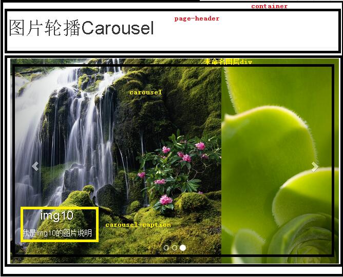
三、實作步驟
第一步:準備環境。到官網下載正式版的 Bootstrap。要提醒的是 Bootstrap 3 與 2 並不相容,建議直接照 3 的開發文件走,本文也是以 Bootstrap 3 為例。此外 Bootstrap 3 的 JavaScript 效果需要 jQuery 1.11 支援,請到 jQuery 官網抓可相容舊版 IE6 的 1.11,而不是不支援 IE6 的 jQuery 2。下載完成後把 Bootstrap 3 直接解壓到站點目錄,並把 jquery-1.11.1.js 放進 js 目錄,也就是和 bootstrap.js 同一層,目錄結構大致如下:

第二步:寫入完整程式碼。先給出整體,再逐段拆解。
<!DOCTYPE html PUBLIC "-//W3C//DTD XHTML 1.0 Transitional//EN" "https://www.w3.org/TR/xhtml1/DTD/xhtml1-transitional.dtd">
<html xmlns="https://www.w3.org/1999/xhtml">
<head>
<meta http-equiv="Content-Type" content="text/html; charset=utf-8" />
<meta name="viewport" content="width=device-width,initial-scale=1.0,user-scalable=no">
<link href="css/bootstrap.css" rel="stylesheet" media="screen">
<script type="text/javascript" src="js/jquery-1.11.1.js"></script>
<script type="text/javascript" src="js/bootstrap.js"></script>
<title>圖片輪播 Carousel</title>
</head>
<body>
<div class="container">
  <div class="page-header">
    <h1>圖片輪播 Carousel</h1>
  </div>
  <div style="width: 640px; height: 480px; margin-right: auto; margin-left: auto;">
    <div id="carousel" class="carousel slide" data-ride="carousel" data-interval="1000">
      <ol class="carousel-indicators">
        <li data-target="#carousel-example-generic" data-slide-to="0" class="active"></li>
        <li data-target="#carousel-example-generic" data-slide-to="1"></li>
        <li data-target="#carousel-example-generic" data-slide-to="2"></li>
      </ol>
      <div class="carousel-inner" role="listbox">
        <div class="item active">
          <a href="images/img0.jpg"><img src="images/img0.jpg" alt="img0"></a>
          <div class="carousel-caption">
            <h3>img0</h3>
            <p>我是 img0 的圖片說明</p>
          </div>
        </div>
        <div class="item">
          <a href="images/img10.jpg"><img src="images/img10.jpg" alt="img10"></a>
          <div class="carousel-caption">
            <h3>img10</h3>
            <p>我是 img10 的圖片說明</p>
          </div>
        </div>
        <div class="item">
          <a href="images/img2.jpg"><img src="images/img2.jpg" alt="img2"></a>
          <div class="carousel-caption">
            <h3>img2</h3>
            <p>我是 img2 的圖片說明</p>
          </div>
        </div>
      </div>
      <a class="left carousel-control" href="#carousel-example-generic" role="button" data-slide="prev">
        <span class="glyphicon glyphicon-chevron-left"></span>
      </a>
      <a class="right carousel-control" href="#carousel-example-generic" role="button" data-slide="next">
        <span class="glyphicon glyphicon-chevron-right"></span>
      </a>
    </div>
  </div>
</div>
</body>
</html>
(1)head 段落的四件事
<head>
<!-- 宣告編碼 -->
<meta http-equiv="Content-Type" content="text/html; charset=utf-8" />
<!-- 讓頁面自動適應裝置寬度 -->
<meta name="viewport" content="width=device-width,initial-scale=1.0,user-scalable=no">
<!-- Bootstrap 的 CSS -->
<link href="css/bootstrap.css" rel="stylesheet" media="screen">
<!-- Bootstrap 的 JS 效果要靠 jQuery 才能運作 -->
<script type="text/javascript" src="js/jquery-1.11.1.js"></script>
<script type="text/javascript" src="js/bootstrap.js"></script>
<title>圖片輪播 Carousel</title>
</head>
(2)body 段落:先框一個容器
最外層的 container 會把裡頭的內容自動置中,接著再往裡面填東西。頁頭用 page-header 加上一個 h1 即可:
<div class="page-header">
  <h1>圖片輪播 Carousel</h1>
</div>
之後再定義一個不具名的 div 來約束輪播的尺寸。這裡有個關鍵:Bootstrap 的輪播元件本身不會自動縮放內部元素,尺寸必須在外層 div 上用 width 與 height 指定,否則圖片會變形。另外要置中,只能在 style 裡寫 margin-right: auto; margin-left: auto;,單獨加 align="center" 是完全沒有效果的。
<div style="width: 640px; height: 480px; margin-right: auto; margin-left: auto;">
  <!-- id 為 carousel;data-ride 是 Bootstrap 要求一定要有的;data-interval 控制每 1000 毫秒(1 秒)換一張,設太小元件會失真 -->
  <div id="carousel" class="carousel slide" data-ride="carousel" data-interval="1000">
    <!-- 這裡決定總共幾張圖,要多一張就在下面多補一項,並把 data-slide-to 的數字加一;第一張(第 0 張)務必帶 class="active",否則元件不會動 -->
    <ol class="carousel-indicators">
      <li data-target="#carousel-example-generic" data-slide-to="0" class="active"></li>
      <li data-target="#carousel-example-generic" data-slide-to="1"></li>
      <li data-target="#carousel-example-generic" data-slide-to="2"></li>
    </ol>
    <div class="carousel-inner" role="listbox">
      <!-- 第一張圖的 class 必須是 item active,其餘一律只要 item -->
      <div class="item active">
        <!-- 點圖片就開啟該圖的連結;若不需要連結,直接把 a 標籤拿掉 -->
        <a href="images/img0.jpg"><img src="images/img0.jpg" alt="img0"></a>
        <div class="carousel-caption">
          <!-- 圖片下方的文字說明 -->
          <h3>img0</h3>
          <p>我是 img0 的圖片說明</p>
        </div>
      </div>
      <div class="item">
        <a href="images/img10.jpg"><img src="images/img10.jpg" alt="img10"></a>
        <div class="carousel-caption">
          <h3>img10</h3>
          <p>我是 img10 的圖片說明</p>
        </div>
      </div>
      <div class="item">
        <a href="images/img2.jpg"><img src="images/img2.jpg" alt="img2"></a>
        <div class="carousel-caption">
          <h3>img2</h3>
          <p>我是 img2 的圖片說明</p>
        </div>
      </div>
    </div>
    <!-- 左右兩顆切換鈕,屬於固定框架,照抄即可 -->
    <a class="left carousel-control" href="#carousel-example-generic" role="button" data-slide="prev">
      <span class="glyphicon glyphicon-chevron-left"></span>
    </a>
    <a class="right carousel-control" href="#carousel-example-generic" role="button" data-slide="next">
      <span class="glyphicon glyphicon-chevron-right"></span>
    </a>
  </div>
</div>
把這幾個 class 的職責記起來,之後要換圖、加圖或調速度,都只是在改屬性而已。