Bootstrap 是現在最流行的響應式 CSS 框架,行動優先的設計讓同一份程式碼能自動適配各種裝置。用它寫響應式頁面快速又省心,還順帶把瀏覽器差異屏蔽掉了——用過之後,實在很難回想以前手寫原始 CSS 的日子。
學過一輪之後我發現,自己也具備了「幾分鐘做出一個像樣頁面」的能力。本文就帶大家從安裝開始,一路做到一個完整的響應式頁面。
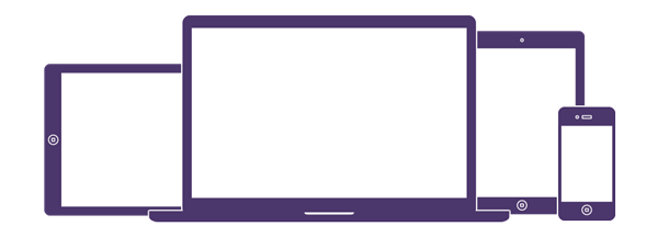
圖 1. 行動優先,適應不同裝置
一、安裝
最省事的方式是直接用 CDN,使用者拜訪頁面時會從最近的節點抓資源:
清單 1. 從 CDN 載入 Bootstrap
<!-- Latest compiled and minified CSS --> <link rel="stylesheet" href="bootstrap/3.3.4/css/bootstrap.min.css "> <!-- Optional theme --> <link rel="stylesheet" href="bootstrap/3.3.4/css/bootstrap-theme.min.css "> <!-- Latest compiled and minified JavaScript --> <script src="bootstrap/3.3.4/js/bootstrap.min.js"> </script>
也可以下載回來本地部署。官網除了提供完整包,還有定制頁面,能依專案需要勾選功能、編譯出精簡版。下載解壓後的目錄如下:
清單 2. Bootstrap 目錄結構
bootstrap/ ├── css/ │ ├── bootstrap.css │ ├── bootstrap.css.map │ ├── bootstrap.min.css │ ├── bootstrap-theme.css │ ├── bootstrap-theme.css.map │ └── bootstrap-theme.min.css ├── js/ │ ├── bootstrap.js │ └── bootstrap.min.js └── fonts/ ├── glyphicons-halflings-regular.eot ├── glyphicons-halflings-regular.svg ├── glyphicons-halflings-regular.ttf ├── glyphicons-halflings-regular.woff └── glyphicons-halflings-regular.woff2
其中三個檔案最關鍵:bootstrap.min.css 是主體,包含大量常用 CSS 類;bootstrap-theme.min.css 是可選主題;bootstrap.min.js 提供 JavaScript 功能。特別注意——Bootstrap 依賴 jQuery,所以 bootstrap.min.js 之前必須先引入 jQuery。
實務上我通常直接拿官方基礎模板當起點,它已經把響應式需要的元資料都備齊了:
清單 3. Bootstrap 基礎模板
<!DOCTYPE html> <html lang="en"> <head> <meta charset="utf-8"> <meta http-equiv="X-UA-Compatible" content="IE=edge"> <meta name="viewport" content="width=device-width, initial-scale=1"> <!-- The above 3 meta tags *must* come first in the head; any other head content must come *after* these tags --> <title>Bootstrap 101 Template</title> <!-- Bootstrap --> <link href="css/bootstrap.min.css" rel="stylesheet"> <!-- HTML5 shim and Respond.js for IE8 support of HTML5 elements and media queries --> <!-- WARNING: Respond.js doesn't work if you view the page via file:// --> <!--[if lt IE 9]> <script src="https://oss.maxcdn.com/html5shiv/3.7.2/html5shiv.min.js"></script> <script src="https://oss.maxcdn.com/respond/1.4.2/respond.min.js"></script> <![endif]--> </head> <body> <h1>Hello, world!</h1> <!-- jQuery (necessary for Bootstrap's JavaScript plugins) --> <script src="https://ajax.googleapis.com/ajax/libs/jquery/1.11.2/jquery.min.js"></script> <!-- Include all compiled plugins (below), or include individual files as needed --> <script src="js/bootstrap.min.js"></script> </body> </html>
二、CSS 與網格系統
Bootstrap 首先是個 CSS 框架,預先定義了大量 class,只要掛上去就能得到樣式,布局與排版都包在裡面。功能實在太多,本文聚焦在網格系統,其餘用到再順帶提。
容器
用 Bootstrap 布局時,內容要包在 .container 裡。它有兩種:.container 固定寬度並置中,.container-fluid 則撐滿整個視窗:
清單 4. .container 與 .container-fluid
<div class="container"> <p>“小時候每當我生病,母親都會為我沖一杯咖啡,她溫柔地說:“外國人都喝這個的。 ”幼小的我總害怕咖啡,酸甜苦澀交錯。如今我走遍米蘿、上島、星巴克都找不到小時候喝的那個味道, 直到那天我喝了一杯板藍根。” </p> </div> <div class="container-fluid"> <p>“小時候每當我生病,母親都會為我沖一杯咖啡,她溫柔地說:“外國人都喝這個的。” 幼小的我總害怕咖啡,酸甜苦澀交錯。如今我走遍米蘿、上島、星巴克都找不到小時候喝的那個味道, 直到那天我喝了一杯板藍根。” </p> </div>
圖 2. 容器

網格系統
Bootstrap 把頁面分成行(.row),每行 12 欄(.col-md-*)。行必須放在容器內。依螢幕尺寸不同,欄的 class 分為 .col-xs-、.col-sm-、.col-md-、.col-lg-,分別對應手機(<768px)、平板(≥768px)、中等螢幕(≥992px)與大螢幕(≥1200px)。這些像素稱為臨界點,尺寸跨過臨界點時對應的 class 才生效,布局也就跟著變。
圖 3. 網格系統
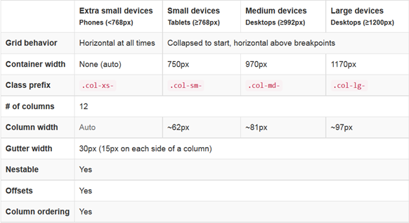
怎麼讀這張表?假設桌機上要分三欄,佔 1/4、2/4、1/4:
清單 5. 一行分三欄
<div class="row"> <div class="col-md-3">.col-md-3</div> <div class="col-md-6">.col-md-6</div> <div class="col-md-3">.col-md-3</div> </div>
三欄分別佔 12 欄中的 3、6、3,合起來剛好 12。把視窗縮到 970px 以下,它們就會堆成三行。除了 .col-xs- 之外,其他 class 都是這個行為:螢幕小於臨界點就堆疊,大於才排成列;而 .col-xs- 在任何尺寸下都維持排列。
不同尺寸的 class 可以混用。想讓桌機顯示 3 欄、手機顯示 2 欄:
清單 6. 桌機與手機顯示不同欄數
<div class="row"> <div class="col-xs-6 col-md-3">.col-md-3</div> <div class="col-xs-6 col-md-6">.col-md-6</div> <div class="col-xs-6 col-md-3">.col-md-3</div> </div>
手機上第三欄會換行,佔半幅寬度。若希望所有裝置欄數一致,只需定義最小尺寸的 .col-xs-,布局會自動放大;反過來則不成立:
清單 7. 所有裝置顯示相同欄數
<div class="row"> <div class="col-xs-6">.col-xs-6</div> <div class="col-xs-6">.col-xs-6</div> </div>
欄也可以位移。第一欄佔 1/4,第二欄往右推 6 欄、佔行末 3 欄:
清單 8. 欄位移
<div class="row"> <div class="col-md-3">.col-md-3</div> <div class="col-md-3 col-md-offset-6">.col-md-3</div> </div>
順序則可用 .col-md-push-* 與 .col-md-pull-* 調整,把某元素往後推或往前拉。這招很實用——例如讓重要內容在手機版提前出現:
清單 9. 推拉欄
<div class="row"> <div class="col-md-9 col-md-push-3">.col-md-9 .col-md-push-3</div> <div class="col-md-3 col-md-pull-9">.col-md-3 .col-md-pull-9</div> </div>
更棒的是網格可以嵌套,複雜布局因此變得可行:
清單 10. 嵌套
<div class="row"> <div class="col-sm-9"> Level 1: .col-sm-9 <div class="row"> <div class="col-xs-8 col-sm-6"> Level 2: .col-xs-8 .col-sm-6 </div> <div class="col-xs-4 col-sm-6"> Level 2: .col-xs-4 .col-sm-6 </div> </div> <div class="col-sm-3"> Level 1: .col-sm-3 </div> </div>
整體兩欄,第一欄裡頭又嵌了兩欄。
三、實戰
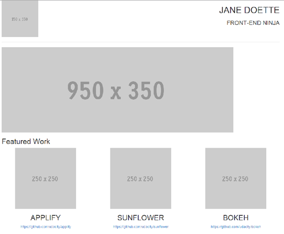
假設要做這樣一個頁面:
圖 4. 網頁設計

第一步先把設計稿切成行與欄:
圖 5. 將設計劃分成行和欄

依這個切法寫出 HTML,並掛上對應的 Bootstrap class:
清單 11. 定義 HTML 結構
<div class="container"> <div class="row"> <div class="col-md-3"> <img src="https://placehold.it/150x150"> </div> <div class="col-md-9"> <h1>Jane Doette</h1> <h3>front-end ninja</h3> </div> </div> <hr> <div class="row"> <div class="col-md-12"> <img src="https://placehold.it/950x350"> </div> </div> <div class="row"> <div class="col-md-12"> <h2>Featured Work</h2> </div> </div> <div class="row"> <div class="col-md-4"> <img src="https://placehold.it/250x250"> <h2>applify</h2> <a href="https://github.com/udacity/applify">https://github.com/udacity/applify</a> </div> <div class="col-md-4"> <img src="https://placehold.it/250x250"> <h2>sunflower</h2> <a href="https://github.com/udacity/sunflower">https://github.com/udacity/sunflower</a> </div> <div class="col-md-4"> <img src="https://placehold.it/250x250"> <h2>bokeh</h2> <a href="https://github.com/udacity/bokeh">https://github.com/udacity/bokeh</a> </div> </div> </div>
這段結構不到十分鐘就寫完了,圖片先用線上佔位圖代替。在瀏覽器打開,已經很接近設計稿,剩下的只是字體、大小寫、間距的細節——翻一下官方文件找到對應的 class 套上去即可:
圖 6. 完成效果
最有意思的是,當你縮小視窗或用手機開啟這個頁面,它已經是個不折不扣的響應式頁面了——而我們沒有多寫一行程式碼。看看時間,前後不到 20 分鐘。